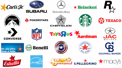
We live in an age of opportunities, enormous choice, and even overabundance, and if it makes life a little easier for clients, it doesn’t make it any easier for companies. It’s quite difficult to stand out from the competition, let alone to be remembered. Of course, the first thing that the potential buyer pays attention to is the logo, and there are not many symbols that you can be to use on the emblems of brands to reflect professionalism and trustworthiness. One of the most commonly used visual identity symbols is undoubtedly the star. Apart from the above-mentioned characteristics, for many, it also stands for patriotism. Today we want to draw your attention to 25 of the most famous and interesting star logos.
Why is a Star so popular in logos?
Star is one of the most commonly used symbols for emblems of different brands from all possible categories. Dozens of companies choose Star to be placed on their badges, and this is why: the Star is not only a symbol of glory and power but also of guidance and protection. The Star symbol shows excellence (Mercedes-Benz), professionalism (Paramount), and quality (Heineken).
Top-25 Logos featuring a star symbol:
Paramount
We will start our list of logos with a star with Paramount, an American company that creates and distributes movies, and which name is known in every corner of the earth. Paramount is a legend, but its visual identity has always been associated with the mountain image, not with the star symbol, although, the company uses twenty-one five-pointed stars as framing for its iconic circular medallion. So apart from the NFL logo, which we will talk about a little later, the Paramount badge is the “star quantity” leader in our today’s ranking.
Chrysler
One of the most iconic logos with a star is the one, that belongs to Chrysler, a legendary American automobile company. The star here is unscripted into a solid pentagon, a geometric figure that is strongly associated with the brand and its sun-marques. So here the star is more of a secondary element; which adds volume and lightness to the main symbol, also making the whole badge look more stylish and sharp, elegant and timeless. The thin rays of the Chrysler star stand for progress and strength, for motion and speed, for professionalism and loyalty. Executed in gradients, the symbol makes the badge three-dimensional and sleek.
Texaco
Texaco, the largest integrated energy company in the U.S., one of the biggest corporations in the world, also uses a star in its logo, but here it is not only about a powerful symbol with clean lines, but it is also more meaningful, as Texas is known as the “Lone Star State” (it was nicknamed after the flag, used by the state in the 1830s). The patriotic meaning of the logo is elevated by the red and white color palette, a sign of power and passion. The Texaco logo might look simple, and not very modern, but it has a super-strong spirit and is instantly recognizable and memorable.
JAC Motors
JAC Motors is a Chinese state-owned company that makes cars and buses, so it’s not very surprising, that the JAC star in some ways reminds of the iconic Chrysler badge, but here it is placed on a transparent background and enclosed into a horizontally oriented ellipsoidal frame. The JAC star is thin and sharp, elegant and modern, with a sense of passion and progressiveness, which is softened and balanced by a rounded outline. The light silver color palette of the emblem is accompanied by bright red from the bold wordmark, and altogether the elements work just fine, creating an image of a confident and professional company.
Subaru
Another brand with several stars on the logo from our list is the Japanese automaker Subaru. Its famous blue and silver badge uses six four-pointed stars, five of which are set on the right from the main enlarged one. The stars featured a very interesting and recognizable shape, with thin elongated rays, coming out of the bold bodies with sides arched to the center. The stars on the Subaru badge depict the Seven Sisters Constellation, where the seventh star is invisible and the name of the brand is the Japanese name for this constellation. This, the color palette can also be explained as the night-blue sky with blinking stars.
Starbucks
Starbucks, an American coffee company and coffee shop chain of the same name, uses two simple five-pointed stars in white to separate the wordmark’s, written along with its frame, and to emphasize the “Star” part of the name of the brand. This is not the most interesting example of the use of the symbol, but one of the most known and recognizable logos, where the green and the white color palette is elevated by the star symbol, evoking a sense of growth, progress, and, of course, energy, the coffee of the brand gives to its customers, making their days brighter and more productive.
Heineken
Quite controversial for some people is the star in the logo of Heineken, a Dutch brewing company, the largest in the country and the second-largest in the world (after Anheuser-Busch InBev). The star appeared on the brand logo at the beginning of the 1880s, but then it was monochrome. It became red only in the 1930s, and after the Second World War, it changed to red and white with a black outline and red letters around it. The star became completely red again only after 1991, the time of the USSR collapse and the collapse of the communist regime in the country, to avoid any associations with communism.
Poker Stars
Poker Stars is the largest online poker resource in the world. The company was founded by Israeli natives, father and son Isai and Mark Sheinberg. The poker Stars logo is nothing unexpected or surprising, it just reflects the name of the portal, having the white five-pointed star inscribed in a red spades symbol. Obviously, here the star is presented also in its most common meaning — exploration, wonder, achievement, brilliance, and development. the white color adds a sense of transparency and trustworthiness, which are two of the most important characteristics of the portal, where people play for money.
Rockstar Games
A very bright and intense logo, where the star has no other meaning rather than the part of the brand’s name is the one from Rockstar Games, an American company that specializes in the development and publishing of computer games. The white five-pointed star in a distinct black outline is placed on the end of the right “R”s bar, on deep yellow background. The symbol works well in the color palette, standing for energy and strength, development, and happiness. It is also some kind of a riddle, where the name of the brand is deciphered, but a very obvious and literate one.
NFL
Stars make up a celebration of patriotism on the logo of the NFL, a professional American soccer league in the United States. Here the dozens of white five-pointed stars, placed on a blue background, represent the national flag of the USA, showing the affiliation of the league to the country, its values, and, of course, the highest level of professionalism. Placed on a classy crest, the stars on this badge symbolize the timelessness and strong values of the organization, which cares about its reputation and roots.
Carl’s Jr.
A very friendly and kind star we can see on the logo of Carl’s Jr., a fast-food restaurant chain from the USA. The symbol here is executed in a warm orange and red color palette and is slightly slanted to the right as if this smiling star is dancing, and this is what makes it very welcoming and playful. The star has been an essential part of the Carl’s Jr. visual identity since the very first days: it was introduced in the initial badge, designed in 1941, and evolved to the smooth and bright symbol of the whole world associated with tasty and affordable meals today.
Converse
Converse is an American company making shoes since the beginning of the XX century and is best known for its Chuck Taylor All-Star sneakers. The iconic five-pointed star, enclosed into a circular frame, first appeared on the All-Star logo in 1928, and since then never left the brand. If there was no lettering at all, and only a bold blue star left in the thin frame, it would still be associated with the famous shoes for millions of people across the globe. Here the symbol works as a graphical representation of the label’s name but also stands for success, glory, and quality. Executed in the calm and deep shade of blue it looks serious and confident, showing the brand as the one producing really good and timeless shoes.
Mercedes-Benz
One of the most iconic logos with a star is undoubtedly that of Mercedes-Benz, the company manufacturer of premium cars, trucks, buses, and other vehicles. The emblem was formed from the merger of two logos, Benz and Daimler. The resulting image is very similar to the car steering wheel with three spokes. This way the company made it clear that from now on it will focus its production efforts on automobile transport. And not to forget about the past achievements in the field of aircraft and ship engines, the new logo was given a deeper meaning: the company’s engines work equally well in all three elements – on land, on water, and in the air. Each ray of a star symbolizes one of the elements.
Aardman
Aardman is a British studio that mostly produces clay-animation cartoons (like Wallace and Gromit or Shaun the Sheep). Their logo depicts the word ‘Aardman’ written in red letter that looked painted on. Above the letter ‘A’, they’ve also put a slightly rotated red star. They used the same style for it.
Bank of India

Bank of India is one of the biggest banks in this country, led by the Indian government. Their emblem is a 5-tip star, colored red. The top tip is longer than the other four, while the central space is empty to accommodate a little drawing they made in black. It depicts a human figure with a lion (the symbol of India) lying behind.
Benelli

Benelli is an Italian manufacturer of motorcycles, established in 1911. Their long-time logo is a circle with some imagery inside it. The edges are decorated with green laurel wreaths, and the center occupied by a small lion figure. Above it, there was the company’s name, written in black, and above that they’ve put three white stars arranged in a triangular pattern.
Captain America
Captain America is one of the primary superheroes in Marvel Universe. He’s essentially a morally pure patriotic supersoldier. His emblem is his own shield – a circle with three ring layers of red, white, red, and then a blue core with a white star on it. Obviously, it was all taken from the American flag.
Chuck Taylor All Star
Chuck Taylor All-Stars are a brand of sports shoes, designed by Converse. Their emblem features a big red star in the middle of a white, blue-outlined circle. ‘Converse’ and ‘All-Star’ was also written in blue letters along the top and bottom edges of the circle. Furthermore, the words ‘Chuck Taylor’ were placed on the left and right of the central star, written as if by hand.
Coldwell Banker
Coldwell Banker is a provider of real estate services from America, established in 1906. Their logo depicts the letter ‘C’ and ‘B’ written diagonally next to each other. Above this composition, they’ve placed a blue star, because Americans are really fond of them. The company’s name was written below it all in big, blue letters.
Energy Star
Energy Star is a program, launched by the American government in 1992 to teach energy conservation. The program’s emblem is a big turquoise square with ‘Energy’ written in italic letters in the middle. The ‘Star’ bit is represented by a white image of a star to the right of the main wordmark. There’s also a curved line drawn above it all to symbolize the globe.
Estrella
Estrella is a Swedish brand of snacks, produced by Kraft Foods. ‘Estrella’ literally means ‘star’ in Spanish, so it’s unsurprising they used one in their emblem. It’s a 5-tip red star with some tips curved to expose the underside, making it look like paper. The word ‘Estrella’ was also written in white italic font over a red ribbon below.
Macys

Macy’s is a big manufacturer of clothing and other apparel from America. Their logo includes their name written in thin, black letters – all lowercase. Besides that, there’s also a simple red star located on its left. The reason to use the star is just because Americans really liked stars back in the day.
San Pellegrino
S. Pellegrino is an Italian brand of sparkling mineral water, famous throughout the world. Their logo is the company’s name (‘S. Pellegrino’), written in big blue letters with slight white outlines. Above it all, there’s also a red star with a double white-red outline. The star has been the brand’s symbol for a long time.
Steven Universe
Steven Universe is an animated show, created by the American studio Cartoon Network. It revolves around a boy who discovered that he has special powers connected to the stellar beings that resemble gems. Their logo is just the name of the show, written in big, inflated letters. The coloring is a mix of various shades of yellow and orange. On the corner of two words, there’s also a star, made in the same style.
Toys R Us
Toys R Us is an American toy company, established in 1948. Their logo depicts the brand’s name, written in haphazard, cartoonish letters of varying bright colors. That includes a bit blue ‘R’ letter (mirrored into ‘Я’ on the logo). Instead of a normal blank dot, it has a star-shaped hole on it.


