Carl’s Jr. Restaurants LLC is among the best-known fast-food restaurant chains in the US. It also operates in Australia and Canada. Carl’s Jr. was established in 1941 in the imitated states and today has almost 1,5 thousand restaurants on all continents. The chain, which started from a hot-dog truck, has grown into a global franchise famous for its hamburgers and chicken.
Meaning and history
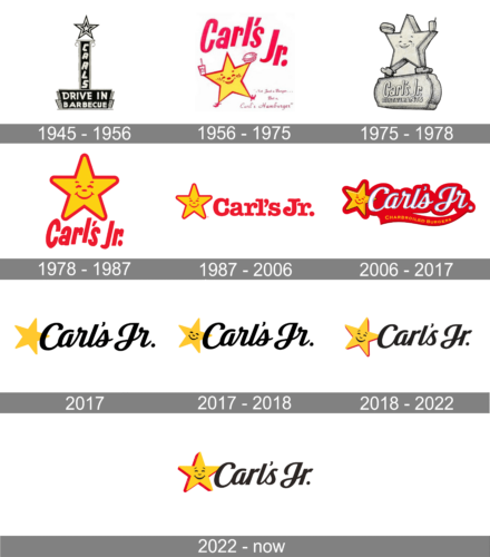
Carls Jr. is a world-renowned chain of fast-food restaurants that was founded in 1941 and has grown from a small sandwich cart to a company with more than three thousand owned and franchised restaurants in 44 U.S. states and 13 countries across the globe.
The company was founded by Carl Karcher and his wife Margaret, in Los Angeles, California. The first specialization of the brand was hot dogs, and burgers only appeared on the menu in 1945. Today the chain is one of the world’s most famous destinations for burger lovers.
What is Carls Jr?
Carls Jr is the name of an American fast-food restaurant chain, which was established in 1941, and today has more than 3 thousand locations worldwide. More than a third part of its restaurants are located in the United States. The chain is known for its burgers.
1945 – 1956
The history of the brand started in 1941 when Carl Karcher and his wife, Margaret Karcher, bought a hot dog cart in Los Angeles. Several years later, they already had four hot dog stands in Los Angeles. In 1956, they opened the first two Carl’s Jr. restaurants.
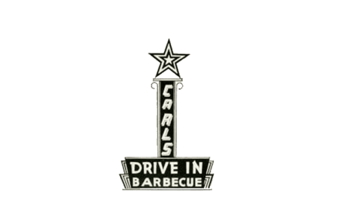
Known as “Carl’s Jr Drive-In Barbecue” for the first 15 years of its existence, the restaurant featured a very typical for its times’ visual identity — it was a vertically oriented banner with the wordmark and a massive star on top of it.
The monochrome star featured a triple outline and was sitting on a black banner with “Carl’s” lettering in capitals, which had another banner under it. It was a trapezoid, where the white “Drive-In Barbecue” wordmark was set.
1956 – 1975
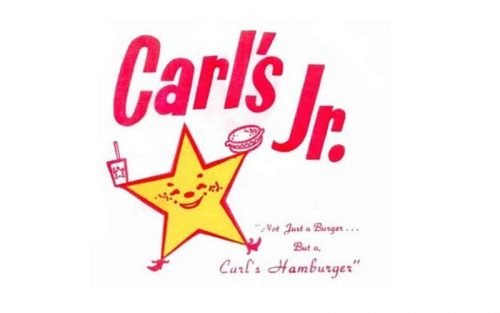
The name was shortened in 1956, and the emblem was redrawn in the same year. A smiling yellow star in a red outline was dancing near the red lettering in a bold sans-serif typeface, having a soda in one hand and a hamburger in the other one.There was also a version showcasing a more minimalist star without the drink and hamburger. Here, the wordmark was placed below.
1975 – 1978
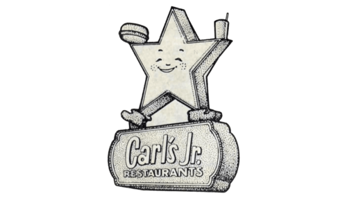
For a few years, the brand’s emblem depicted the dancing star in short boots and the hamburger and cup switched hands. The “Carl’s Jr.” inscription was done in the same style and placed right under the star on a stylized rectangular shape. On the second line, it specified “Restaurants” in a smaller font using all uppercase letters. The logo preserved its happy, cheerful feel and told everyone what this company was known for.
1978 – 1987
The star was simplified and placed above the inscription in 1977. Now the letters were jumping, but all the additional detail were removed. The contours of all the elements were redrawn in order to look stronger and more solid.
1987 – 2006
The star was placed on the left of the wordmark again in 1985, but there was also the version with the previous composition in use by the food-chain during this period. The most significant change of those years was about the inscription, which gained a new rounded serif typeface and a bold solid dot at the end.
2006 – 2017
In 2006 the logo was completely redrawn again, and the white color was added to the official palette. The star was placed diagonally on the left of the white script wordmark, which was outlined in black and placed on a red banner, which repeated the contour of the lettering. The delicate yellow “Charbroiled Burgers” in all caps was placed on the red underline of the banner.
2017
The red background and lettering “Charbroiled Burgers” disappeared. The name of the brand turned black, although the style and font were preserved. For a short period of time, the star appeared without a happy face and black outline.
2017 – 2018

It was not long before the company realized that the star character was part of its brand identity. Thus, the smiling star was back.
2018 – 2022

The lettering was rewritten in a simpler and more confident typeface with fewer curves, and the star gained a strict red outline. The emblem was also coming out from the inscription more to the left, becoming a separate element of the visual identity. The eyebrows, which had been removed from the 2017 Carl’s Jr logo, returned. The letters “r” and “s” were tweaked. The design was developed by the Havas agency.
2022 – Today
The emblem appeared very familiar as it had the same style of inscription and the yellow star. There was something different about the star character, though. It was turned to stand straight and the three-dimensional effect was enhanced by making the red lines thicker.
Font and color
The custom script typeface of the Carl’s Jr. logo was designed specifically for the brand and doesn’t have many analogs, though it is pretty close to such fonts as Kathya Script, Ethan Italics, and TT Polls Script Bold, which also look neat, elegant and very confident.
As for the color palette, the combination of black and yellow evokes a sense of energy and professionalism, while delicate red details elevate the whole logo, adding warmth and passion to it.


