

![]() Paramount Pictures Logo PNG
Paramount Pictures Logo PNG
Although the Paramount Pictures emblem has undergone numerous amendments, it has always revolved around one and the same visual concept.
Meaning and history
![]()
The company was founded by Adolph Zukor in May 1912 and was originally called the Famous Players Film Company. By the middle of 1913, the Famous Players Film Company had already produced five films.
In 1916, Adolph decides to merge his Famous Players Film Company with Jesse Lasky’s film studio, the Lasky Feature Play Company. This merger created a powerful new player in the motion picture industry, the Famous Players-Lasky Corporation.
The company did not start using the familiar name “Paramount Pictures” until the mid-1930s.Paramount Pictures was one of the first proponents of television, launching an experimental television station in Los Angeles back in 1939.
In 2005, Paramount announced its $1.6 billion acquisition of DreamWorks, which expanded its zone of activity and influence on the animated film industry as well.
What is Paramount Pictures?
Paramount Pictures Corporation is a major American film production and distribution company (major). It is located in Hollywood, California. It is the oldest film production studio in the United States. Paramount Pictures is owned by the Viacom conglomerate. The company was established in 1912.
1914
![]() The earliest Paramount Pictures logo was introduced in 1916. According to the company’s official legend, it was developed from a simple sketch on a napkin.
The earliest Paramount Pictures logo was introduced in 1916. According to the company’s official legend, it was developed from a simple sketch on a napkin.
1914 – 1917
![]()
The logo, introduced in 1914, became a prototype to the iconic emblem the whole world knows today. A monochrome circular badge framed into a chain of black five-pointed stars, touching each other’s corners, had an image of a snow wire mountain of the bottom part. The white cursive “Paramount” inscription was set in the middle of the circle, on a black background, while the “Pictures” was set in black on the bottom line of the white mountain drawing.
1917 – 1967
![]()
The redesign of 1917 introduced a refined version of the Paramount Pictures insignia, which stayed with the company for fifty years. All the elements were still there — black circle, starry framing, white Aeon mountain peaks, and elegant black-and-white lettering, but the contours of each line and symbol were strengthened and cleaned. The logo started looking more balanced and modern, showing the strength of the label and its character.
1967 – Today
![]()
In 1967 the Paramount Pictures logo got another refinement. The “Pictures” part of the lettering was completely removed from the badge. The lines of the white mountain became stronger yet more minimalist and abstract. As for the “Paramount” logotype, it changes its typeface to a cleaner and more sophisticated one. Another important thing about the new insignia — it got a delicate sans-serif tagline set in bold full letters under a thin black horizontal line.
Font
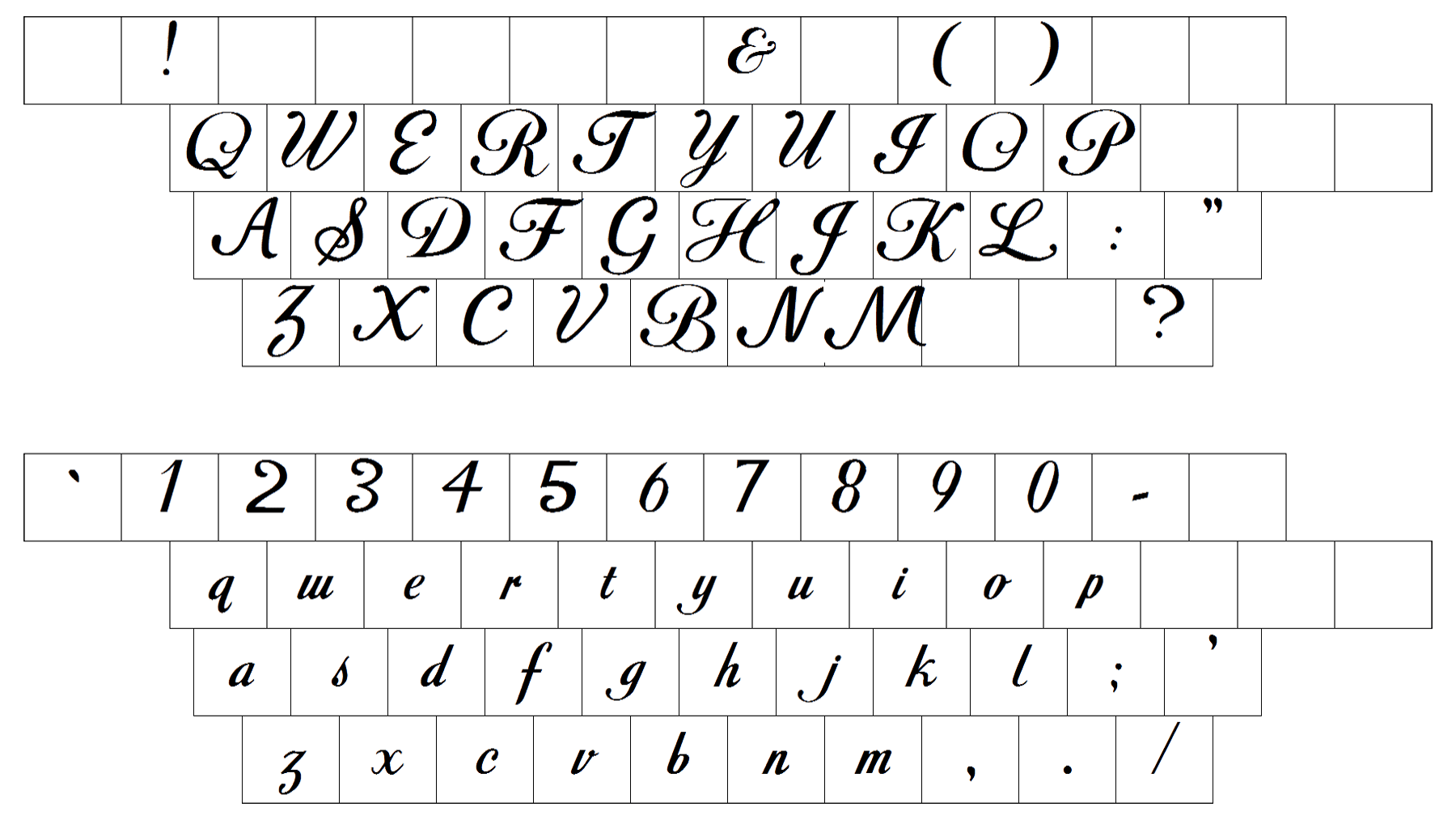
The Paramount wordmark has always sported a “scripty” type, with the “P” character especially swirly. Although the script may appear the same at first glance, in fact it has been tweaked more than once.
Color
![]()
Typically, the logo features a range of colors that coincide with the natural looks of the mountain peak. However, the color palette may vary as the virtual landscape is “shot” in different weather and time of the day.


