

In the vast tapestry of brand imagery, where symbols carve the identity of corporations and whisper the ethos of enterprises to the global audience, water and mountain logos emerge as profound narrators of brand stories. These logos, transcending mere visual appeal, harness the elemental power of water and mountains to evoke deep-seated emotions and universal values. Water, with its fluidity and life-giving essence, combined with the unwavering permanence and towering might of mountains, creates a duality that speaks volumes about a brand’s vision and values. This exploration into the most famous water logos with mountains unveils the intricate dance between these primal elements, revealing how they encapsulate concepts of purity, adventure, and resilience, thereby forging a deep, indelible connection with the audience.
Did you know?
The strategic use of water and mountain imagery in logos dates back centuries, rooted in ancient heraldry and symbolism, where such elements were employed to denote geographical origins, virtues, or the noble lineage of tradesmen and guilds. This historical context underscores the timeless appeal and versatility of these symbols in conveying identity and heritage.
Expanded Exploration of Water and Mountain Logos:
- Infinite Flow and Eternal Peaks: The interplay between the gentle flow of water and the steadfast presence of mountains in logos symbolizes a balance between grace and strength, inviting viewers into a world where brands embody both adaptability and reliability.
- Journey and Destination: These elements combined not only signify the journey towards achieving lofty goals but also the pinnacle of success itself, inspiring both the brand and its consumers to strive for excellence continually.
- Harmony with Nature: By incorporating water and mountains, logos signal a brand’s commitment to environmental stewardship and sustainable practices, resonating with the growing global consciousness towards preserving our natural world.
- Sanctuary and Challenge: They represent the dual nature of life’s journey — water as a source of tranquility and refreshment and mountains as challenges that beckon one to rise above and conquer.
- Myth and Material: Drawing from mythological and cultural associations of water and mountains as places of origin, rebirth, or dwelling of the divine, these logos tap into deep-rooted archetypes, enriching the brand narrative with layers of meaning.
Where water meets mountains, there lies a realm of possibility and promise. In these logos, we find a confluence of human aspiration and the elemental forces of nature, crafting a visual symphony that speaks to our innate desire for purity, strength, and harmony.
As we conclude our deep dive into the realm of the most famous water and mountain logos, it’s clear that these symbols are not chosen at random but are imbued with profound significance. They act as a bridge between the brand and its audience, conveying messages of resilience, purity, and the relentless pursuit of excellence. In a world increasingly drawn towards authenticity and sustainability, logos that embody these elemental forces stand out, offering a beacon of inspiration and a testament to the enduring power of nature in shaping human endeavor and imagination. Through this exploration, we’ve seen how brands leverage these powerful symbols not just to market a product or service but to tell a story, to share a vision, and to invite consumers on a journey that transcends the ordinary, reaching toward the extraordinary.
Why are mountain and water logos perfect for nature and eco-friendly brands?
Mountain and water logos are ideal for nature and eco-friendly brands because they evoke a sense of purity, natural beauty, and sustainability. These elements are often associated with freshness, cleanliness, and the preservation of the environment, aligning perfectly with the values of eco-conscious consumers.
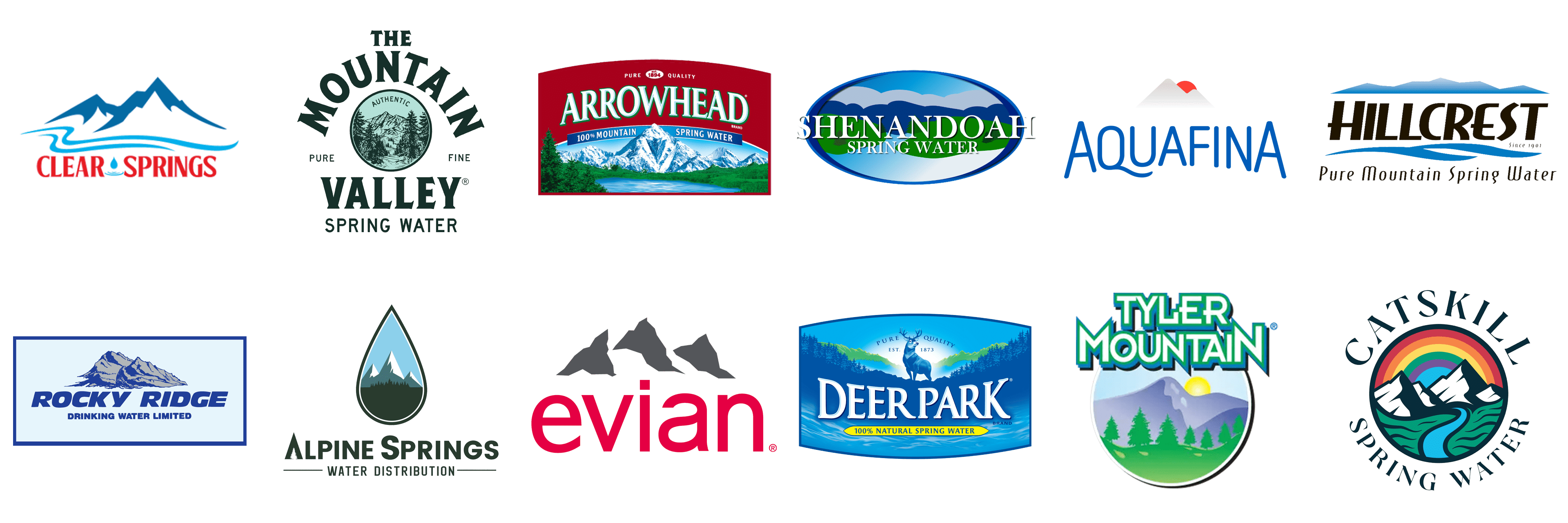
Mountain Valley Spring Water
![]()
Mountain Valley Spring Water, with its heritage deeply rooted in the heart of the Ouachita Mountains of Arkansas, stands as a beacon of purity in the bottled water industry. This esteemed company has been quenching thirsts with its naturally alkaline spring water since the late 19th century, embodying a tradition of natural wellness. The emblem of Mountain Valley Spring Water is a masterful depiction of the lush, verdant mountains that cradle its source, encapsulated within a classic and elegant frame. The use of a serene green color palette not only reflects the natural vitality of the water but also pays homage to the untouched wilderness from which it flows, symbolizing a promise of purity and natural refreshment in every bottle.
Aquafina
![]()
Aquafina, a globally recognized purified water brand under the PepsiCo umbrella, brings an urban twist to the bottled water scene. Renowned for its rigorous purification process, Aquafina promises a crisp, clean taste. The brand’s logo cleverly marries modernity with nature through the incorporation of a sleek, abstract mountain range cradled within a pristine water droplet. The cool blue hues and fluid design elements of the logo mirror the brand’s commitment to purity, clarity, and innovation in hydration, making a bold statement about the transformative journey from source to sip.
Shenandoah
![]()
Shenandoah Spring Water captures the essence of the Virginia’s Shenandoah Valley, an area celebrated for its breathtaking landscapes and natural springs. This brand, perhaps more modest in its reach, prides itself on drawing water from this historically rich and ecologically vibrant region. The Shenandoah logo is a heartfelt tribute to the majestic Blue Ridge Mountains, rendered with an artful simplicity that evokes the tranquil beauty of dawn breaking over the peaks. The logo’s soothing color scheme and gentle curves invite consumers to partake in the pure, life-giving waters, offering a taste of Shenandoah’s untouched wilderness.
Rocky Ridge
![]()
Rocky Ridge delivers an unyielding promise of strength and purity through its name and branding. This water brand, inspired by the stoic beauty of mountainous terrains, offers a product as robust and enduring as the landscapes that inspire it. The Rocky Ridge logo stands out with its bold depiction of craggy peaks, using stark, earthy tones and solid, confident lines to convey a sense of resilience and permanence. This visual identity not only emphasizes the natural origins of the water but also reflects the brand’s commitment to delivering a product that stands the test of time, much like the ancient mountains it venerates.
Catskill Spring Water
![]()
Catskill Spring Water is a testament to the serene beauty and purity of the Catskill Mountains, a region renowned for its pristine water sources and lush, verdant landscapes. This brand draws its lifeblood from the tranquil springs nestled within these mountains, offering a product that is as refreshing as it is pure. The logo of Catskill Spring Water is a delicate portrayal of these mountains, utilizing a palette of soft blues and greens to conjure images of cool, clear waters and the tranquil ambiance of the Catskills. This imagery not only connects the consumer with the source of their water but also encapsulates the essence of Catskill Spring Water: a natural retreat in every sip, inviting a moment of peace and rejuvenation amidst the hustle and bustle of daily life.
Clear Springs
![]()
Clear Springs stands as a beacon of environmental stewardship and purity in the bottled water industry, offering its consumers water that’s as untouched as nature intended. This commitment is visually encapsulated in their logo, which features a pristine and tranquil mountain landscape. The design is deliberately minimalist, using clean lines to convey the simplicity and clarity of their water. This mountain range is not just a symbol of the source’s purity but also represents the brand’s dedication to preserving these untouched natural reserves. The palette of cool blues and crisp whites in the logo mirrors the refreshing and invigorating experience of drinking Clear Springs water, inviting a sense of serenity and purity with every sip.
Tyler Mountain
![]()
Tyler Mountain Water Co. draws its essence from the ancient and unspoiled Appalachian Mountains, embodying a legacy of purity and natural richness. The logo is a tribute to this heritage, featuring meticulously detailed mountain peaks that not only signify the source of its water but also the depth of Tyler Mountain’s commitment to quality. These mountains are rendered with a realism that speaks to the brand’s authenticity and connection to the land. The earthy tones used in the logo evoke a feeling of warmth, reliability, and the comforting promise of water that’s as natural as the terrain it comes from. This visual identity not only marks the brand’s product but also its deep-rooted connection to the Appalachian legacy.
Evian
![]()
Evian, a synonym for luxury in the water world, sources its life-giving mineral water from the heart of the French Alps. The brand’s logo is a masterclass in sophistication, featuring a stylized mountain range that reflects its prestigious Alpine source. This representation is sleek and modern, embodying the brand’s forward-thinking ethos while honoring its rich heritage. The mountains, while minimalistic, are depicted with grace and fluidity, suggesting the natural journey of Evian water through the Alpine rock formations. This logo doesn’t just sell water; it sells an experience of refinement and natural luxury, echoed in the choice of a monochromatic palette that adds to its timeless elegance.
What’s the most recognizable global brand with a mountain water logo?
Evian is arguably the most recognizable global brand that features a mountain and water in its logo, symbolizing the brand’s origin and the purity of its natural spring water sourced from the Alps.
Alpine Springs
![]()
Alpine Springs is a testament to the exhilarating purity of high-altitude water sources, bringing the essence of the Alps to every bottle. The logo is vibrant and full of life, with an illustrated mountain scene that bursts with energy and freshness. These mountains are more than just a backdrop; they’re a promise of the invigorating and crisp taste that Alpine Springs delivers. The dynamic portrayal of the peaks, with their sharp lines and vivid colors, mirrors the lively and pure character of the water. The greens and blues not only reflect the natural scenery of the Alpine region but also symbolize the brand’s commitment to delivering an authentic and refreshing hydration experience.
Ice Mountain
![]()
Ice Mountain is celebrated for its commitment to providing a natural and refreshing hydration experience sourced from protected springs. The logo is a homage to the brand’s namesake, featuring majestic, snow-capped mountains that evoke the purity and refreshing coolness of their water. These mountains are depicted with a degree of realism that invites consumers to connect with the natural origins of Ice Mountain water. The choice of cool, soothing color tones in the logo is deliberate, reinforcing the brand’s identity as a purveyor of crisp, clean water. This imagery doesn’t just represent the source of the water; it’s a visual promise of the fresh, invigorating experience Ice Mountain offers with every bottle.
Deer Park
![]()
Deer Park is an esteemed bottled water brand that prides itself on delivering pure and refreshing water sourced from carefully selected natural springs. With a legacy that spans over a century, Deer Park has established itself as a trusted name in households across the region. Its logo captures the essence of its heritage, featuring a serene landscape dominated by a majestic mountain range in the background, symbolizing the brand’s commitment to natural purity. The foreground of the logo is adorned with a graceful deer, harmonizing with the brand’s name and reinforcing its connection to the pristine wilderness from which its water is sourced.
Hillcrest
![]()
Hillcrest stands out in the bottled water market with its focus on sustainability and providing water of unparalleled taste and quality. The brand is dedicated to eco-friendly practices, sourcing its water from sustainable springs to ensure a minimal environmental footprint. The Hillcrest logo is a testament to the brand’s philosophy, showcasing a stylized depiction of rolling hills and a prominent mountain peak. This imagery conveys the brand’s connection to untouched natural landscapes, emphasizing the purity and freshness of its water. The use of soft, natural colors in the logo further underscores Hillcrest’s commitment to nature and environmental stewardship.
Arrowhead
![]()
Arrowhead is a renowned brand that specializes in offering crisp, clean water drawn from mountain springs located in various regions. Known for its commitment to quality and natural sourcing, Arrowhead has been a popular choice among consumers for generations. The brand’s logo is visually striking, featuring a distinctive mountain silhouette that immediately draws the eye. This mountainous imagery is central to the Arrowhead identity, symbolizing the source of its water and the rugged purity it represents. The logo’s design is clean and straightforward, mirroring the brand’s promise of delivering unadulterated, refreshing water to its customers.
Conclusion
As we draw the final strokes on our canvas exploring the intricate world of logos imbued with the essence of water and mountains, we stand back to admire a landscape rich in symbolism and imbued with profound meaning. These logos, more than mere symbols or visual identifiers, encapsulate the essence of the brands they represent, weaving narratives that speak to the core of human experience—our relentless pursuit of excellence, our deep-seated reverence for the natural world, and our enduring quest for balance and harmony in an ever-changing landscape. This voyage through the realm of the most famous water and mountain logos illuminates the artistry and strategic thought underlying their creation, showcasing how these elemental symbols serve not just as markers of identity but as messengers of deeper brand stories and values.
Enhancing Brand Legacy: The journey into the symbolism of water and mountain logos unravels a tapestry of themes—purity, strength, adventure, and sustainability—each resonating with the universal ethos of resilience and harmony. By adopting these primal elements, brands achieve a timeless connection with their audience, fostering a sense of trust and admiration that transcends the conventional bounds of consumer relationships. These logos stand as testaments to the brands’ legacy, each reflection in the water and each peak in the silhouette serving as a beacon of the brand’s journey and its aspirations.
Sustainability and Ethical Stewardship: In an era where environmental consciousness takes precedence, logos that feature water and mountains carry an added layer of significance. They not only symbolize the brand’s alignment with the forces of nature but also underscore a commitment to ecological responsibility and ethical stewardship of the planet. This message of sustainability resonates strongly with contemporary consumers, who increasingly favor brands that reflect their own values of conservation and respect for the natural environment.
Bridging the Past with the Future: These elemental logos also serve as a bridge, linking the timeless beauty of the natural world with the forward-looking vision of the brands they represent. They are a nod to the heritage and origins of the brand, while also propelling the narrative forward, into the future—a future where brands and consumers alike are partners in the journey towards sustainability, innovation, and the pursuit of excellence.
Cultivating a Deeper Connection: As we conclude, it is clear that the most famous logos featuring water and mountains do much more than identify; they invite, inspire, and engage. They beckon viewers to delve deeper, to discover the stories and values that lie beneath the surface. These logos are a confluence of art and strategy, nature and human creativity, embodying the dualities of our world—strength and serenity, challenge and triumph, innovation and tradition.
Beyond water brands, who else uses mountain and water logos, and for what reason?
Beyond water brands, outdoor and adventure companies, such as Patagonia and The North Face, also use mountain and water logos. These elements symbolize the adventurous spirit and connection to nature that these brands promote, appealing to consumers who love outdoor activities and value environmental conservation.
In closing, the exploration of these logos is a reminder of the power of design to communicate complex narratives and connect with audiences on a profound level. As brands continue to navigate the complexities of the modern marketplace, the lessons drawn from these elemental logos will remain relevant, guiding the way toward creating brand identities that are not only visually striking but rich in meaning and purpose. Through this journey, we’ve seen how the elemental allure of water and mountains can transform a simple logo into a symbol of enduring legacy, a beacon of sustainability, and a bridge to a future where brand and consumer move forward, together, in harmony with the world around them.


