Chrysler is a legendary American car brand, which was established in 1925 and merged with Fiat in 2014. The brand is one of the largest automobile manufacturers in the USA.
Meaning and history
The company, named after its founder, Walter Chrysler, is an icon and one of the “Big Three” of the American automobile industry.
During its history, the brand was a part of the Daimler group, then a completely independent company, and today it is a part of a Fiat Chrysler international group.
The brand’s visual identity is even teacher than the ownership timeline. The Chrysler logo had more than ten redesigns throughout the years.
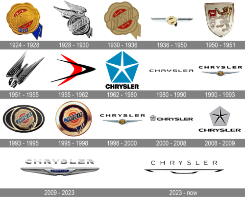
1924 – 1928
The badge, used by the automaker in the middle of the 1920s, was a sleek and elegant seal, with the golden wax-stamp element, where the name of the brand was embossed on the diagonal banner, and two short blue ribbons, coking from behind the stamp in the bottom right corner.
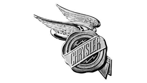
1928 – 1930
The original Chrysler logo was designed by Oliver Clark, who got inspired by the Roman myths. The logo was composed of a wax seal image with two wings, symbolizing speed. The seal was meant to be a quality mark of the Chrysler brand.
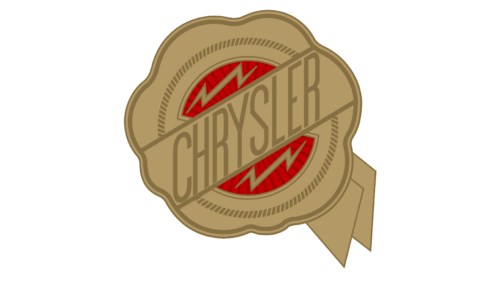
1930 – 1936
In 1930 wings are removed from the logo and now it’s just a seal, that changed its color palette to burgundy and gold. It is a reflection of luxury and quality.
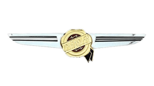
1936 – 1950
The new, more losers and strict wings are now placed on both sides of the seal. They feature silver color with black horizontal stripes.
1950 – 1951
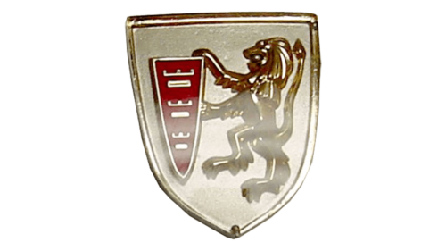
The brand’s logo was dramatically changed in 1950z now it features a black shield with a gold lion rampant holding a red crest. The experiment was pretty short and the emblem stayed with the brand for just one year.
1951 – 1955
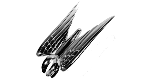
In 1951 the brand design a new emblem — a three-dimensional bird, reflecting speed and progress. It was also a short era, which lasted only for 4 years.
1955 – 1962

The redesign of 1955 introduced a very modern and minimalistic version of the Chrysler badge, with two horizontally-oriented ticks — a long and sharp one in black, overlapping a shorter and wider red one. This interesting geometric logo was used by the automaker for seven years.
1962 – 1980

In 1962 the badge of the car marque was changed again. It was the iconic blue Pentastar, formed by five solid triangles, making up a white five-pointed star with thin and sharp rays in the center. The Pentastar was accompanied by black uppercase lettering, set under it, and executed in a heavy geometric sans-serif typeface with massive characters.
1980 – 1990
In the 1980s Chrysler uses the text-based logo. It is composed of a modern wordmark in all the capital letters, with futuristic confident lines and rounded letters. Both “R”’s of the nameplate are open, which adds individuality to the brand’s visual identity.
1990 – 1993
The winged seal comes back to the Chrysler logo in 1990. The shape of the seal is changed to oval and the wrongs are refined and elongated. The emblem looks sleek and stylish.
1993 – 1995
In 1993 brand decides to give a tribute to its roots and return the original seal logo, slightly modifying the color palette. The nameplate’s ribbon is colored blue now.
1995 – 1998
The shape of the logo was brought back to a circle in 1995. The frame of the roundel became thicker, with the bright gold surfaces getting more gloss than on the previous version. As for all other elements, they remained almost untouched, just slightly refined and strengthened.
1998 – 2000
The redesign of 1998 has put the black and golden Chrysler roundel between two elongated sharp wings in silver, resembling the badge from 1990. The refined and brightened-up emblem was placed under the uppercase logotype in a stylized geometric typeface with heavy extended capital characters, in black.
2000 – 2008
In the 200s Chrysler starts using the Pentastar emblem for its visual identity. It is placed on the left of the wordmark, which gained a new more traditional typeface with bolder lines.
2008 – 2009
In 2008 the Pentastar changes its location and becomes bigger — now it is the central element, which has a nameplate underneath it.
2009 – 2023
The Chrysler logo from 2009 is a chic and elegant interpretation of its winged emblems. The seal is gone, now it is replaced by the blue line with a wordmark on it. The three-dimensional wings have smoother and fuller lines, which look balanced and sophisticated.
The blue and silver palette of the Chrysler logo is a reflection of a professional approach, the brand’s longevity, and stability.
2023 – now
In 2023 Chrysler introduced a new logo, with the modernized emblem from 2009. The new concept is built on a minimalistic approach, with the iconic wings drawn in flat black lines with no central banner on it. As for the logotype, it was also rewritten, and today the uppercase wordmark is set in a medium-weight sans-serif typeface with very futuristic shapes of the characters and some of the contours opened.
Why did Chrysler change their logo?
Chrysler is a company, which is not afraid of experimenting with its visual identity design. The American automaker has had a dozen badges created for it throughout the years. The latest redesign, held by the brand in 2009, was supposed to elevate the look of the company to a new level and to reflect the progressive and modern approach of Chrysler.
What is the Chrysler logo?
The Chrysler badge, designed in 2009, boasts a sleek and recognizable emblem with two elongated smooth wings on the horizontally-stretched composition with a small blue banner in the center. The silver uppercase logotype is written across the blue banner and supported by a larger three-dimensional silver lettering, written above the emblem.
Is Chrysler a luxury?
Chrysler is a famous American automaker, which has a wide range of cars in its portfolio: from simple affordable models to luxury ones. Overall, as a part of FCA (Fiat Chrysler Corporation), Chrysler is considered a luxury brand.
When did the new Chrysler logo come out?
The latest Chrysler badge was created in 2009, and replaced the iconic Pentastar, showing the new style and mood of the company. The smooth sleek wings represent the new approach of the American automaker and show its ability to move and change.


