Established in 1906, Bank of India is a government-owned financial services and banking company. It is headquartered in Bandra Kurla Complex, Mumbai. It is a founder member of SWIFT. Its logo symbolizes the bank’s promise to keep its customers’ money in a safe and protected place, as well as the promise to perform their financial transactions in a safe way.
Meaning and history
Like many companies in its country, Bank of India has a logo where the name of the brand is given in both the official languages, Hindi and English. However, apart from the two-language Bank of India logo, there is also a shorter monolingual version. It has a slightly different structure, which better fits the truncated text.
1906 – present
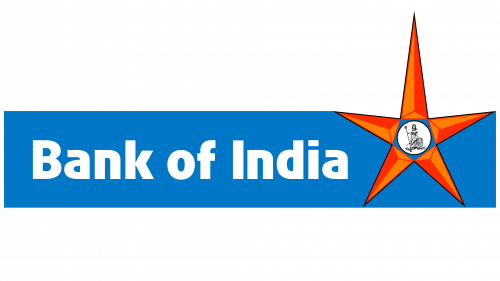
The monolingual logo is featured as the primary one on the company’s website. The majority of the space here is occupied by a rectangle in a rather saturated, yet not overly bright shade of blue.
Inside the box, the name of the company is placed. It is set in a generic sans. The majority of the letters are lowercase, while the initials are capitalized – a rare treat to a grammarian in the era of all-caps logos. Even the regular spaces between the words are in place. On the subliminal level, this approach emphasizes the bank’s strive to be traditional and to abide by the rules.
The brightest accent of the Bank of India logo is the dark orange star on the right-hand side of the logo. While the star can be interpreted in various ways, it’s a universal symbol of something that leads you and makes your life brighter. There is a “divine protection” aspect to it, too. Whichever individual message the company may mean by this symbol, the majority of customers perceive only this superficial level.
Inside the star, there is a rather detailed depiction of a stylized human figure and a lion. The human has long hair and is wearing a sari. More importantly, there is a trident, which is a symbol of power and the ability to protect here.
Behind the figure, there is a lion lying on the ground. The lion has been a key symbol for India. For instance, the country’s State Emblem, which is an adaptation of the ancient statue, the Lion Capital of Ashoka, showcases three lions. This animal is one more symbol of power.
Interestingly, the human figure is drawn in a way that shows that she controls the wild animal as her hand rests on its mane. This symbolizes how the bank’s top executives use their mental and power resources to control and protect the money of the clients.
In the bilingual BOI logo, the blue rectangle is higher – its top goes a little beyond the top point of the star. Also, there is a gradient.
Colors and font
The combination of bright orange with saturated blue is a rather popular one in India and has deep roots in the local culture.
The type is slightly bolder than it is necessary to provide adequate legibility. Bank of India isn’t lonely in this – if you take a closer look at bank logos, you may notice many of them have a tendency to have bolder than average typefaces. This designer choice is highly meaningful, it represents stability and durability.
It is just like in real life. The heavier the object, the more difficult it is to move it. The more stout the object, the more difficult it is to break it. Conversely, more elongated and lighter letters would look more likely to be broken or carried away.
The stability theme in the Bank of India logo also represents the bank’s ability to fulfill its promises through the years in spite of any circumstances.
What is Bank of India
Bank of India has been government-owned since nationalization in 1969. It’s under the ownership of the Ministry of Finance. Of its more than 5,300 branches, over 55 are located outside India (as of 2019).


