Thanks to the careful choice of the colors and the font, the rectangular Coldwell Banker logo represents what the company stands for.
One of the oldest real estate franchises in America Coldwell Banker Real Estate LLC has a wordmark-based logo. The only wordmark in it is the company’s name. As its numerous offices work in 49 countries and territories, it is a must for the company to have its clients remember the brand’s name.
Meaning and history
The Coldwell Banker company was founded in 1906 by Robert Coldwell and Benjamin Banker, who decided to change the real estate market in the United States, offering innovative strategies and high-quality services for its clients.
Today, Coldwell Banker is a global leader in residential real estate in more than 40 countries with 3,000 offices with nearly 105 thousand agents. The offices of the company are located in all the central cities of the world, and the name of the franchise is widely recognized, being a synonym for the real estate services of the highest level.
What is Coldwell Banker?
Coldwell Banker is the name of an American real estate company, which was established in 6, and by today has grown into a global franchise with more than 3 thousand offices in almost 50 countries across the globe.
1974 – 1980

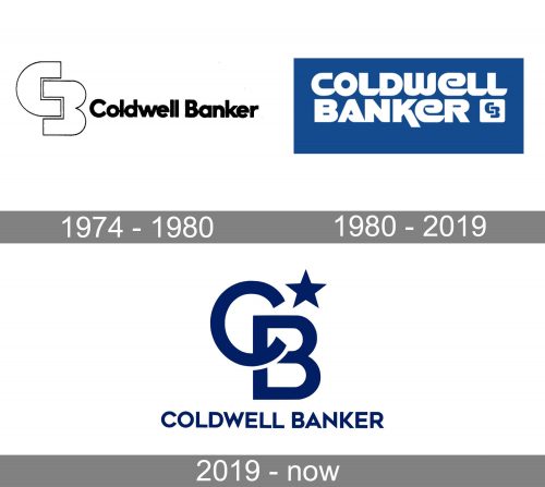
The initial logo for Coldwell Banker was introduced in 1974 and boasted a strict and modest composition of a logotype and a lightweight yet strong emblem placed on its left. The black lettering was executed in an ExtraBold sans-serif typeface with its massive letters placed close to each other, and their contours touching. As for the emblem, it was a stylized outlined “CB” monogram with square cuts of the letters.
1980 – 2019

The redesign of 1980 switched the color palette of the company’s logo to blue and white and made the whole insignia confident and modern. The new concept featured a solid blue horizontally placed rectangle with stylized white lettering in the uppercase. The inscription featured a bold sleek sans-serif font and looked unique and modern. The emblem with the monogram from 1974, was placed under the inscription, with two blue letters set in a solid white square.
2019 – Today

The Coldwell Banker logo consists of a rectangular field and the wordmark “Coldwell Banker” on it. The wordmark is stacked on two lines. The typeface is custom-designed, which ensures recognition and retention in memory. It is soft to some extent and it speaks about dedication to customer service. There is also a small white square with the intersecting blue letters “C” and “B” to the right of the word “Banker”.
Besides the word “Banker”, there are some other features in the Coldwell Banker logo pointing to the fact that it is a financial emblem. First of all, it is the type of the logo itself. Wordmark logos are a popular choice as they work well in this business.
But the most evident feature is the color palette. Its choice was not accidental. Blue inspires maturity and seriousness, the qualities customers expect from such companies. So, the company makes use of this color to tell clients that they are a reliable and straightforward brand.
Font and Color
The clean and distinctive lettering from the primary Coldwell Banker logo is set in the uppercase of a modern sans-serif font with straight cuts and sharp angles. The closest fonts to the one, used in this insignia, are, probably, Avalors Regular, or Geometos Neue Bold, with some minor modifications of the characters’ contours.
As for the color palette of the Coldwell Banker visual identity, it is based on a deep shade of navy blue, which looks strong and stylish on a plain white background. Blue is the color of stability and quality, which also evokes a sense of reliability, confidence, and professionalism.


