SsangYong is Korean brand of the car manufacturer, which was established in 1963 and today is owned by the Indian Mahindra Corporation. The brand was formed through the merger of two Korean companies and was focused on the production of military jeeps at the beginning of its history.
Meaning and history
SsangYong is a famous South Korean automaker, which was established in 1954. The name SsangYong did not appear immediately. Initially, the company was called Ha Dong-hwan Motor Company. After 23 years, the brand changed its name to Dong-A Motor. And only in 1988 the company received its current recognizable name. The word “Ssang” can be translated from Korean as“Couple,” while“Yong” means “Dragon”. Hence, the full name can be translated as “Two Dragons”.
Since 1964, Ha Dong-hwan Motor Co. assembled jeeps for the U.S. Army, in addition, the company produced trucks and buses. Since 1976, the company has been producing various special-purpose vehicles.In 1991, the company begins a partnership with Daimler-Benz Corporation. This allowed the brand to develop the SUV line using the technology of Mercedes-Benz.
Today SsangYong is one of the four largest South Korean automakers, with its production facilities in several Asian countries and Russia.
What is Ssangyong?
Ssangyong is the name of one of the largest and most popular Korean automakers, which was established in the middle of the 1950s and quickly grew into a reputable and powerful company, which operates not only on the Asian market but all over the globe.
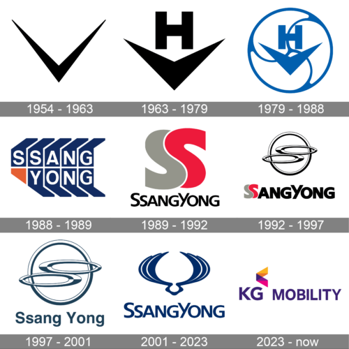
1954 – 1963

The very first logo of the Korean corporation was created at the beginning of the 1950s and featured a very simple and even naive composition with a stylized letter “V” in yellow, drawn on a brown background and underlined with a thin yellow horizontal line. This badge only stayed with the brand for a few years but influenced its following badges a lot.
1963 – 1979

The redesign of the 1963 changes the color palette of the badge to the monochrome one, and strengthened the lines of the “V”, making them bolder and sharper. The thick V-like tick was now placed under the ExtraBold geometric uppercase letter “H” with flat lines and strict distinct angles.
1979 – 1988

The logo from 1979 featured the previous emblem drawn in white and blue color scheme, and placed on the left from the black Korean inscription. The new emblem featured the same two elements, in white and outlined in a circle, placed on a solid blue square. The whole badge was enclosed into a thin gray rectangular frame.
1988 – 1989
The black inscription was strengthened and emboldened in 1988, and in the same year, the emblem was completely changed. The new concept featured the same blue and white color palette, but now it was a geometric blue construction with two levels of white “SsangYong” lettering. The bottom left corner of the emblem had a small yellow triangular on it.
1989 – 1992
The emblem was changed again in 1989. This time it was a stylized double letter “S” in gray and red, with the two parts of it intertwined. The inscription was still executed in black but got its contours emboldened and cleaned up. The new badge stayed with the Korean company for eight years.
1992 – 1997

The badge created in 1992 looked completely different from all the previous badges. It was a thick black and white ring enclosing two horizontally stretched ovals placed one above another and drawn also in black and white. The two flattened rings reminded of an infinity sign and looked elegant and fine.
1997 – 2001

The company updated the logo in 1997. The main change consisted of a more polished and simpler font choice for the name. It still features a sans-serif font, but now the letters are no longer as bold and look significantly smaller compared to the round emblem. The larger spacing between the letters compensates for the smaller font and creates a confident look. The whole emblem is now done in graying blue and white color palette.
2001 – 2023
The name of the brand, SsangYong, means a twin-dragon, and the brand’s visual identity was based on a literate meaning since the very beginning of the brand’s formation.
The SsangYong logo is composed of a wordmark with a memorable and recognizable emblem on its left. The color palette of the brand’s visual identity varies from monochrome to blue on a white background, which is both very traditional and calm combinations, evoking a sense of professionalism and company’s stability.
The SsangYong wordmark is executed in a classic sans-serif-typeface, with two capital letters “S” and “Y” and no space between the two-part of the brand’s name.
The iconic SsangYong emblem depicts a stylized image of two wings, forming an open ring, symbolizing the dragon. It is a symbol of freedom, movement, and growth, which is simple and elegant at the same time.
The SsangYong logo is pretty modest in comparison to other car manufacturer’s visual identity concepts, but it says a lot about the brand and its background.
2023 – now
Although it was already known in 2022 that the company will take the name of its new owners, the logo did not reflect this change until it was officially announced in early 2023. The rebranded logo now says “KG Mobility” as the KG Group now owns the brand. It is printed using a clean, simple font that resembles HelloFont ID Pinocchio Regular but with sharper cuts instead of slightly rounded corners. They use a purple color, which is associated with creativity, devotion, power, and luxury. The inscription is accompanied by a colorful arrow-like shape that is placed above the “G” and reflects that the company has ambitious goals that do not have any limits to creativity.
Font and Color
The bold and stable lettering from the primary SsangYong badge looks pretty friendly due to the slightly softened contours and angles of the heavy capital letters. The closest fonts to the one, used in this insignia, are, probably, LCT Picon Bold, and Resotho SemiBold but with some contours significantly modified.
As for the color palette of the SsangYong visual identity, here the company has chosen to be special and to distinguish itself from the competitors, using an unusual for the industry color — intense blue. This hue stands for reliability and security, at the same time evoking a sense of elegance and precision.


