Smart is an automobile brand from Germany, which was established in 1994 by two famous companies — Swatch and Mercedes-Benz. Today Smart is a part of Daimler and operates in more than 40 countries across the globe.
Meaning and history
The history of the Smart brand dates back to 1994, when Daimler-Benz and the watch company Swatch created Micro Compact Car, or MCC, intending to create an iconic micro car. Swatch developed the unusual design and Mercedes-Benz prepared the technical basis for the future car. The first car of the company was released in 1998.
Later, the Swatch company decided to leave the project, and Micro Compact Car AG was renamed Smart GmbH.The Smart lineup was expanded already in the early 2000s, and the company began to increase its production capacity by opening new plants in Europe.
In March 2019, 50% of the Smart brand was bought by the Chinese automaker, Geely. The plan is to open a plant in China and produce a new generation of cars.
What is Smart?
Smart is the name of a modern automaking brand, which is owned by German Daimler and is famous for its micro and mini cars with luxury tuning and super good technical characteristics. The brand started in 1992, with the three-Dow vehicles and today has several different models in its portfolio.
1998 – 2002

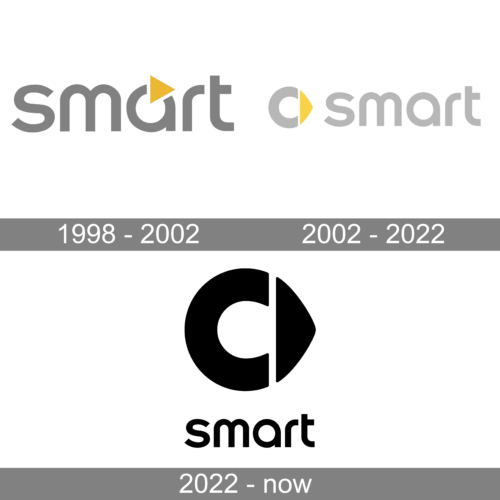
The very first emblem for Smart was introduced in 1998 and stayed with the brand for a little less than four years. It was a smooth and friendly lowercase logotype in light gray, with full rounded contours of the sans-serif letters. There was only one bright element in the composition — a solid yellow triangle placed on the upper border of the letter “A”. The triangle was pointing to the right, looking like the “Play” button.
2002 – 2022
Smart is a design-focused brand, that aims to provide its customers with high-quality small cars, which are eye-catching and unique.
The brand’s visual identity is very modern and laconic. It is composed of a wordmark and an emblem on its left.
The wordmark is executed in the lowercase lettering in a simple gray color of a sans-serif typeface with smooth rounded lines, that are minimalist yet sleek.
The Smart emblem is a three-dimensional figure, consisting of two parts: a cut circle of the letter “C” (stands for “compact”) in silver-gray and a yellow triangle with two curved sides. The figures form some kind of arrow, pointing East, which is a symbol of futuristic and progressive brand’s philosophy.
The color palette of the Smart logo reflects the brand’s creativity and imaginative designs, yet evokes a sense of luxury and sophistication. The earliest version of the Smart logo featured only silver-gray, the yellow color was added not that long ago, but it definitely changes the brand’s visual identity for the better.
Yellow color symbolizes youth and energy, eternal movement and curiosity. It is a perfect color for such a brand as Smart, which is innovative and stylish yet provides a high quality of cars.
The Smart logo is an example of a simple and strong visual identity, which is modern and laconic, keeping the best of the design world in it.
2022 – Today
The color palette of the Smart logo was changed to black-on-white in 2022. The emblem got enlarged and placed above the wordmark, which kept the typeface from the previous version, but got its characters larger. The new minimalistic design of the logo makes the brand look more progressive and cool.
Font and Color
The bold lowercase lettering from the Smart badge is set in a stable and smooth sans-serif typeface, which looks very friendly and fresh, showing the brand’s focus on the young audience. The closest fonts to the one, used in the Smart insignia, are, probably, All Round Gothic Demi, and Arthaus Bold but with minor modifications of the “A”.
As for the color palette of the Smart visual identity, it is set in a combination of light-gray and yellow, which looks surprising and cool. Gray here is a symbol of quality, stability, and professionalism, while yellow makes it all look more energetic and progressive, brilliantly depicting the character and values of the company.


