Studebaker is the name of a former American automotive company, which was established in 1852 and became famous for the production of wagons. Later, the company started manufacturing electric and gasoline cars, and ceased all operations in 1967.
Meaning and history
Studebaker is one of the companies, which had the most influence on the American automotive industry. During its more than a century-long history the brand has had four emblems, which were all perfectly reflecting the epoch and showing the growth and development of Studebaker.
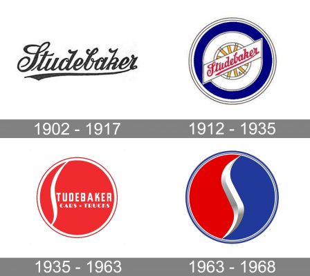
1902 – 1917
The logo, created for Studebaker in 1902, featured a monochrome script nameplate with fancy curved tails of the letters and sharpened end of the underline, coming out from the last “R”. It was an elegant and simple inscription, which was well-balanced and looked stylish and actual.
1912 – 1935
In 1912 another logo was designed for the famous company, and this time it was a colorful circular badge, depicting the essence and purpose of the brand and looking delightful and memorable. The circle was colored blue and outlined in white and black. In the center, there was a smaller circle, in white, with the white and yellow wheel image and a diagonal banner with the red lettering on it. The inscription was set in the same typeface and style as in the version from 1902, though on this badge it was colored red.
1935 – 1963
The circular Studebaker badge got refreshed in 1935, gaining a sleek and modern look with a professional and sharp touch. The color of the new emblem was scarlet-res, and all the additional elements, including framing and lettering, were executed in white. The main accent in the logo was a stylized letter “S”, placed on the left part of the badge and vertically extended, having its smooth bold line touching the white outline of the logo.
The main inscription was set in the uppercase and executed in a modern square sans-serif typeface with thick lines and straight edges. Under the nameplate, there is a “Cars – Trucks” tagline, written in a more elegant font, smaller size, though also in white.
1963 – 1968
The redesign of 1963 simplified the Studebaker logo and placed the lettering under the badge. The color palette was also switched and now the circle featured two parts — red and blue, separated by a three-dimensional silver “S”, which repeated the contours of the letter from the previous version, though was a bit bolder and sharper. The nameplate was set in a title case of a full-shaped sans-serif typeface with all letters connected to each other.
Font and color
The lettering from the last Studebaker emblem was written in a modern and bold sans-serif typeface, which is very similar to Europa Grotesk and Neue Plak fonts, though due to the connected letters and their bold lines, the brand’s inscription looks unique and very stable. Despite the lack of spaces and air in the wordmark, it still looks balanced and clean, making a perfect addition to the minimalist emblem of the company.
The blue, red, and silver color palette of the Studebaker visual identity is a fresh and bright combination, which stands for professionalism, passion, and loyalty, along with such qualities of the company as responsibility and authority. This color scheme makes the badge modern and delightful, creating a great intense image.


