Spyker is a sport-cars manufacturing company, which was established in 1999 in the Netherlands. Specialized on the design and production of exclusive luxury vehicles, Spyker sold around 1000 cars during its relatively short history.
Meaning and history
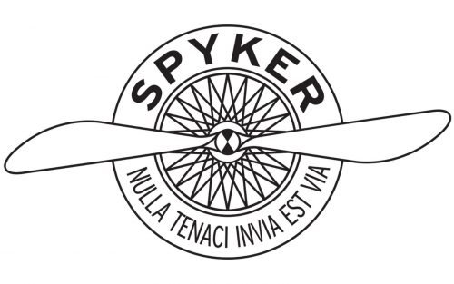
The Dutch company Spyker Cars N.V. was founded by Victor Muller and Martin de Bruijn at the beginning of the 1880s. The logo of the model features an image of a propeller and a car wheel. This is a reflection of the fact that at the very beginning of its history, even before the production of trucks and cars, Spyker was actively involved in the production of aircraft.
During World War I, the demand for expensive cars declined, and as a result, by 1926 the Spyker brand ceased to exist. In 2000, the Spyker C8 Spyder was presented at the auto show in Birmingham, with which an attempt was made to revive the brand. It turned out to be successful.
What is Spyker?
Spyker is a European sports car brand, which was established at the edge of two centuries, in 1999, and became a symbol of a new generation of automobiles. The brand grew from the company, which manufactured engines for airplanes.
1880 – 1926

The very first badge for Spyker was created in 1880 when the company was specialized in the production of airplane engines. Though it had no graphical elements o and images of wings. It was a bold and modern black script-style logotype, executed in thick lines, with smooth angles of the letters and straight flat cuts of the lines. The first uppercase “S” of the logo looked elegant and playful.
1999 – Today
The Spyker visual identity is fully based on the tribute to history, and shows the brand’s roots — it grew up from the aircraft manufacturing company, which was also called Spyker.
The logo of a high-end cats brand is composed of a rounded emblem, depicting an airplane’s engine with its impeller, and the wordmark, placed around the white framing.
The wordmark features the name of the company, located on the top part of the circle, and the motto of the brand “Nulla Tenaci Invia Est Vía” written in laying along the bottom part of the frame’s perimeter.
The Spyker logo is unique and stylish. Its shape and elegant color palette makes it instantly recognizable and always actual.
Font and Color
The Spyker emblem uses two types of sans-serif fonts for its lettering, with traditional contours and clean lines. The upper, “Spyker”, part of the inscription is set in a bold and stable type, which is pretty close to Orqquidea, while the bottom part of the logo comprises a narrowed uppercase lettering in a medium-weight sans-serif font, resembling Sole Sans Extra Condensed Book.
As for the color palette of the Spyker visual identity, everything is very simple — all elements are drawn in plain black, with a white or transparent background. It looks professional and confident, balancing the pretty detailed design of the emblem and the number of lines in it.


