Škoda is a brand of car designing and manufacturing company, that was established in 1895 in the Czech Republic. Since 2000 the brand is a part of the Volkswagen Group and operates in more than 100 countries across the globe.
Meaning and history
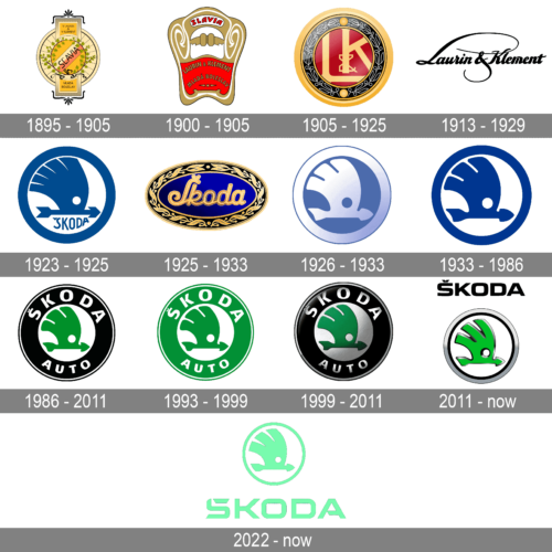
Škoda has a very long and rich history as a company, and its visual identity evolution is a perfect reflection of all the brand’s milestones.
Škoda was founded in 1985 by two cyclists, Vaclav Layton and Vaclav Klement. In the first years, the company Salvia was manufacturing bicycles, then decided to add motors and in 1899 the company was renamed to Laurin & Klement and started producing motorbikes.
The company started trying itself in a car manufacturing and 1925 merged with Pizen Skodovka Co and became a Škoda company, producing vehicles, engines and agricultural machinery.
What is Škoda?
Škoda is the name of one of the oldest European automaking companies, and the most famous modern car manufacturers from the Czech Republic. The brand produced middle-class sedans and city cars, which make good competitors for German brands.
1895 – 1905
The first logo of the company was a celebration of its name, Slavia, in which all capital letters were executed in an elegant fine typeface and placed diagonally inside a wheel.
The circle of the wheel was framed with lime leaves, which symbolizes the Slavic nations. The 1895 logo also featured the names of the company founders.
1900 – 1905
In 1900 a new classy and bright badge for Škoda was created. It was a very elegant and fine gold and red crest with smooth rounded contours and white curves all over the thick golden frame. The central part of the crest featured solid scarlet-red background and an uppercase sans-serif lettering arched in two levels and outlined in thin black.
1905 – 1925
The 1905 logo was composed of the founders’ initials enclosed in a circle with laurel leaves around its perimeter. The color palette was burgundy and gold, which was a symbol of luxury, elegance, and victory. The logo was a part of the brand’s visual identity until 1925, then it was replaced by two options design in the same year.
1913 – 1929
The Skoda logo, designed in 1913, featured a very elegant and sleek black “Laurent & Klement” lettering in a fancy script with elongated and curved lines of the capital “L” and the ampersand, making up an interesting sophisticated ornament in the central part of the badge.
1923 – 1925
The redesign of 1923 introduced the very first version of the iconic Skoda arrow badge, which we still can see today. It was a bold blue image, drawn on a plain white background and enclosed into a thick circular frame in the same shade of blue. The arrow was accompanied by an uppercase “Skoda” lettering in a custom handwritten font, with the letters executed in medium-thick lines of the same calm blue.
1925 – 1933
After the company got its new name, Škoda, one of the options for the new logo was based on the previous design. It was a deep blue oval with gold laurel framing and gold wordmark in an elegant handwritten typeface.
1926 – 1933
In 1926 the badge was replaced by a traditional and elegant plate, which featured a shape of a horizontally-oriented oval: it was a bright blue emblem in a golden frame with floral ornament, and fancy bold lettering in gold, written across the main part of the logo. This badge stayed in use by the company for almost eight years.
1933 – 1986
The more significant design was created in the same year. The five-feathered arrow in blue color, placed inside a blue circle was designed by Tomas Maglic.
It was a stylized drawing of the Indian feather hat and an arrow. The idea of Tomas Maglic was to reflect the company’s look into the future and its continuous movement.
The wordmark in a handwritten typeface was placed inside the circle and under the arrow.
1986 – 2011
After the acquisition of Škoda by Volkswagen, the brand’s logo was redesigned, but the idea remained.
The main change touched the color palette, which was switched from blue to green, to celebrate life, energy, and power. The circle itself was enlarged, to make enough space for a new wordmark “Škoda Auto”.
1993 – 1999
1999 – 2011
In 1999 the Škoda logo became brighter and stronger due to the use of black color in its palette. The contrast of black with green and silver made the logo stand out and celebrated the style and dynamics.
The black color is a symbol of the brand’s traditions and heritage, while green is a representation of the new life and environmentally-centered approach of Škoda.
2011 – Today
The redesign of 2011 made the Škoda logo simplistic and more stylish. It is now composed of a circle with a thin silver outline, with a green iconic symbol placed inside on a white background. The wordmark is located above the circle and features black bold lettering.
What Skoda logo meaning?
The Skoda logo represents a blend of tradition and modernity, encapsulating the brand’s evolution over the years. Originating from the town of Mladá Boleslav in Czechoslovakia, the emblem has undergone several modifications to align with current trends and the brand’s expanding global perspective. The emblem’s recent years have seen it adopt a more streamlined and typographical logo, moving away from intricate designs to embrace a cleaner, more contemporary artistic style. This change signifies Skoda’s commitment to new brand identity, aligning with the automotive industry’s shift towards electrification and digital platforms.
2022 – Today
The redesign of 2022 has introduced a cool minimalistic version of the iconic Skoda badge in a modern color palette. The new Skoda green is much lighter than all the previous hues and looks very futuristic and innovative. As for the logo itself, it is composed of an arrow emblem in a fistulae frame, placed above an enlarged capitalized logotype, wi all the elements drawn in bold flat lines, in one color.
The Emblem
The famous Škoda emblem features an abstract image of a winged arrow, enclosed in a circle. According to the legend, it was created in the 1920s by Tomas Maglic, who got inspired by the portrait of a Native American man.
The arrow in the Škoda logo symbolizes speed and targeted approach, the wings are a celebration of freedom and flight. This is a very meaningful logo for the brand, which values traditional and heritage.
The color palette of the Škoda logo is silver, white and green, which represents the company’s energy, progressive thinking, and stability.
However, before the iconic emblem was created, Škoda had undergone several logo redesigns.
What animal is the Skoda logo?
Contrary to some beliefs, the Skoda logo does not feature an animal but instead showcases a forward-pointing arrow, known as the ‘winged arrow’, encased within a smaller circle and a large circle. This design symbolizes the dynamism of forward motion and the brand’s foresight into progressive manufacturing processes. The arrow’s sleek form and the precision of its design reflect the aesthetic standards and expertise Skoda aims to deliver, resonating with the emblem’s history that traces back to the inspiration from Czech sculptors Otakar Španiel and Otto Gutfreund. The incorporation of elements such as the laurel wreath in earlier versions of the winged arrow pays homage to the brand’s heritage and its longstanding tradition of excellence in the automotive industry.
Font and color
The bold and futuristic logotype of the latest Skoda badge, set in a custom sans-serif typeface, showcases intriguing details and a notable symmetry that speaks to the precision of Škoda’s design. This logotype, echoing the brand’s commitment to innovation and technological advancement, integrates elements of its rich heritage, including a nod to the L&K monogram, in recognition of founders Laurin and Klement, and subtle references to the Slavia logo. The design introduces a distinctive twist with diagonal stencils in the first and last letters of the brand name, enhancing its visibility and making it a memorable emblem of Škoda’s innovative approach. The closest fonts to the one used, such as Langith Regular and Aspire SmallCaps, are modified with unique elements that tie the design closely to Škoda’s rich legacy, further enriched by the integration of modern features like SVG and AI formats for better digital adaptability.
Regarding the color palette of Škoda’s visual identity, it has remained green-centric since the mid-1980s. However, the latest badge incarnation introduces an emerald shade that signifies a new era for Škoda, reflecting its journey towards environmental sustainability and its ambition to redefine mobility through electromobility. This shift in design and color not only highlights Škoda’s commitment to progress and adaptation to the needs of a global clientele, extending its reach to markets in Germany, Norway, and Italy, but also underscores its status as a preferred choice among consumers. This modern, sleek green look, coupled with the company’s focus on precise manufacturing and innovation, encapsulates Škoda’s ongoing dedication to meeting the evolving preferences of its clients, thereby reinforcing its iconic status in the automotive industry.


