

Below, there’re two rankings: one for Minor League Baseball teams, the other for Major League Baseball teams.
We’ve started with the Minor League, and for a reason. Major League teams often have to stick to traditional logos, so their brand identities may lack freshness and look somewhat old-fashioned. Can you imagine a team called the Isotopes or the Sky Sox here?
Technically speaking, the status of Minor League teams is lower. And yet, the logos themselves can look more professional than those of Major League teams. That’s because Minor League teams are free to update their brand identity and therefore have a chance to develop an impressive one. Also, they are more open to experiment, which is also a good thing when it comes to logos.
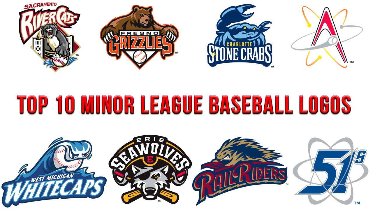
Top 10 Minor League Baseball logos
10. Trenton Thunder
![]()
Almost in any league, in any sports, you can see at least one logo alluding to the power of lightning. In the Minor League Baseball, these teams are the Trenton Thunder and the Omaha Storm Chasers. The Trenton Thunder logo has a stronger impact as at least it features a living creature. The Storm Chasers Logo is more refined in its palette, though.
9. Las Vegas Aviators
![]()
An aviator for a mascot? Why not?!
In comparison with the gloomy alien of the same team’s previous logo, the aviator looks brighter, more in control, more powerful, and less funny. Similar to the Las Vegas 51 logo, this one shows a link with Las Vegas (in the form of the US military base known as Area 51).
8. Richmond Flying Squirrels
![]()
A unique take on the superhero theme, the Richmond Flying Squirrels logo is bright and highly memorable. A touch of cartoonish friendliness isn’t that bad for a Minor League team. Anyway, it’s not just about rivalry and competition, but also about families visiting matches with small kids.
On the downside, the squirrel seems scared rather than scary.
7. Scranton/Wilkes-Barre RailRiders
![]()
There’s something in the color scheme making the image less impressive than it could have been. Other than that, the logo is fantastic. A fictional creature, RailRider, is moving at an incredible speed and has teeth.
6. Erie SeaWolves
![]()
While the pirate and wolf are among the most widely used design themes, they don’t look utterly generic here. The designer seems to have paid enough attention to every detail, from the handles of the saber-bats to the letters of the script. As a result, the logo has mood and style.
5. West Michigan Whitecaps
![]()
The choice of mascot is fresh and unusual. There’s a lot of implied motion in the picture, and the white cap is “holding” a ball.
4. Albuquerque Isotopes
![]()
The thing on the surface is that this one is all about speed and motion. Unlike many other logos, the Isotopes emblem implies many participants (as there’re many neutrons depicted here).
And what about the power of the atom? It’s far greater than that of any living creature. On the conscious level, each of us is aware that nuclear power can destroy the total earth landmass. However, the more primordial parts of our brains can’t fully realize this fact, so for them, an atom is less scary than the grizzly or wild cat from the logos seen at the top of this ranking.
3. Charlotte Stone Crabs
![]()
While crabs can crawl surprisingly fast, the one on the Charlotte Stone Crabs logo seems rather static. However, there’s some game-related tension as the crab’s posture shows that he’s ready to catch the ball.
Also, a crab is quite an unusual mascot, and it wasn’t that easy to depict it in a serious, not cartoonish and funny manner.
The logo gives several graceful hints as to what the team’s parent club is. To begin with, the Stone Crabs logo features the same palette as that of the Tampa Bay Rays from Major League Baseball. Also, you can see the same yellow and white star, while the choice of the marine theme only reinforces the subtle metaphorical connection with the logo of the parent team.
2. Fresno Grizzlies
![]()
While this logo is less dynamic than that of the Sacramento River Cats, it is more “powerful.” The grizzly doesn’t have the wild stare of the river cat – his muzzle shows just slight disapproval. And yet, taking into consideration the creature’s size, his disapproval can be more dangerous than the fury of the wild cat.
Bright orange brings some vividness to the brown and black color scheme. The letters seem to have sharp “claws” like the grizzly himself.
1. Sacramento River Cats
![]()
It’s not a kitty sleeping by the fire. This one is wild. It likes showing its sharp teeth and claws. On the logo, the river cat is depicted in the middle of the game. Holding a baseball in his paw, it’s just about to score a goal, while his ferocious stare scares off anyone who could stand on his way. You can feel the dynamism and sharpness of this logo even in the way the team name is scripted.
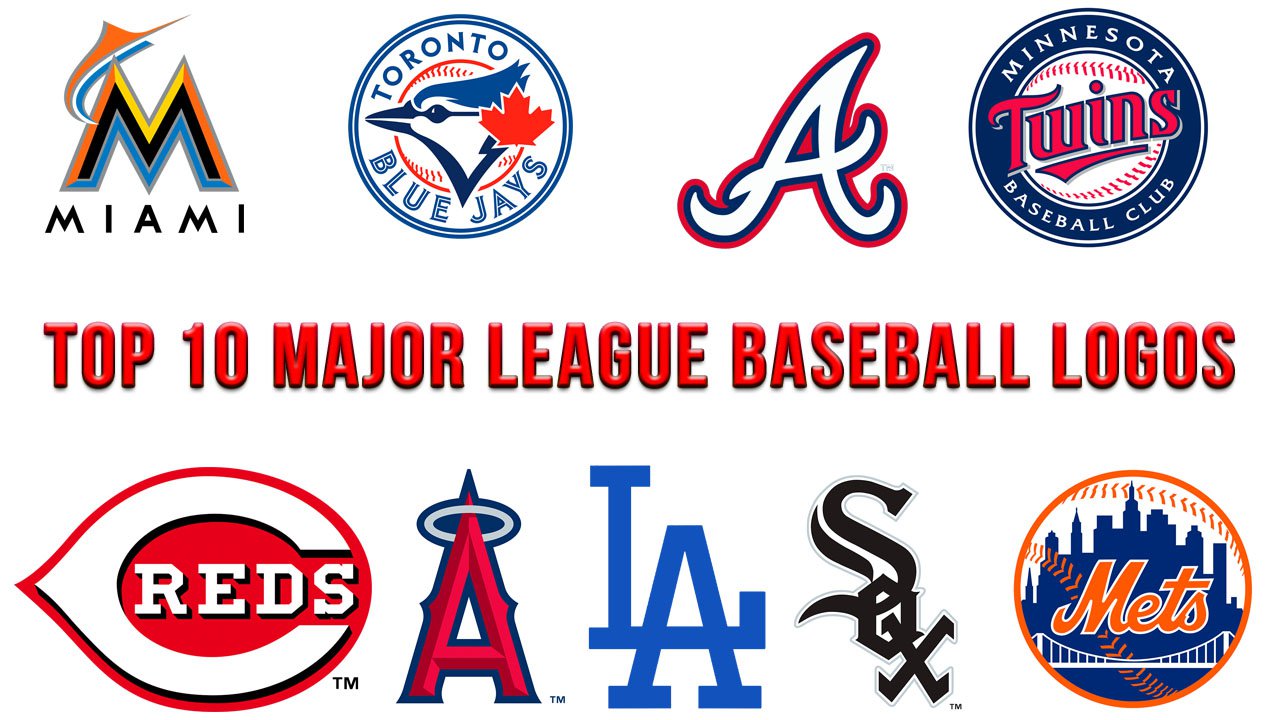
Top 10 Major League Baseball logos
10. Los Angeles Dodgers
![]()
The baseball in flight and the script imply motion and speed. And yet, don’t you think the baseball and its traces resemble a shower? Isn’t the script old-fashioned and generic?
9. New York Mets
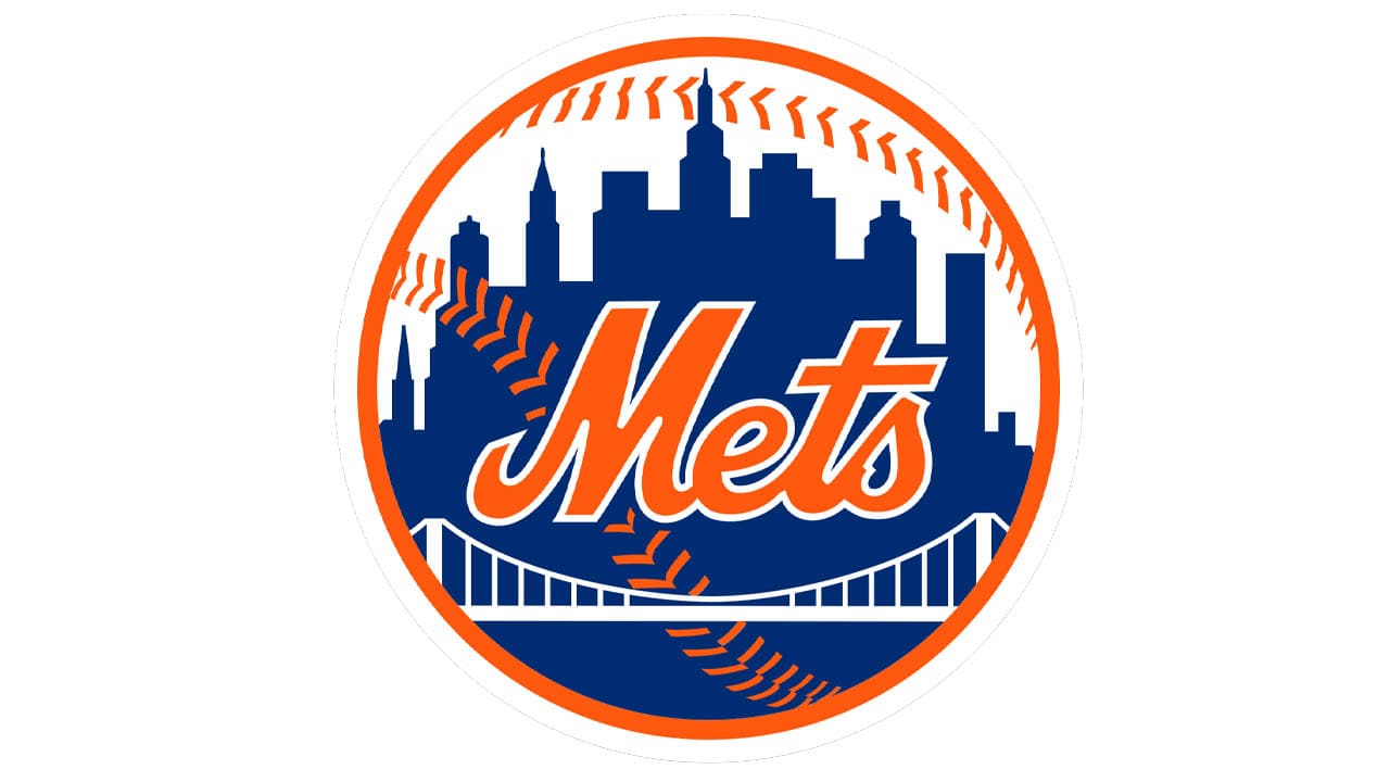
The orange looks bright and unique in combination with the blue. The skyline leaves no doubt as to the city the team is located at. And yet, there seem to be too many details for a strong logo. While the bridge attempts to create a visual rhyme with the seams on the baseball, this rhyme is weak and somewhat inconsistent. The font doesn’t appear to fit the image in any way. The overall impression is the logo is cluttered.
8. Los Angeles Angels
![]()
The halo around the “A” makes the letter recognizable and moves it a bit forward from a simple monogram logo. In addition to this, it’s not just a decorative element but a graphic symbol creating a link with the City of Angels.
7. Chicago White Sox
![]()
Sex sell. So, if you write the word “Sox” in a way that the “o” looks like an “e,” the insignia will sell, too. Pretty obvious and pretty effective. And, also, too direct for a really good logo.
6. Cincinnati Reds
![]()
The white “C” is highly recognizable and symbolic. In addition to representing the initial letter of the word “Cincinnati,” the glyph looks very distinctive. It conjures up the idea of motion and may even look like a bow and arrow.
5. Minnesota Twins
![]()
The unique typeface is the highlight of the Minnesota Twins logo. The parallel lines of the letters “w,” “i,” and “n” in the word “Twins” create a visual rhyme with the red seams of the ball. You can notice the implied motion and elegance of the “T” and red underline.
There are several other roundel logos within the Major League Baseball, including Texas Rangers, New York Mets, and Washington Nationals. In comparison with them, the Minnesota Twins emblem looks more professional, primarily due to the type and shades.
On the downside, this one looks a bit like a beer bottle label.
4. Atlanta Braves
![]()
One of the main pros of the Atlanta Braves logo is that it’s exceptionally distinctive. If you analyze many sports logos, you will notice quite a few recurrent motifs, including balls, specific living creatures (bears, tigers, bulls, birds). You will see hundreds of roundel logos or monograms. But you’ll hardly find a lot of prehistoric hammers.
Also, this logo is good at demonstrating power – each of us carry the genes of people who saw, experienced, and used the deadly power of this primitive weapon.
That’s why we can overlook the fact that the Braves logo is too static and doesn’t show any link with baseball.
3. New York Yankees cap insignia
![]()
That’s the only time we place a cap insignia in this ranking. The Yankees cap insignia and its history are legendary without being old-fashioned. It’s astonishing how a contemporary-looking logo can have such a heritage
The Yankees primary logo doesn’t hold the candle to the cap insignia. The main emblem is quite decent, yet it appears there’s too much going on here.
2. Toronto Blue Jays
![]()
While the peaceful-looking bird lacks the wild character and aggressiveness of a perfect sports mascot, it looks very stylish and graceful. The baseball seams and the red leaf here don’t spoil the overall image. The tiny serifs on the letters echo the shape of the bird’s tuft. The colors are clear and saturated without being too bright.
1. Miami Marlins
![]()
The marlin’s ability to move extremely fast and its spear-like snout make it a decent mascot. Anyway, the fact that there’s a living creature and it’s not just a peaceful bird could be enough to put the Miami Marlins logo on the first place within the Major League Baseball.
There are other pros, too. The typeface fits the curves and angles of the marlin perfectly. This is especially obvious on the “M” with its ends imitating the fins. The rounded shape of the “a” and the “i’s” were inspired by the softer curves of the fish’s body. The red elements represent the seams of a baseball and water splashes. The choice of the marine theme also seems appropriate for a Miami-based team.


