

The fact that we live in a consumer age can be considered luck or vice versa, but one thing is certain: we have a lot of choices. Thousands of companies and brands are competing for our attention, coming up with new ways to attract customers. One of the most powerful ways is visual identity. And here the imagination of designers has no limits. Some brands use understated minimalistic logos, while others compete in brightness and abundance of graphic elements.
In our today’s article, we’re going to look at logos in which the main element is the face. After all, no matter how you look at it, the image of a person (especially a satisfied and smiling one) causes axial confidence in the consumer.
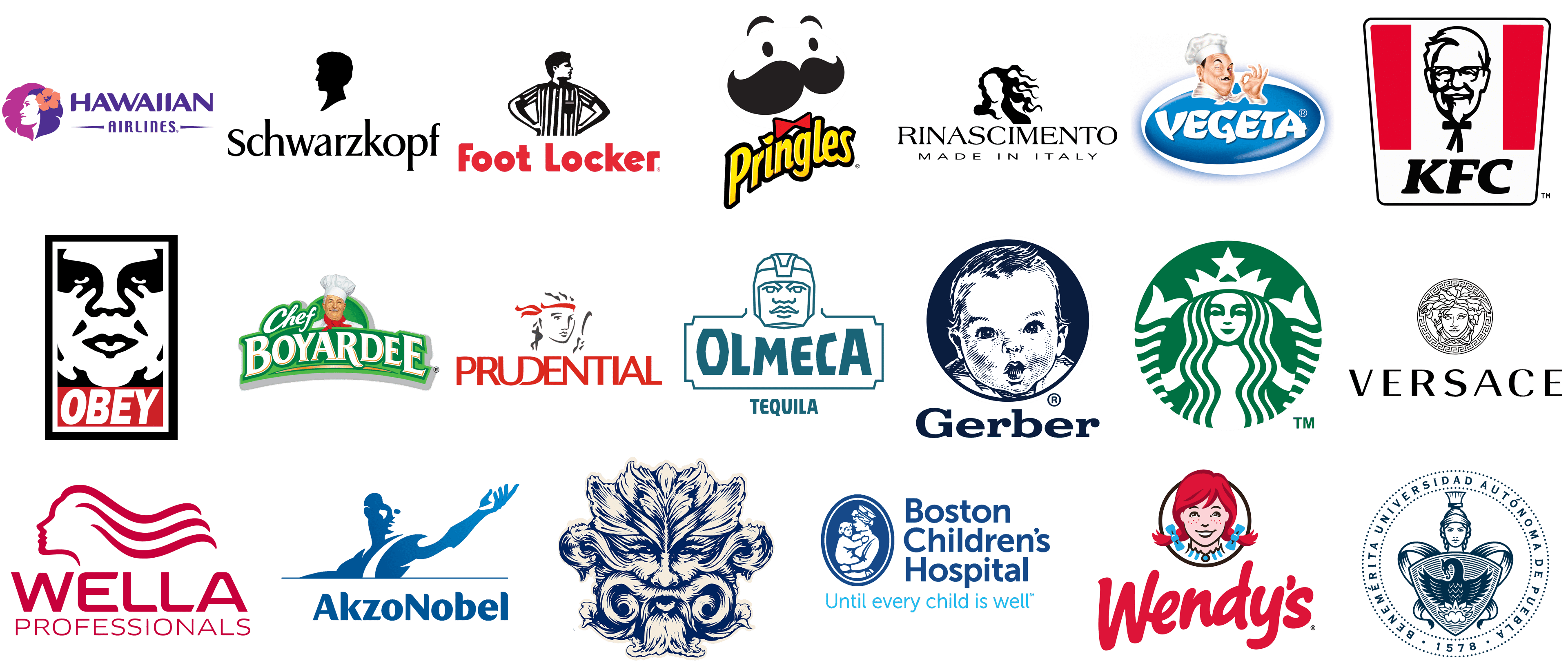
Let’s take a look at the most popular emblems with the image of a face, executed in different styles and color schemes. All brands in the list are arranged in alphabetical order.
AkzoNobel
![]()
AkzoNobel is a European paints and coatings manufacturer, which has its products distributed all over the globe, and its logo is recognizable on all continents. The badge of the Dutch company is executed in a blue and white color palette, which looks very confident and stylish. The logo is composed of an image of a person, placed ¾ above the bold title case inscription in a smooth modern sans-serif typeface. The man on the AkzoNobel badge is drawn in thick solid lines, featuring gradient blue shades, getting lighter from left to right, from the head to the tips of the fingers.
Boston Children’s Hospital
![]()
Boston Children’s Hospital has a very elegant and traditional badge, with a nurse holding a baby in her hands. The image is drawn in white on a solid blue medallion, which features a shape of a vertically-oriented oval in a double blue and white outline. The medallion is accompanied by a three-leveled logotype in a simple and clean sans-serif typeface in the same shade of blue, as the background of the over, and complemented by a lightweight “Until Every Child is Well” tagline in sky-blue. The badge evokes a sense of love and caress, perfectly reflecting the main aims and values of the hospital.
BUAP
![]()
BUAP is an abbreviation standing for Benemerita Universidad Autonoma de Pueblo, one of the universities in Mexico. The educational institution has a very elegant and sleek badge, drawn in a traditional heraldic manner, but with contemporary confidence. The badge features an image of a woman in a Roman helmet, and with a massive shield, placed under her head and covering the upper body. The image is drawn in medium-thick lines in the calm and dark shade of blue, against a white background, and enclosed into a blue circular frame with the name of the university written around its perimeter.
Chef Boyardee
![]()
Chef Boyardee is a popular brand of food products, which are distributed all over the globe, hence its bright and friendly logo is known by people from different countries. The badge of the brand boasts a colorful and detailed image of a chef in a white uniform. The man has a smiling face with a gray mustache evoking a sense of friendliness and kindness. The white uniform of the chef is decorated with a bright red scarf. The portrait is placed on a gradient green background, accompanied by enlarged white lettering, with the “Chef” in cursive title case, and the “Boyardee” in the uppercase of an elegant font with sharp serifs.
Foot Locker
![]()
Foot Locker is another brand, that uses an image of a person in its badge. The company, engaged in the online sales of footwear and sports apparel, has its logo executed in a black, white and red color palette, with the bold red inscription in a modern sans-serif typeface, accompanied by a monochrome emblem, with the man in a striped shirt standing above. The man has his arms at his sides, making up two triangles, and the head is turned to the right like he is looking into the future, representing the progressive approach of the company, and showing its energy in moving forward. The black and white shirt of the man resembles a referee uniform, pointing to the sports orientation of the e-commerce platform.
Gerber
![]()
Gerber is a famous brand of food products for the little ones, and its logo, created decades ago, has become synonymous with high-quality baby foods. The badge of the brand, executed in a dark-blue and white color palette, is composed of a circular medallion with a portrait of a baby, drawn in white and blue, accompanied by a smooth extended logotype in the title case of an elegant serif typeface. The portrait on the Gerber badge was created by Dorothy Hope Smith, an American artist, in 1931, and since then has never left the visual identity of the brand.
Hawaiian Airlines
![]()
Hawaiian Airlines has a face image on its logo too, but in the case of the air carrier, the face is drawn in a bolder and more modern way. It is inscribed into an emblem, which features a shape of a leaf, taking its right half, and being executed in white. The woman is drawn in profile, with her dark purple hair decorated by a large red flower, a symbol of Hawaii. The emblem is accompanied by two-leveled lettering, with the enlarged bold “Hawaiian” in a smooth modern sans-serif font, written above the “Airlines” in small capitals, with the contours of the letters slightly narrowed. The bottom line of the logotype is enclosed between two sharp horizontal lines on the sides.
KFC
![]()
KFC, an American fast-food chain, is probably the bearer of the world’s most recognizable logo with a face. The logo of the restaurant boasts a contoured portrait of Colonel Harland Sanders, the founder of the company. His face has been placed on the logo of the chain for decades, being slightly modified from redesign to redesign, but keeping its friendly smile. The latest badge of KFC is drawn as a trapezoidal crest with softened angles, with the white background accompanied by two solid red elements on the sides, the black contoured portrait of the colonel in the center, and the bold black “KFC” lettering in a slanted serif typeface.
OBEY
![]()
OBEY is a brand of casual streetwear and accessories, which is loved by young people from all over the world for its boldness and recognizable style. The contoured face from the logo of the brand is based on the artwork of a famous graffiti artist Shepard Fairley. His sticker, which was designed at the end of the 1980s, with a depiction of the French wrestler and actor André René Roussimoff known under the nickname André the Giant, is what has become an essential part of the OBEY visual identity. Drawn in bold black lines over a white background, the image is enclosed into a vertically-oriented black rectangular frame, and accompanied by a solid red horizontal banner with white sans-serif lettering, placed under it.
Olmeca
![]()
Olmeca is one of the most famous brands of tequila. The Mexican label has its roots and background reflected in the cool and strong logo. The badge of an Olmeca is composed of a contoured portrait of an Aztec warrior, placed on the top of a horizontally-oriented rectangular banner with square corners cut out. The banner has bold uppercase lettering written across it in the same dark-turquoise color as the portrait and the framing of the wordmark. The whole badge is underlined by a narrowed “Tequila” in small capitals of a bold sans-serif font. The badge looks very modern and powerful, even though uses traditional elements.
Pringles
![]()
Pringles is a brand of chips, which is known for the cool shape of its packaging and the chips too. The visual identity of the label is composed of a drawing of a mustache man, executed in an abstract schematic way, with the solid white circle decorated by two solid black dots with two arches above them, and an enlarged, even exaggerated black mustache. The emblem is underlined by a red bow-tie, which is placed directly above the letters “N” and “G” of a bold and elegant “Pringles” logotype, executed in a smooth sans-serif, with the yellow letters in a bold black outline.
Prudential
![]()
Prudential is a very loud name in the finance and insurance segment. The American company, established in the 1970s, is one of the world’s largest businesses, with its place on the Global Fortune 500 list. The visual identity of Prudential is executed in a modest and elegant gray and red color palette, with a contoured portrait of Prudence, a female depiction of virtue. The portrait is drawn in smooth gray lines against a white background, with her hair decorated with a red scarf. The shade of the scarf is supported by the bold stylized logotype, written under the emblem in a custom sans-serif font.
Rinascimento
![]()
The visual identity of the Italian brand Rinascimento has an image of a woman without a face. It is drawn in black lines over a white background, with the long waving hair of the lady making up the contour of her face, but with no details on it. The image is placed above the elegant serif lettering in uppercase, underlined by the “Made in Italy” inscription in an extended sans-serif font. All the elements in the logo are set in black, which makes the whole badge timeless and elegant, and perfectly reflects the essence and character of the brand, showing a woman as the main value, and the desire to make every woman beautiful — as the main target.
Schwarzkopf
![]()
Schwarzkopf, a brand of hair care products, has its name translated from German as “The black head”. So the literal translation of the name is what is depicted on the logo of the brand. The head of a man is drawn in profile, turned to the left, and resembles vintage medallions, featuring classic contours of the face, and the line of the neck. The profile is set in solid black, against a white background, and placed above the name of the brand, written in the title case of an elegant sans-serif typeface, also in black. The badge of Schwarzkopf looks timeless and sophisticated, reflecting both the essence and purpose of the brand and its professionalism.
Starbucks
![]()
Starbucks is definitely the most popular coffee spot brand in the world. The logo of the company features a depiction of a mythological creature, a mermaid, which is drawn in bold white lines over a solid green background in a circular shape. The solid white face of the mermaid is decorated by green lines making up the eyes, the nose, and the mouth of the lady, and her long wavy hair, executed in clean smooth lines supported by the stripes on two fish tails, which arch up on the sides of the green medallion. The logo looks unique and bright due to the proper color palette and interesting lines of the image.
Vegeta
![]()
Vegeta is a Bosnian brand of condiment, which was founded at the end of the 1950s, and is still very popular in Eastern Europe and Russia. The logo of the brand somehow resembles the badge of Chef Boyardee but is executed in a blue and white color palette. It is a horizontally-oriented oval in gradient blue, with a thick white frame and an extra-bold uppercase logotype in a custom typeface. The oval is decorated by a portrait of a chef, who is wearing a white uniform and has its black thin mustache elegantly curved on the ends. The man looks chic and fancy and is placed on the badge like a quality seal.
Versace
![]()
Versace is an iconic fashion brand, which has been on top of the industry for decades. The visual identity of the brand is recognizable all over the globe, and the famous Medusa from the Versace medallion has become an essential element of the brand’s history. The logo of composed of a contoured circular medallion with a depiction of the head of Medusa, a mythological creature, known for her ability to make people fall in love with her. The image is executed in thin black lines and enclosed into a wide frame with the iconic Versace ornament. The emblem is accompanied by a bold uppercase logotype in a modern sans-serif typeface, with stable clean letters placed at a pretty significant distance from each other.
Wella
![]()
Wella is a popular brand of hair care products, which are used by professional hair salons all over the globe. The visual identity of the brand perfectly represents the porpoise of its products — taking care of the customers’ hair and making them beautiful. The badge is composed of a graphical emblem, depicting a woman in profile, drawn in one line, with long hair waving to the right. The emblem is accompanied by the two-leveled lettering in the same shade of red, with the bold smooth “Wella” written above a lightweight uppercase “Professionals” in a simple yet modern sans-serif typeface, with lots of air in it.
Wendy’s
![]()
Wendy’s is the third-largest chain of fast-food restaurants in the United States. The company’s burgers are considered to be one of the best, and the logo of the chain has already become iconic by today. The fun and colorful Wendy’s badge is based on the drawing of Melinda-Lou ‘Wendy’ Thomas, daughter of the chain’s founder, Dave Thomas. It was created at the end of the 1960s and has barely changed since then. The emblem depicts a portrait of a young red-hair girl with two braids decorated with light-blue ribbons. The color of the ribbons is supported by a white and blue striped collar of the girl’s dress. The image is set against a white background and enclosed into a thin black circular frame, placed above a bold red logotype, written in a rounded cursive sans-serif typeface.
Whistling Straits
![]()
Whistling Straits is the name of a luxury gold resort in Wisconsin, USA. The visual identity of the resort looks super elegant and chic, with the stylized face of a mythological creature drawn in thin blue and light-yellow lines, making up leafy ornament and swirls, which form the traits of the face. The image is associated with wind and its whistle, perfectly representing the name of the resort. The fantasy image is a designer’s vision of the God of the Wind, powerful and determined. The emblem is most often used on its own but sometimes is accompanied by the lettering in the uppercase of an elegant serif typeface.


