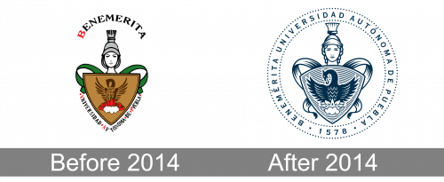
BUAP is an abbreviation, standing for one of the largest Mexican universities, the Benemérita Universidad Autónoma de Puebla, named after the city of its foundation, Puebla, and established at the end of the 1970s. The university is sponsored by the government but makes its own decisions on all the programs (both educational and sports ones).
Meaning and history
One of the oldest and largest universities of Mexico values knowledge above all. Based on traditional educational organizations’ values, BUAP has its motto translated into English as “To think well to live better”, and its visual identity fully supports it. There was only one major redesign of the BUAP logo, held in 2014, and it didn’t touch the main idea and symbols, created for the University at its establishment.
Before 2014
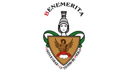
The original BUAP logo was introduced shortly after the establishment of the university and stayed as a primary version UO to 2014. It was a colorful emblem, composed of a classy gradient yellow shield in a thick black outline with a black image of a Phoenix bird, coming out of the red flame above the shield there was a monochrome portrait of Athena, the Greek goddess, who symbolizes wisdom and knowledge. The lettering was set above the goddess’s head, and under the crest, written in bold capitals of an elegant serif typeface, in black and red.
After 2014
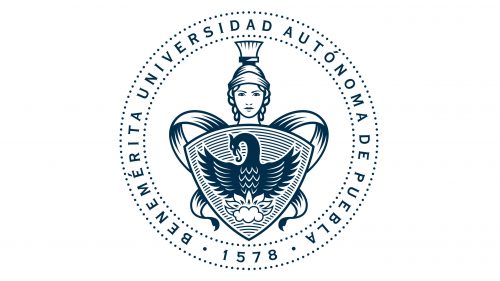
The redesign was of 2014 simplified the color palette of the BUAP logo to black and white, yet complicated the composition and made it more modern and strong. All the main elements of the logo remained in their places but were redrawn with more details and emboldened lines. The lettering was removed from the white background and placed into the circular framing of the new badge, switching its typeface to a clean and modern sans-serif. As for the framing itself, it was formed by solid black dots from both inside and outside.


