Foot Locker is the name of the American footwear retailers which was established in 1974 and today has more than 3 thousand stores not only across North America but worldwide. The company, specialized in footwear and sportswear retail also successfully operates through its online platform.
Meaning and history
The visual identity of the world’s famous sports clothing and footwear retailer is cool and instantly recognizable across the globe. Based on an image, it got the current style designed in the 1980s and was only slightly modified by today.
However for the first 14 years of its existence, the retail company has been using a completely different logo, which can hardly be associated with the current one, but one thing remained untouched — the typeface of the nameplate.
What is Foot Locker?
Foot Locker is the name of a footwear retail company, which was established in the United States in the middle of 1970, and by today has grown into one of the most reputable brands in its segment, with thousands of stores across the country, and an online store with international delivery.
1974 – 1988
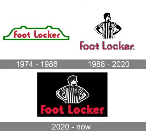
The very first logo for Foot looker was composed of a smooth and bold sans-serif wordmark in red, which was placed on a white background and enclosed in a thick green frame. It was simple and not very unique to be instantly recognizable. Though the inscription style looked solid and bright and it was decided to keep it for the next visual identity generation.
1988 – 2020
The redesign of 1988 brought a graphical emblem to the Foot Locker logo, and it made it iconic. The image depicted a football coach in a striped black and white shirt, with his head, turned to the right.
The coach himself was also executed in black and white and placed on a white backs ground with the red wordmark under it.
2020 – Today
The company decides to redesign its logo again in 2020. It is more about minor changes, such as refined contours and some lines simplified. The most significant change was done to the color palette — the white background is now black, and the black contour of the image turned white. This is what made the whole image look more powerful and professional, staying at the same time recognizable and contemporary.
The black, white, and red color palette of the Foot Locker logo is a representation of the strength, quality, and professional approach of the company, which is known and trusted all over the globe.
Font and color
The bold and modern lettering from the Foot Locker official badge is set in a heavy softened sans-serif typeface with the title case letters executed in thick bars with straight cuts of the ends. The closest fonts to the one, used in this insignia are, probably, Intervogue Alt Ultra and Cocomat Pro Heavy, but with some contours slightly modified.
As for the color palette of the Foot Locker visual identity, it is set in a traditional elegant combination of black, white, and red. This timeless palette represents the company as a reliable and professional one and makes its logo look confident and stylish on any background.


