The Pringles logo has had a long history. It has gone through several modifications, but it has always featured the mascot Mr. Pringle and the name of the product.
Meaning and history
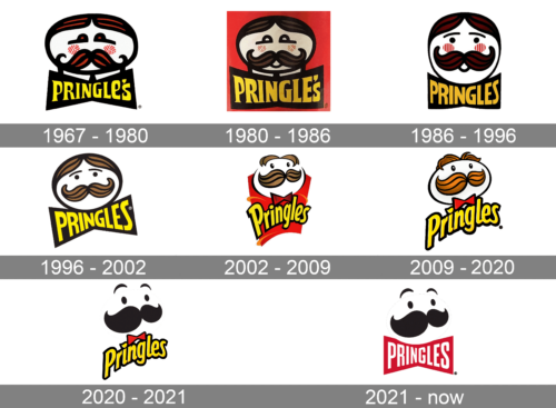
The visual identity of Pringles hasn’t changed much since the beginning of the brand, established in 1967 as Pringle’s. The iconic mustache man has stayed with the famous chips throughout the years, being only slightly redesigned and stylized by now.
What is Pringles?
Pringles is the name of a food brand, which was established in the United States in 1968. The brand is known for its potato chips in cylindrical packages. Pringles is owned by the American Kellogg’s and has its chips distributed all over the globe.
1967 – 1980
The original logo was composed of a horizontally stretched rounded man’s portrait executed in bold black lines with red and black striped hair and much rage and circular red cheeks with a white stripes pattern. The yellow “Pringle’s” lettering was placed under the portrait on an enlarged solid black bow. The typeface of the inscription featured elongated and sharpened serifs and smooth angles.
1980 – 1986
The 1980 update was largely the same design, save for a red square used as background.
1986 – 1996
The name of the brand was changed to “Pringles” in 1986, and the logo of the product was refined in the same year. The portrait changed its shape to a circle, and the lines of the face were redrawn in a more modern and fun way. As for the wordmark, its custom and elegant typeface were switched to a more modern and strict geometric sans-serif with solid square shapes.
1996 – 2002
The portrait got a diagonal positioning and a refined color palette in 1997. The bright red color was changed to a calm brown, and the rounded mouth and cheeks were removed from the image. The logotype became brighter and cleaner and made the whole logo look fresh, stylish, and confident.
2002 – 2009
A more fancy and ornate logo was introduced by the brand in 2002. The logotype was now placed under the images and the bow got smaller and was colored in gradient red, having its thick black outline. The mustache man was redrawn in a more contemporary manner and placed on a red and yellow background.
2009 – Today
The 2009 portrait is based largely on the previous logo. From it, they took the face, the bowties and the wordmark. The wordmark changed somewhat – they mostly stretched the letters and redrew some parts in the letters. The hair became an auburn color, and those on the head actually became rather nuanced.
2020–2021 (United States)
The current Pringles logo was created in 2009 and is fully based on the previous version, but has its background plain white and the inscription in a new typeface. The logotype is now executed in a sleek and smooth sand-serif cursive with elegant rounded shapes and a bold black outline of the gradient yellow letters.
2021 – Today (International)
It’s the version of the main logo adopted in 2021. This one is used outside of US, but stylistically it’s very similar. The only difference is that the name is written in white on what is essentially a red bowtie shape beneath the face.
Font and color
 The Pringles logo palette consists of 6 colors. They are Dirty Brown (#B76E23), Chocolate (#744304), Black (#000000), White (#FFFFFF), Lust (#E51B23) and Middle Yellow (#FFEA00). Thanks to red (lust) and yellow the logo attracts attention and keeps it.
What is the name of the Pringles logo?
Not many emblems have their names, by Pringles’ logo does. The name of the iconic Pringles badge is Mr. Pringle, which is also the name of the brand’s mascot, the funny man with a bold black mustache and surprisingly arched eyebrows. Since 2013 the brand’s badge got an official name — Julius Pringles, in honor of Julian Peppers, a famous football player.
Did Pringles change the logo?
Pringles has changed its logo several times throughout the years. The last redesign of the brand’s visual identity was held in 2021, with Mr. Pringle redrawn in a more minimalistic and stylish way, with the use of only black elements, set against the plain white background, with no outline of the face.
How old is the Pringles logo?
The first Pringles logo was designed in 1967, so this can be called the birth year of the Mr. Pringle badge. As for the current version of the logo, it is pretty young, being born in 2021.
What does the Pringles Logo symbolize?
The logo of Pringles represents fun and joy, showing the mood, that anyone can get after eating the Pringles chips. The playful and friendly image of Mr. Pringle evokes super positive emotions, while the color palette, used for the badge shows the brand as a progressive and professional one.
Why did Pringles change itslogo?
Pringles changed its logo to follow the latest design trends. The badge of the brand became more minimalistic and distinctive, with the smooth clean lines of the elements and solid black shade as the only color used for the Me, Pringle portrait.
What is the Pringles guy?
The Pringles Guy is the cartoonish man from the badge of the famous chips, whose name is Julius Pringle,’or simply Mr. Pringle. The mascot of the brand got his name Julius Pringle in honor of Julius Pepper, a famous American football player. The first depiction of Mr. Pringle was introduced in 1967.
Why is the Pringles man bald now?
The Pringles man went bald during the redesign of 2020, as the company decided to go minimalistic, following the latest trends in visual identity design. Without his hair, the man started looking cooler and even friendlier than he was before. Also, the whole badge became stronger and more stylish.
What is the meaning behind the Pringles logo?
The meaning behind the Pringles logo is k no it is a big mystery. The shape of Mr. Pringles” head repeats the shape of the famous chips of the brand. Before the last redesigns, there was another correlation between the logo with the product hidden in the pack of Pringles chips — the yellow color of the lettering, which repeated the shade of the snack. But now the minimalistic badge features a white logotype, which looks more confident and professional.
Who came up with the Pringles logo?
The Pringles logo was originally created by the reputable American design bureau Teague. The concept was developed by Arch Drummond, the art director of the agency he wanted the face on the logo looks like an old-style depiction of a baker. As for the current version of the Pringles badge, it was refined by Jones Knowles Ritchie.
When did the Pringles logo change?
The Pringles logo was dramatically changed in 2021, with the concept of the badge going completely minimalistic, compared to all the previous versions. But it was not the only redesign in the brand’s history. The badge was constantly Lu refined and modernized, with some elements replaced, removed, or changed.
Who is the Pringle man?
The Pringles man, Julius Pringle, Mr, Pringle, or simply Mr. P, is the mascot of the manufacturer of the chips, which was created at the end of the 1960s, based on the traditional old-style depiction of a baker — with the rounded face and mustache. Another thing about the shape of Julius Pringle’s face is that it repeats the shape of the brand’s products — the chips.


