

![]() Whistling Straits Logo PNG
Whistling Straits Logo PNG
The logo of Whistling Straits, one of the best-known championship courses in the United States, visualizes the metaphor on which its name is based.
Meaning and history
Taking into consideration the link between the name and logo, let’s start with what was created the first – the name.
For this, we’ll have to go back to the beginning of the history of Whistling Straits, i. e. the time when the golf course was at the stage of early construction.
Here’s what the corporate legend tells us.
One day, Herbert V. Kohler, Jr., Executive Chairman of Kohler Co. (the company that owns the Golf Course), went for a walk around the property to check how the work was going and (who could refuse this additional bonus?) enjoy the picturesque landscape. The day was exceptionally blustery, even for this windy piece of land. Everything was conquered by the wind; everything was moving – the grass, the water, the clouds. There was nowhere to hide from the north-to-south gale – it was blowing along the cliffs, while the waves of Lake Michigan were breaking on the rugged shoreline, the straits.
The whistle of the wind filled the air. Kohler must have been in a somewhat lyrical mood as, instead of curses (or simultaneously), the words “Whistling Straits” came to his mind. He thought these words would make an excellent name for the windswept patch.
Symbol
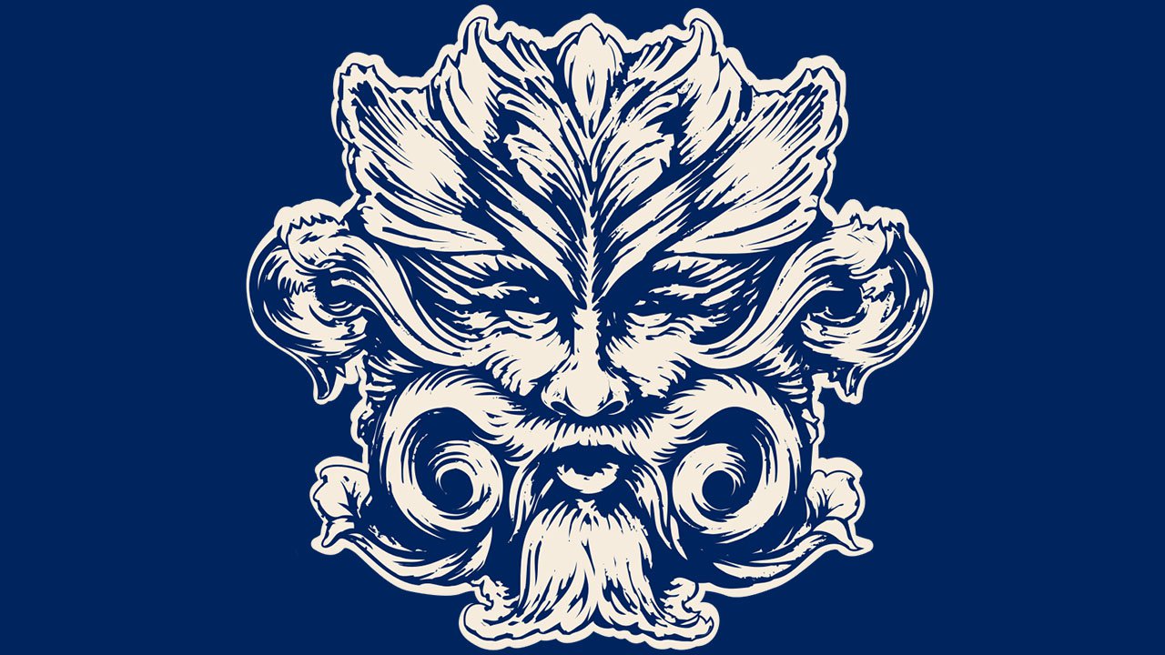
Now, it was time to create a Whistling Straits logo. What symbol could represent the seemingly supernatural power of the wind? To convey the meaning, the author of the logo went back to pagan times, when people believed that forces of nature were represented by different goddesses and gods. The character depicted on the logo appears to be a god of wind.
The company hasn’t provided a detailed history of how the logo was created. All we know is that the author of the concept was the CEO of Kohler. Most likely, the physical implementation of the emblem was developed in-house by their lead designer.
Emblem description
The wind god looks severe and strong. His lips are rounded to produce the wind blowing all around the Whistling Straits. There’s a certain roughness to his face (or should we say “muzzle”?), and yet, he’s not appalling. The whiskers, and beard, and sideburns, and eyebrows are so vast they seem to cover almost all the face and merge with the hair. All the hair growth is “blown” to the sides, as if by the wind, in a symmetrical and rather elaborate manner.
The word “Whistling” in capitals can be seen above, while the lettering “Straits” is placed below. The letters in “Straits” are separated from each other by tiny rhombuses – the effect used apparently to make the lettering longer, equal to the length of “Whistling.”
Versions
![]()
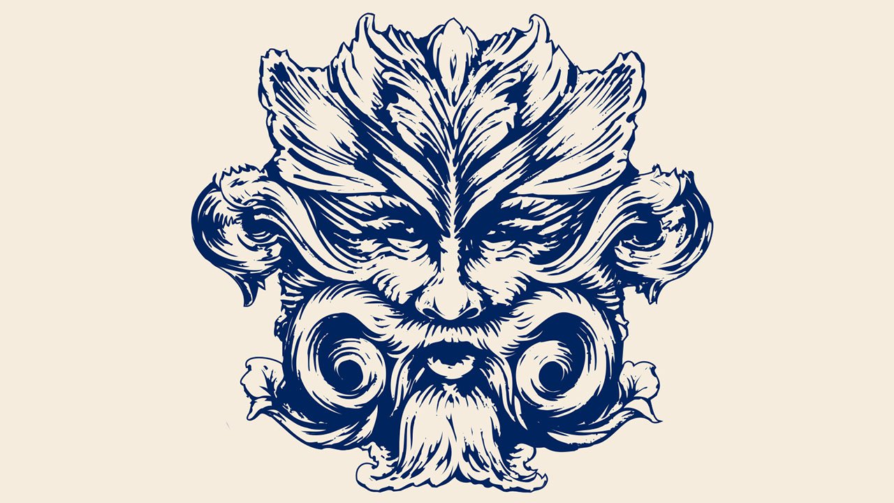
There’s hardly any information about the evolution of the Whistling Straits logo. Apparently, there haven’t been any notable changes to it so far. And yet, you can come across slightly different versions. For instance, on the poster for the PGA Championship held in August 2015, the face of the wind god is made up out of clouds, between which the blue sky can be seen. The eyes of the god appear larger and more emphatic than on the primary logo. There are less symmetry and refinement than in the main version – in fact, this one looks more natural.
The emblem has appeared on a variety of products and types of surfaces, including collectible coasters, embroidered flags, cufflinks, and metal gates. The Whistling Straits logo has a lot of tiny details and color nuances. It’s not the type of emblem easily reproduced on a variety of surfaces. Each time, it has been slightly modified to fit the type of material (textile, metal, plastic, etc.).
So, we can’t talk about an “old” and a “new” logo but rather about its versions created to fit specific contexts and existing simultaneously.
Font
![]()
The sans serif type has a classic, traditional elegance. It can be a modified version of the JT Alvito Regular font, which was developed by JAM Type. Among fonts looking pretty close are Goudy Serial Medium published by SoftMaker and Holla Medieval Regular by Manfred Klein. The most distinctive feature is the retro “W.”
Colors
![]()
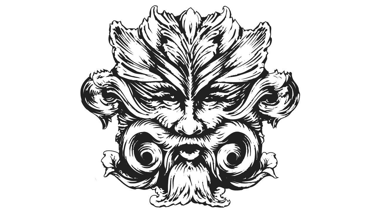
While the color scheme is based on black and white, there’re many shades of grey helping to add some depth to the image and keeping it from being flat.


