Hawaiian Airlines Logo PNG
The flag carrier in the U.S. state of Hawaii is based in Honolulu, Hawaii. It commenced operations in the fall of 1929.
Meaning and history

Hawaiian Airlines Hawaiian Airlines is the largest airline in Hawaii and is also one of the top 10 largest airlines in the United States. Its home port and headquarters are located at Honolulu Airport, the state capital of Hawaii. An additional hub, from which regular flights are also operated, is the Maui airport.
The Hawaiian Airlines route network has 28 destinations, with direct flights to Asia, Australia, New Zealand, the U.S. mainland and between the Hawaiian Islands. Curiously enough, Hawaiian Airlines is the only one of the oldest airlines in the United States that has never lost an aircraft in its history. Hence, Hawaiian Airlines is recognized as one of the safest airlines in the world.
What is Hawaiian Airlines?
Hawaiian Airlines is the name of an American air carrier, which was founded in 1929 in Honolulu. The company operates scheduled flights between Hawaii, Asia, Oceania and the United States. The main airport of the company and its central hub is Honolulu International Airport, located in the city of the same name, known as the location of the historic Pearl Harbor military base.
1929 – 1940

For the first two decades, the Hawaiian airlines’ logo was executed in a traditional crest style, with red as the main color. The initial badge was composed of a red and blue crest set on a white one, with the map of the islands on the top red part, a golden-winged badge on the bottom blue part, and the stylized bold inscription on a light background in the center of the badge.
1940 – 1950
The redesign of 1940 introduced a more ornate red and blue badge, with the image of a sailboat, and a plane flying above it. The script “Hawaiian” lettering was set on the upper red part of the crest, and the script “Airlines” — in the bottom blue part.
1950 – 1953
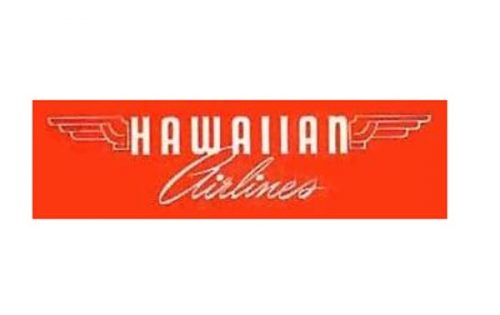
The more minimalist design concept was created for the Hawaiian Airlines in 1959. It was a horizontally stretched scarlet-red rectangle with bold white “Hawaiian” in the uppercase, written in custom sans-serif and placed between two delicate wings. And an elegant cursive “Airlines”, also in white, is written under the main part.
1953 – 1966

The red and white palette remained but the logo was completely changed in 1953. Now it was a more square badge with arched sides and rounded angles. The red emblem featured a double white and red outline, a stylized image of a white bird flying to the right, the “HAL” monogram placed on its body, and the “Hawaiian Airlines” white inscription in an extra bold slanted sans-serif font.
1966 – 1973

The smooth bird turned into an angular one in 1967. The creature started looking more like a plane, also facing to the right. The colors got reversed, so now the red emblem was accompanied by the red “Holder of the World’s Safety Record” motto, and placed on a white background. The italicized “Hawaiian” in modern and strict sans-serif white letters were written over the red emblem.
1973 – 1990
Another concept was created in 1973. Now the red flower with the stylized lady’s profile made up the Hawaiian Airlines emblem. The graphical part was accompanied by a custom inscription in a smooth intense color between dark chocolate and burgundy.
1990 – 1995

The thin white lines were removed from the flower in 1990, and in the same year the wordmark became bigger and the contours of the letters — cleaner. Now the “Hawaiian” was placed on the top line, and the “Airlines” was written in a simple stable sans-serif font right under it.
1995 – 2001

The flower turned orange, and the lady’s hair got a purple shade in 1995. This is also when the emblem got a smaller size and moved to the left from the wordmark. As for the inscription, it still used the same style as on the previous version, but now was drawn in purple.
2001 – 2017

The logo was redesigned and modernized in 2001. The color palette turned more purple and fuchsia, the lettering changed its typeface to a more minimalist, but stylish sans-serif with smooth lines, and the emblem was completely redrawn. The lady got more traits and now the face was visible, while the flower on the contrary got more abstract and schematic. At the sale time, the flower in the lady’s hair became brighter and bigger.
2017 – Today
The colorful scenery and exotic way of life were the primary sources of inspiration behind the Hawaiian Airlines logo. The design is dominated by a stylized side view of a Hawaiian woman with a flower in her hair (apparently, a Hibiscus, which is the flower of Hawaii).
The word “Hawaiian” features a highly legible yet unique type. Among its distinctive features are the unusual middle bars on the “A’s.”
The palette probably echoes that of the official flag of Hawaii, although the shades are not exactly the same.
Font and color
The top line of the logo is composed of a smooth custom uppercase “Hawaiian” wordmark, executed in a fancy sans-serif typeface, with triangular cuts between some bars, and softened ends of the letters, based on one of the traditional fonts, such as FF Signa Round Pro Bold and Linotype Finnegan Small Caps Medium.
As for the “Airlines” tagline, it is also set in the uppercase, but in a lighter and simpler font, the one close to DIN Next Cyrillic Regular or Embarcadero MVB SC.
The purple, red and white color palette brilliantly reflects the bright and happy mood of the air carrier’s motherland. Purple also stands for safety and protection, while a red represents passion and love, and white — trustworthiness.


