Olmeca is a brand of tequila, produced in Jalisco, Mexico. Founded in 1967, it’s been a part of Pernod Ricard Group since 2001. There are currently five tequilas offered by Olmeca: Olmeca Blanco, Olmeca Reposado, Olmeca Gold, Olmeca Añejo and Olmeca Dark Chocolate.
Meaning and history
The forebear of the Olmeca brand is considered to be the Destileria Colonial, built in Arandas in 1873. It was here, as a result of numerous experiments, that a unique distillate of blue agave was produced, later called tequila. However, officially the history of the Olmeca brand begins in 1967, the moment of trademark registration.
In 2003 Olmeca tequila was recognized as the best tequila in the world. The drink also received many prizes and awards at various international competitions. Today all the rights to TM Olmeca belong to the French corporation Pernod Ricard. The brand is exported to more than 80 countries, in most of which Olmeca tequila is considered the number one tequila brand.
What is Olmeca?
Olmeca is the name of one of the world’s most popular brands of tequila, which was established in Mexico in 1967. Today there are several flavors of Olmeca available for sale all over the globe. The brand was acquired by the reputable Pernod Ricard group in 2001.
1967 – 2014
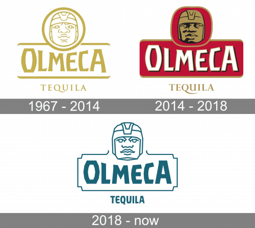
The original logo is the same as the following designs, save for a few features. Namely: it’s fully yellow; the face is surrounded with a circle; there are two horizontal lines above and below the wordmark; the word ‘tequila’ uses an elegant serif style.
2014 – 2018
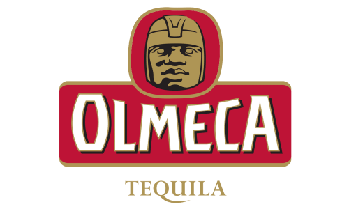
Several things were recolored in 2014: the main wordmark turned white; the circle and the space between the lines turned dark red; the head became bronze with black shades. All the yellow parts in general became bronze in this design.
2018 – Today
The name Olmeca comes from “Olmec”, the first elaborate pre-Colombian civilization of Mesoamerica. The Olmecs are especially identified with 17 huge stone heads with flat faces and full lips. One of the images of those stone heads – The Head of Mexico – is the Olmeca Tequila logo.
During the last redesign the Olmec head icon was redrawn by Chris Mitchell in a more contemporary and simple way, but still in keeping with the brand’s Mexican legacy.
The brand’s color palette varies depending on the Tequila kind. Olmeca Reposado uses burgundy and gold, while Olmeca Blanco – emerald green with silver.
The Olmeca is a brand with a very rich visual language and it’s logo is a combination of authentic Mexican cues and modern, sleek design.
Font and Color
The stylized uppercase lettering from the primary Olmeca logo is set in a heavy sans-serif typeface with modern contours of the stable letters and some sharp lines and elements, making it look very progressive and cool. The closest fonts to the one, used in this insignia, are, probably, Lentzers Bold, or VTF Redzone Classic Regular, but with significant modifications of the glyphs.
As for the color palette of the Olmeca visual identity, itis based on just one shade — calm and pleasant turquoise green, which evokes a sense of individuality, professionalism, and progressiveness. The unusual shade of green makes the badge of the brand stand out in the list of its competitors.


