

![]() VK Logo PNG
VK Logo PNG
The logo of the social network VK has gone the way from a longer emblem in Russian to a monogram in the Latin alphabet.
Meaning and history
![]()
2006 – 2012
![]()
The history of the VKontakte logo started in 2006. It was developed by the company founder Pavel Durov. He later claimed it took him as little as ten minutes to create the emblem from scratch. He opted for a simple sans serif type and unobtrusive colors, white and blue. The combination already proved to work well as the Facebook colors.
The initial letter was placed in a blue box with rounded corners (or a reverse color scheme was used). While it wasn’t a unique approach, the result was perfectly descent – a simple and legible logo that didn’t irritate you even if you spent a lot of time on the website (something many users did).
In the course of time, more and more users became familiar with the social network. Now, it wasn’t necessary to include the whole name of the service in its primary logo – just the initial letter was well enough.
So, the company got rid of the blue lettering leaving only the “В” (stands for the “V” in the Cyrillic script). Like in the previous version, the bold white letter was placed inside a blue box with rounded corners (or the reverse color scheme was used). The corners mirrored the curves of the “B” creating a pleasant and soft mood.
However, a full version, where the icon was paired with the wordmark, was still often used.
2012 – 2016
![]()
The shade of blue became grayer, while the white trim around the logo disappeared. Other than that, the emblem looks the same.
2016 – 2020
![]()
Around early 2013, the company went through a significant brand identity update. The website was moved to the dot com zone. Instead of the old address “VKontakte.ru,” it now used a simpler two-letter equivalent “Vk.com.” According to the official commentary of the founder, this step was necessary to make the service name more understandable for users outside Russia.
The new name required a new emblem. The author of the VK logo decided to build upon the brand heritage, so the blue box with rounded corners remained the basic element in the structure of the logo. The letters “v” and “k” were proudly placed inside. The glyphs partly overlapped and due to this looked like a single monogram. In comparison with the old emblem, the new one had a more unique and recognizable look.
2020 – 2021
![]()
Unlike the type in the previous versions, this one has fewer curves (note the shape of the “k,” for instance). Also, the wordmark looks more like an independent element, while in the older versions it was included in the same frame as the icon, which merged the two parts into a single whole.
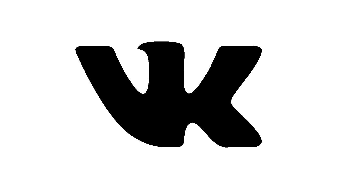
2021 – Today
![]()
In 2021 the VKontakte social media platform decided to simplify its visual identity to just an emblem, so the logotype was removed from the composition. The primary logo of the social network today is a bright blue square with rounded angles and a heavy and stylized white “VK” monogram with the two capital letters sharing one vertical bar. All other bars are arched from the vertical one, creating a stylish and unique badge.
Criticism of the emblem
On the downside, we can say it’s just a tiny bit too intricate for a top logo. You can’t think of a simple object or shape with which it could create an association, a link in your mind. Compare the “M” from the MacDonald’s logo, the Mazda logo or the Nike Swoosh with their minimalistic and easy to remember shape, the Apple or Twitter emblems with their clear symbolic meaning.
![]()
Arguably, if the little serif-like detail on the top of the “v” had been removed, this could have helped to enhance the overall impact. While the visual rhyme between the “V” and the similar shape on the top of the “K” is perceptible, it could have been more pronounced and become one of the ways to make the logo more minimalistic and easy to remember.
Also, if you compare the VK logo to other popular social networking services, you may discover similarities in the palette with such projects as Linkedin, MySpace, Behance, Skype, Twitter, Tumblr, Discus, and of course Facebook. So, while blue is very comfortable for the eye, which makes it a smart choice for a social networking project, it is also somewhat generic. Also, the shape of the logo is slightly reminiscent of the Vimeo icon (especially when it comes to the serif element).
Colors

Starting from the very beginning of the website, it has always been built on the combination of blue and white. The muted shade of blue creates a soft, unobtrusive contrast with the white background, which is quite beneficial for this type of website. In comparison with the Facebook design model, the old VK logo featured a greyer tone of blue, while the current version is rather light.


