

![]() Tumblr Logo PNG
Tumblr Logo PNG
The Tumblr logo incorporates only the name of the project and uses a very old typeface. However, the authors managed to make it fresh and contemporary and give it the sort of look that sticks in the mind.
Meaning and history
![]()
The visual identity of Tumblr has always been built around the logotype, created in 2008 when social media just launched. Though the wordmark was executed in various color palettes throughout the years, the typeface of the inscription has never been changed.
2007
![]()
The original Tumblr logo featured a bright blue lowercase inscription in a bold serif typeface with the solid dot at the end of the word and a fancy light gray flower on the left. This version was only used for one month and is the only logo with a graphical element in the Tumblr history.
2007 – 2013
![]()
In 2007 another version of the Tumblr logo was created by the designers. There was nothing new in terms of shapes and style, but the color palette was different. Now it was just the lettering, with the graphical part removed. The bold lowercase inscription was executed in a deep and calm shade of blue, which looked stable, and strong and evoked a sense of trustworthiness and expertise.
2007 – 2010
![]()
The redesign of 2007 changed the style of the logo, writing its lowercase wordmark in gradient white, with a delicate gray shadow. The three-dimensional insignia had no bright spots or drawing accompanying it, it looked cold, fancy, and creative.
2010 – 2013
![]()
In 2010 the color palette of the logotype was slightly elevated by adding more gray shades and making the logo a bit darker and more stable. If the previous version was light and glossy, this one looked more matte and strong. The typeface and the dot on the right from the inscription remained untouched.
2013 – 2018
![]()
The redesign of 2013 made the Tumblr logotype flat and masculine. The new dark gray color palette of the lowercase inscription added a sense of style and experience to the insignia and made it more eye-catching and chic than ever. Gray also stands for professionalism and authority, and the color was brought to the logo after the acquisition of social media by Yahoo!
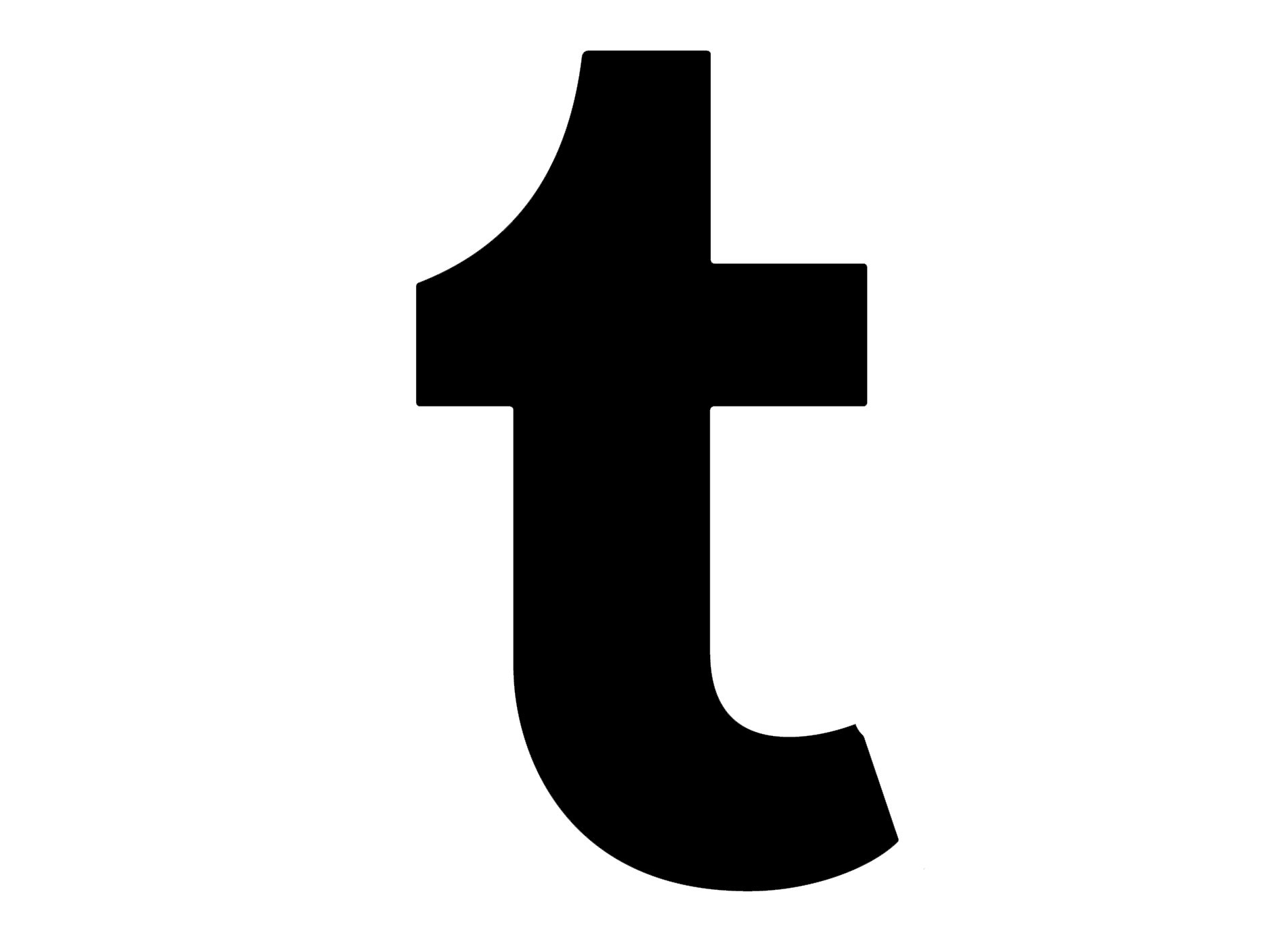
2018 – Today
![]()
The dot was removed from the Tumblr logo in 2018 after the visual identity of the service was redesigned, celebrating its acquisition by Automatic. The new logo is the strictest and the most laconic among all the Tumblr emblems. It is a solid black lowercase lettering in a bold and classy serif typeface, placed on a white background. And that is it.
Emblem
The emblem is based on the Bookman Old Style font. The typeface created more than 150 years ago received a subtle but impactful update, due to which it acquired an appealing and modern look. One of the keys is the spacing: the letters are a bit closer to each other than they should be.
Another interesting move is the use of lowercased letters instead of capitalized ones. Due to these features, as well as a couple of other modifications, the typeface and the wordmark, on the whole, have been made recognizable and unique.
Davidville flower symbol

Originally, next to the Tumblr, a flower with 10 petals could be seen. In fact, the flower was taken from the Davidville project. However, when Tumblr was working at the v3 redesign, the company decided it could slim down the wordmark dramatically by dropping the flower.
If you are observant, you may notice that the Tumblr still has not got rid of the Davidville flower altogether: the emblem serves as the background for the anonymous icon.
Icon
The Tumblr icon is very strict and laconic. The bold white “T” in the lowercase, executed in the corporate elegant typeface of the company, is placed on a calm dark blue square with clean and straight borders. The shade of blue, used for the icon, evokes a sense of trustworthiness and reliability.
Though sometimes the famous icon uses a monochrome color palette, with the “T” in white set on solid black background. In this case, the logo starts looking stronger and stricter.
Font
![]()
Bookman Old Style was created in 1860. It is a serif type, which was designed on the basis of the so-called “Old Style”, created by Alexander Phemister for the Miller & Richard foundry. Bookman somewhat resembles Caslon, but have more even and regular structure. Another notable feature refers to lower-case letters: they are wide and tall.
Color
![]()
The logo is most often given in one of the two versions: dark blue letters and white background or white letters and dark blue background.
Taking into consideration the type of service Tumblr provides, it seems absolutely natural that blue was chosen as the main color for the logo. This is the color of many projects connected with social networking, communication, information etc. However, Tumblr does have a unique feel due to the shade chosen. Dark, greyish hue makes the logo recognizable and helps to create a better contrast and legibility.


