

![]() Nike Logo PNG
Nike Logo PNG
One of the world’s largest manufacturers of sports equipment, shoes, and apparel, Nike employs over 45,000 people. The brand alone was estimated at $19 billion in 2015. It is definitely one of the strongest and most famous brands in history, which has itsvision, targets, and approach.
What is the symbol of Nike?
The symbol of Nike is an iconic Nike Swoosh, one of the most popular and successful emblems, created in the 20th century. The swoosh can be seen in various colors, yet in any shade, it looks sleek, achy, and powerful. This symbol stands for motion and speed, representing the wing of the goddess Nike, the Ancient Greek goddess of victory, who gave the name to the brand.
Brand Overview
The creators of the Nike brand met in 1957 at the University of Oregon. Bill Bauerman, a track coach, and freshman Phil Knight, a middle-distance runner.
In 1962, the student traveled to Japan, where he signed a contract to import Tiger sneakers to the United States. Knight came up with the name of the company he represents, Blue Ribbon Sports, on the fly.
In 1963, the first shipment of 300 sneakers from Japan went on sale. Phil used his parent’s laundry as a warehouse. In 1964 Knight invites Bill Bauermann to collaborate on a full partnership.
A year later, the company begins to expand. Knight’s former college race rival Jeff Johnson becomes the first full-time employee of Blue Ribbon Sports. Jeff is the author of the brand name: in 1965 he dreamt about the winged goddess of victory, Nika, after whom the partners decided to name their sneakers.
In 1971, the founder of Nike is still working at the university to increase the income that Blue Ribbon Sports generates. There he meets student Caroline Davidson, the girl who creates the famous “swoosh” Nike.
At the 1972 Olympics, Nike introduces the Moon Shoe sneaker model. It was created by Bill Bauerman, experimenting with rubber. He used his wife’s waffle iron to create a sole that later became revolutionary for its tight grip and high level of abrasion resistance.
And already at the Olympics in 1976 most of the athletes performed in Nike-branded sneakers. World records are set, championships are won, and gold medals are won in these sneakers.
In 1980 Nike sneakers become the best-selling in the U.S., surpassing the permanent leader Adidas.
Since the foundation laid by Bill Bowerman, the brand has only ascended, securing contracts with sports stars and new designers who craft not just comfortable but also stylish modern attire for both sports and urban settings.
Meaning and history
![]()
The Nike Swoosh logo was created by Carolyn Davidson in 1971. Interestingly enough, Phill Knight, Nike’s co-founder, who had commissioned her for the project, initially did not like the logo (or so he said).
Moreover, the very fact that he found the designer was a mere coincidence. At the time he was teaching an accounting class at Portland State University, where she was a student. One day the girl was sitting in a hall at the university talking to her friends. She mentioned that she does not have enough money to take oil painting, and Knight overheard these words. So, he offered her $2 per hour “to letter some signs”.
It took Carolyn 17 hours to create one of the most iconic emblems in the world. For 17 and a half hours The young designer created a new logo, trying to put on paper the symbol of the movement that the client wanted to see. The main condition was also a radical difference from the logo of the Adidas competitor. This is how the three straight lines were opposed by a single curved line.
The logo was originally called “strip,” which later became widely known as “Swoosh”. Swoosh referred not only to the movement in general but also to the fibers that were used in Nike shoes at the time.
What is the Nike symbol called?
The Nike symbol is known under the nickname “The Swoosh”. This tick with an arched contour and sharp ends of the line has become iconic by today, representing motion and speed. The idea of the Swoosh is connected to the name of the brand, Nike, called after the Greek goddess of Victory, and the graphical element represents the goddess’ wing.
The Nike Logo History
The Swoosh is one of the most recognizable and iconic logos with a 50-year history. And while the mere mention of the checkmark icon immediately forms images of iconic Nike products in your mind, it is not the only significant emblem of the company. Nike has an extensive library of symbols, numbering more than a dozen.
There are logos in the brand’s catalog that have been designed for specific sneaker models, athletes, events, and partner organizations. For example, the well-known Jumpman image or the slogan “Just Do It”.
The Nike Logo Evolution
The mere mention of the Nike logo immediately conjures up images of the brand’s amazing sneakers, but Nike sneakers were not originally adorned with this emblem. In fact, for the first time, the logo appeared on soccer boots in 1971, and then it began to appear on other equipment.
Another fact, that is already forgotten by today, is that for the first several years the Nike logo was executed in a red and white color palette, not the black one. For the founders of the brand the red color was elevating the meanings they put into the Nike core and its badge: energy, power, speed, and passion. While white color is always a symbol of transparency and loyalty.
However, to make the iconic badge stronger and more universal, its color palette was changed to plain and strict black-and-white.
1964 – 1971
![]()
The company’s earliest logo featured its original name “Blue Ribbon Sports.” The text was placed under the interlacing letters “BRS.” Although there is a legibility issue, the letters look unusual due to the stripes and unique shape.
The first “B” was separated from two other letters, overlapping the upper part of the “R” on the left. At the same time, the “R” was smoothly merging into “S”, which also overlapped it, but on the right. Although the composition only contained three letters and was executed in the black and white palette, it looked quite complicated, this is why the underline was made pretty simple: an italicized uppercase inscription in a simple sans-serif.
1971 – now
![]()
Yet, the iconic swoosh is way better memorable and more impressive than its predecessor. The company co-founder, Phil Knight, got it totally by chance, without having to pay a lot of money to a renowned professional. The designer that worked on the swoosh, Carolyn Davidson, was only at the very start of her career, and yet she managed to create one of the greatest logos of all time.
1971 – 1976
![]()
Another, more cluttered version of the swoosh, was used at the same time. The word “Nike” written in lowercase letters right across the emblem ruined its splendor.
The Swoosh was outlined, while the cursive inscription was executed in bold lines, which were overlapping the contours of the iconic symbol, making it less visible and messier.
1976 – now
![]()
Over time, the company’s design team experimented with the Nike logo adding or removing the name of the brand. Due to the italicized font, it looked rather dynamic.
At the same time, the massive letters and their straight lines and cuts added a sense of stability to the smooth and sharp swoosh, which has always been associated with motion and speed. The bold logotype “grounded” it, creating an image of a confident and powerful brand, with a very progressive look.
Who made the Nike logo?
The Nike Swoosh was created in 1971 by Carolyn Davidson, who was studying design at Portland State University. She received $35 for the job, which today equals $217. Nike co-founder Phil Knight, who was an accounting teacher at the University, offered her to design the logo when he heard her complain she didn’t have the money to buy oil painting supplies.

![]()
Just Do It
In the middle of the 1980s, the popularity of fitness skyrocketed. Nike, which was then focused only on athletes, realized that it was time to change its strategy and produce shoes for everyone. This required a strong promotional campaign.
In 1988, the brand turned to the advertising agency W&K, and soon co-founder Dan Weeden suggested the brand’s “Just Do It” slogan, inspired by the last words of convicted criminal Gary Gilmore (In 1977, Gary was sentenced to death for robbing and killing two men. His last words were “Let’s do it”).
A year later, designer Ron Dumas introduced a graphic representation of the iconic slogan, which was printed in black lines of the Futura Bold Condensed font. Until today, this logotype is the second most-famous Nike insignia, strongly associated with the brand, speed, and motion, and not with Gilmore anymore.
The Inspiration Behind the Logo
In addition to being inspired by Greek mythology, Davidson also thought about the competition while creating the iconic logo for Nike. It is absolutely normal for professional visual identity designers, however Carolyn Davidson had a touch task, as the main competitor for Nike was the world’s famous Adidas.
The German company’s logo had three lines that were placed at a certain angle. She liked the idea of an angle, which sort of symbolized energy and movement. But instead of three separate lines, she turned them into one solid, thick shape. This gave the logo a sense of the same energy and movement, but a smoother geometry.
Symbol modifications
Although the Swoosh has looked almost the same since 1971 there were minor changes in the emblem. For much of its history, the symbol included the name of the company. Over the first seven years, the word “Nike” was given in a type that imitated handwriting and used the Swoosh image as a background. The emblem sported the same dark shade of blue that can be seen on some of the modern versions. The logo featured negative letters and symbols on a dark blue background.
![]()
In 1978 the name of the company was placed above the symbol. A new type was chosen, and all the letters were given in capitals. The 1985 version looked almost identical but for the color scheme: blue was replaced by a dark shade of red.
Currently, the company prefers to use the solo swoosh, the most usual color scheme being the combination of black and white. Also, it is not rare for the Nike Swoosh logo to appear next to the “Just Do It” slogan. The first time this version was used was in 1988.
Collaborations
During its long history, Nike worked not only on its collections, but I collaborated with a lot of stars of professional sports. Today the famous brand has more than a dozen collaborations, each with a different visual identity.
1985, Jordan Wings
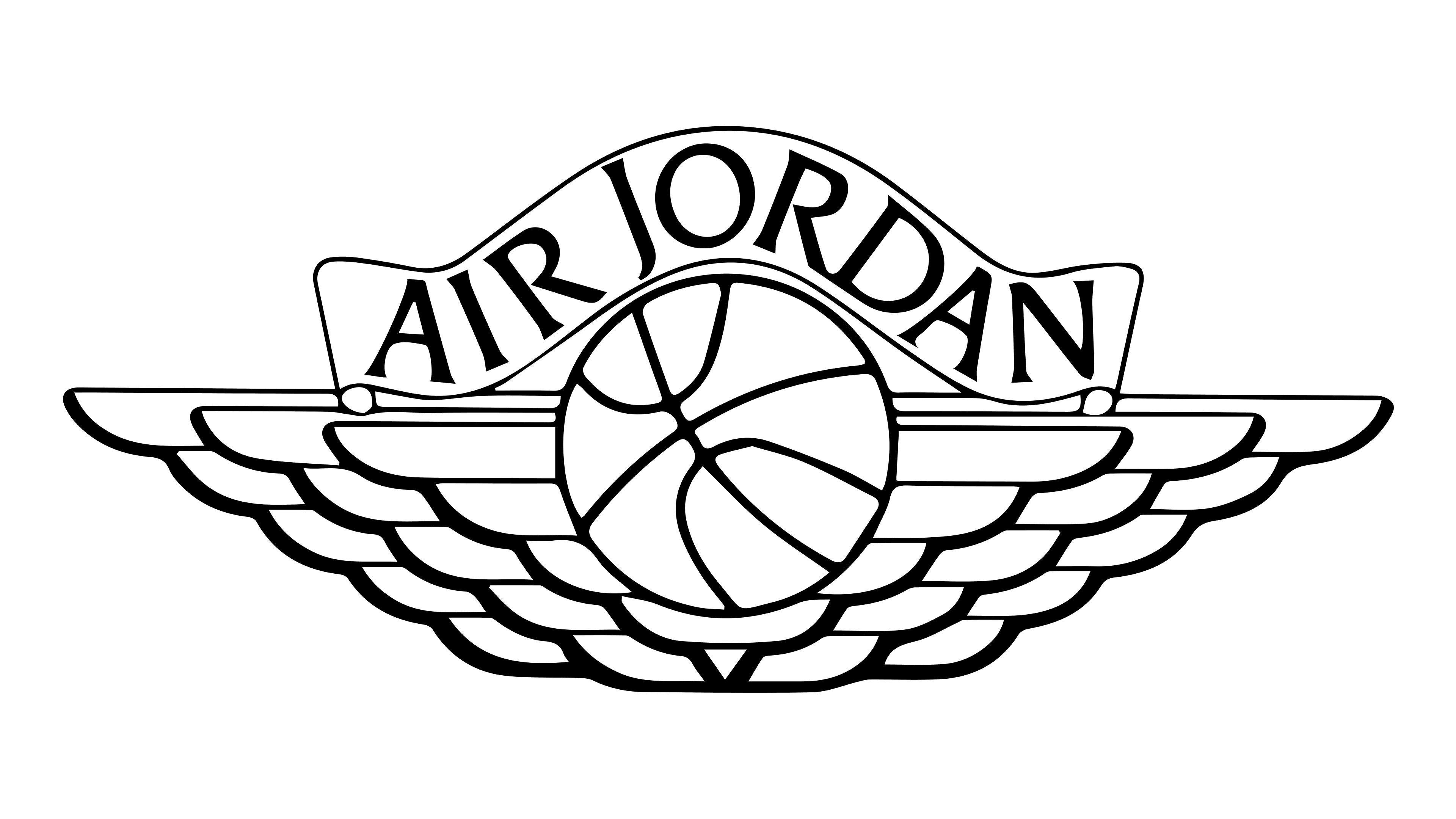
The Jordan Wings logo first appeared in 1985, when Michael Jordan put on his black and red Air Jordan 1 sneaker. The idea for the winged logo came from Nike’s creative director Peter Moore. The designer drew it on the back of a napkin on his way home from a meeting with Jordan’s agent.
1988, Jumpman
![]()
The famous Jumpman, which can still be seen on the Brand’s products today, appeared in 1988 in the Air Jordan 3 sneakers, while the first two models in the series featured the Jordan Wings emblem. Peter Moore liked the Nike poster of Michael Jordan soaring through the air with a basketball in his left hand, and it appears on the emblem.
1989, Bo Jackson
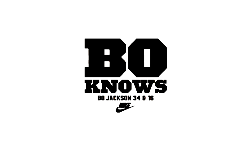
In 1989, Nike developed itstrademark forformer professional baseball player and soccer player Bo Jackson. The company released a series of “Bo knows” videos featuring the athlete, and created a logo with a capital “O” and a capital “B”.
1991, Challenge Court

For the 1990 season, Nike launched a tennis line for Andre Agassi called Challenge Court. The branding that was used to outfit the young athlete in 1991 was created by Tim Andric. According to the designer, the logo came about entirely by accident. Tim drew with a capillary pen, popular at the time, the ink splattered on the paper, forming a blotch that resembled a tennis ball.
1993, Diamond Turf
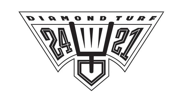
Diamond Turf was Deion Sanders’ signature line that lasted from 1993 to 1998. Deion wore Nike products throughout his professional soccer and baseball career. The logo, placed on the tongue of the sneaker, reflected both of the sports Sanders played. It consisted of a goal post and the athlete’s game numbers, 24 and 21.
1994, Charles Barkley
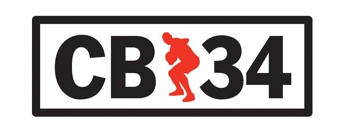
Charles Barkley was one of the most powerful and heavy forwards, so Nike signed him. The basketball player’s line debuted in 1994. The logo was designed by designer Donna Campa, combining Charles’ silhouette with the initials “CB” and the number 34 on either side.
1995, 1 Cent

The 1 Cent mark, launched in 1995, adorned the signature products of basketball player Anfernee Hardaway, better known as “The Penny” (1 Cent), for many years. The coloring of the logo matched the colors of the Orlando Magic team for which the athlete played.
1998, Swingman
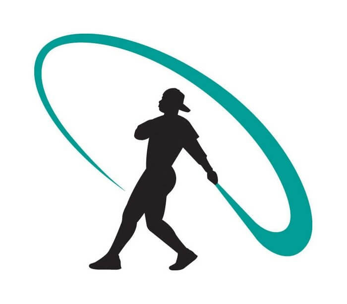
The Swingman logo was created in 1998 for baseball player Ken Griffey Jr.’s name line of apparel and footwear. The author of the logo, designer Kevin Plath, chose a dynamic image of the athlete. While the pose Ken is in might be associated with any other baseball player, it’s the cap worn backward (Griffey Jr.’s trademark) that says otherwise.
2003, Tiger Woods

In 2003, Nike partnered with Tiger Woods to launch a new golf apparel and footwear division. The initials of the athlete serve as the logo.
2003, Lebron James

The first of many LeBron James logos appeared in 2003. It consisted of the athlete’s initials and game number. All the other logos, be it crowns or lions, played on the theme of the king of basketball.
2004, Carmelo Anthony

Carmelo Anthony is one of the best players in the NBA. Thanks to Jordan Brand in 2004, the basketball player had his signature Air Melo line, which included his first Jordan Carmelo 1.5 sneakers with the minimalist “Carmelo” marking on the shin. Two years later, his third shoe, the Jordan Melo M3, sported the new “M” logo on the bottom.
2005, Serena Williams
The logo for the world’s famous American tennis player Serena Williams was designed in 2005 by Mark Smith. The “SW” symbol popularized the multi-champion Grand Slam tennis player’s name line.
2006, Kobe Bryant

Kobe Bryant’s first logo, which appeared in 2006, was his signature, but later that year Tom Ludecke and Tinker Hatfield created a new mark that is still in use today. The symbol is an unusual composition of overlapping “K” letters.
How much did the emblem cost?
Probably, one of the most well-known stories about the Nike logo creation is about how much its designer got for it. Believe it or not, Carolyn Davidson initially received as little as $35 for creating one of the world’s most recognizable emblems (about $215, if adjusted for inflation in 2017). However, this sum does not look that strange taking into consideration the circumstances. To begin with, at the time Davidson was nota professional designer, while Phil Knight, who commissioned her for creating the Nike logo, was just at the beginning of his way to success.
And, yet, over time the designer received much more. In 1983 she was invited to a company lunch, where Knight presented her with a diamond ring in the shape of the iconic Swoosh and an envelope with Nike’s shares. They were $150 worth back then, but now their cost has reached $643k. Carolyn Davidson says she is not a millionaire today, yet lives quite comfortably.
Icon
![]()
Who designed the Nike logo?
One of the most iconic logos of all time, the Nike Swoosh, was created in 1971 by a young graphic designer, Carolyn Davidson. She was hired by the brand’s co-founder at the end of the 1960s, who wanted the logo to represent the movement and dynamics.
The name of the Nike logo, “swoosh,” now known throughout the world, conveys the sound of high speed (wind whistling). It has become a symbol of perpetual and uninterrupted motion. The tick in combination with the later slogan “Just do it” was designed to stimulate athletes to action, new accomplishments, and achievements. Nike is one of the few companies, which logo has its own, unique name, which is not associated with anything else.
The Swoosh icon is one of the most recognizable logos among customers and athletes. It can be seen not only in sneakers but also in all the products of the brand. As for the web icon, it is usually executed in a monochrome palette, looking progressive and minimalist — with the solid black swoosh in a white background, or a white smooth placed on a plain black square with rounded angles.
Font

For more than 20 years since its creation, the Nike logo included the name of the company. For much of the time, it was written in Futura Bold, an all-cap typeface. The minimalistic sans-serif type looked straightforward and energetic, which went well with the company’s core values. It was only in 1995 that the wordmark was removed. By that time, it was obvious, that Nike does not have to include its name in the emblem to make it instantly identifiable – it was already known all over the globe.
Color
![]()
The dark shade of red added to the logo in 1985 can still be seen sometimes, along with other colors. Yet, generally, the black-and-white version is the official standard.
Nike SB logo
![]()
The Nike Skateboarding brand includes shoes, apparel, and skateboarding equipment. The logo looks almost identical to the regular one, except for the letters “SB” below the swoosh.
Nike AIR logo
![]()
For the Nike AIR logo, the standard Nike emblem is complemented by the word “AIR” written in a thinner, clearer all-cap type.
What is the Nike logo meaning?
The iconic Nike logo, composed of a smooth swoosh symbol with clean contours and sharp ends, is a depiction of the wing of the Greek goddess Nike. Apart from the mythological meaning of the swoosh, it also symbolizes motion and speed, showing the essence of the brand.
What was Nike’s original logo?
The original logo of Nike was created in 1964 when the name of the company was Blue Ribbon Sports. It was a badge, composed of a stylized BRS monogram executed in a triple-outlines sans-serif font with the lines of the “R” and the “S” elongated and merged. The icon was accompanied by a slanted uppercase inscription under it.
How did Nike get its name and logo?
Nike was named after the Greek goddess Nike, once dreamt by Phil Knight’s colleague Jeff Johnson. In the Greek pantheon, the goddess Nike is the patroness of victory, and she became the embodiment of the entire brand. The basis for the future iconic swoosh was the movement and the image of the goddess Nike, after whom the company was named. The swoosh was designed in 1971 by Carolyn Davidson, who got paid 35 USD for her job.
Why did Nike change their logo?
The iconic Nike logo has undergone several redesigns throughout the years, with the most significant one in 1971, when the company changed its name from Blue Ribbon Sports to Nike. After the introduction of the Swoosh badge, it has only been refined, with the lettering added here and there, and the graphical element whether solid or outlined.


