EA Sports is a legendary brand in the video-gaming industry. The name is responsible for the creation of such iconic computer games as FIFA, and Need for Speed, while its mother company, EA, is known for Medal of Honor, The Sims, Battlefield, Dead Space, Mass Effect, Star Wars, and Apex Legends.
Meaning and history
EA Sports is a subsidiary of Electronic Arts, a famous American company, which is considered to be one of the world’s leading entertainment software developers. The EA Sports brand specializes in the production of sports simulators and video games, connected to sports. The range of brands contains almost all popular sports disciplines: golf, hockey, soccer, basketball, snowboarding, and others.
The sports subsidiary of EA was officially registered in 1993, and the first version of FIFA football game was released in the same year. Popularity and well-deserved acclaim followed in no time. And the company, which was the first who invented to use the images and names of famous athletes in their games, couldn’t have it any other way.
But EA Sports decided not to put all eggs in one basket, and gradually started mastering games in new genres, developing interesting and innovative products, which all managed to become super hits all over the globe.
The games of the developer are available not only for such game consoles as Play Station, Nintendo, and X-Box but also for computers with both Windows and MacOS operating systems.
EA Sports continues to grow these days, and in addition to authentic licensed games, the brand has mastered mobile devices based on Android, IOS, and Internet gaming, allowing fans to organize world tournaments with opponents from all over the planet.
In 2023 Electronic Arts has begun promoting the reveal of its upcoming soccer game, the first released after its divorce from FIFA and the first to hit stores under the new name EA Sports Football Club or EA Sports FC.
EA Sports FC is the beginning of a new era for EA Sports’ popular series, one of the most played worldwide and one that broke activity records with the most recent release, FIFA 23, which despite losing the official name of the well-known entity in the soccer world, will remain familiar.
What is EA Sports?
EA Sports, short for Electronic Arts Sports, is a developer of computer games. The studio has been working since 1998 and has developed nine games. The best project that Electronic Arts Sports worked on is NHL 13. The first game of the studio was FIFA ’99, which was released over 20 years ago.
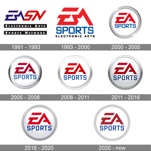
In terms of visual identity, EA Sports has never been afraid to change, hence a large number of official logo redesigns in the history of the company. Even though the basis for the current badge was introduced at the beginning of the 1990s, the brand is always down for making its badge more modern and up-to-date.
1991 – 1993
The original EA Sports logo was only introduced in 1993, with the registration of the new subdivision, but before that, in 1991, the Electronic Arts Sports Network was created, and it had its badge. The logo was composed of a stylized italicized EASN abbreviation red and blue, placed above two wide black horizontal lines with the full name of the network, written along them in bold white characters.
1993 – 2000
After the official foundation of EA Sports, the first logo of the department was designed in 1993. The corporate “EA” in red stylized characters was placed above the uppercase “Sports” in blue, and underlined by the black “Electronic Arts” in small caps. The three levels of lettering, executed in different colors and fonts, were placed on a plain white background, without any framing.
2000 – 2005
The redesign of 2000 has simplified the “EA” contours, making the “A” more straight and distinctive and removing that triangular element on the left, which made the letter look like a star. The red abbreviation was now set above the blue “Sports”, which remained the same as on the previous logo, but the underline was removed. Instead of the black tagline, another element was brought to the logo — a wide circular frame in gradient silver.
2005 – 2008
In 2005 the color palette of the EA Sports logo was refined, and the typeface of the bottom level of the lettering was slightly modernized. Now both lines were set in gradient shades, with the “EA” getting darker, and the “Sports”, on the contrary, — lighter.
2008 – 2011
The redesign of 2008 was also more about colors. The blue shades became more intense, while the silver gradients of the circular frame got almost white, compared to the previous version. It also became more plain and geometric, which made the whole badge look modern and strong.
2011 – 2016
More volume was added to the EA Sports logo in 2011. It was achieved by adding some blueish and gray gradients to the background of the roundel, with its surface gaining some gloss. The gradient shades also affected the intensity of the blue and red in the lettering.
2016 – 2020
The redesign of 2016 has softened the color contrast of the EA Sports logo, bringing in the lighter tones, and slightly “flattening” the glossy sphere of the badge. As for the composition itself, it remained the same.
2020 – Today
In 2020 the EA Sports logo was redrawn in a flat minimalistic way with all glossy gradients and volume removed. Now the badge is composed of plain two-leveled lettering in red and blue, written against a flat white background and enclosed into a gray circular frame.
Font and color
The lettering on the primary EA Sports logo is set in two different typefaces — a designer one for LEA”, with bold geometric lines, and a simpler sans-serif for the “Sports” which looks somewhat similar for such commercial typefaces as Reload Alt Regular, Hudson NY Pro Regular, or Shentox SemiBold.
As for the color palette of the EA Sports visual identity, it is based on a classy and bright tricolor, composed of blue, red, and white, with gray as an additional color, used for the framing.


