Today Dungeons & Dragons are known as a cooperative third-person RPG in the fantasy universe of Dungeons & Dragons. The first table-top version of the game was developed in the early 1970s and has been re-released several times in its history. It was created by Gary Gygax and Dave Arneson.
Meaning and history
Started as a table-too game in 1971, Dungeons and Dragons has grown into a separate world, with its own rules, philosophy, and various types of activities. In a broad sense, it is a tabletop role-playing game. To be precise, the complete set of the latest, fifth edition of Dungeons & Dragons consists of three book volumes. “Player’s Book” describes the rules of the game, “Monster Encyclopedia” gives information about the monsters to be fought, and “Master’s Guide” contains useful cheat sheets for the host.
From first sight, it all might seem to be very complicated, but in reality, you only need the Player’s Book, all the other elements are optional. Today you can even replace the unusually shaped Dungeon and Dragons dice with the mobile application.
In other words, it is a game based on cooperative participation in history and tactical battles, using a given set of rules, pieces on the table, and collective imagination. Despite the somewhat complicated definition, the game is usually very interesting. It can develop imagination, good social skills, and just be a good option for spending time with friends doing something creative.
As geek culture became more pervasive in the mainstream, Dungeons & Dragons came back into the spotlight. In the Netflix series “Very Stranger Things,” which invokes nostalgia for the 1980s, Dungeons & Dragons became somewhat of a frame of reference, and a group of main characters regularly play one of the first editions of D&D.
What are Dungeons and Dragons?
Dungeons and Dragons are the names of a world-famous fantasy role-playing game that emerged in the 1970s. It has several characteristics and features that have had a significant impact on the development of various games around the world.
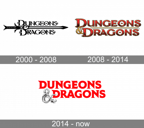
2000 – 2008
The logo, used by the Dungeons and Dragons table game at the beginning of the 2000s, featured an ornate two-leveled lettering in a stylized font with lots of decorative elements, and the two lines of the inscription separated by a horizontally located sword, pointing to the right. The logo was executed in a black-and-white color palette.
2008 – 2014

In the original Dungeons and Dragons logo, there were more ornate elements, and the overall style of the emblem was more gothic. This, the dark red lettering featured a gradient gold outline, and the texture of the letters was complemented by some gold spots, making the whole inscription vivid and more dramatic. The two levels of the wordmark were separated by a thin gold horizontal line with sharp ends, and the ampersand in gradient gold resembled a silhouette of a dragon. It was a massive and brutal logo, brilliantly representing the idea and plot of the game, and the professional approach of the developers.
2014 – present
The visual identity of the legendary game is based on the scarlet-red wordmark, executed in an elegant and bold gothic-style typeface, with the two-part of the game’s name connected by an ornate silver-gray ampersand. This light and cold element have elongated lines with vignettes, which point to the fantasy character of the Dungeons & Dragons plot.
Color and font
The combination of red and silver shades, placed on a white background looks fresh, yet strong and mysterious. The intense scarlet shade of the main Dungeons & Dragons color represents passion and strength, resembling the color of blood and battles.
As for the gradient silver in the ampersand, it has not always been there, as before the whole logo was colored red. After the addition of the new color to the Dungeons & Dragons palette, the style has become more distinct and strict, although the timeless sophistication has also shown up.
The serif typeface of the uppercase inscription has its horizontal lines sharp and thin, which perfectly balanced the thickness and stability of the main letter shapes. The serifs in both letters “D” are also a bit curved, playfully and elegantly looking up.
Dungeons & Dragons Icon
There are two main options for the Dungeons & Dragons icon, used by the franchise. The first one is just the iconic ampersand, which is normally executed in a flat plain black or red and can be placed on different backgrounds, with structures and patterns, or simply on a white background.
The second version is composed of two letters “D” connected by the same ampersand. In this case, all three elements of the icon are executed in one color — red or black.


