

Warhammer is a fantasy board war-game, which offers miniature tabletop playing since 1983. The game has several editions in different designs, each with a pack of mini-figures, which can be set up in ten minutes.
Meaning and history
![]()
Warhammer 40.000 is the largest and most popular tabletop wargame in history, and it has seen many adaptations and rule reprints throughout its existence. But the essence of Warhammer has not changed since the very first edition.
In 1987, the designer of the British company Games Workshop, Rick Priestley, created the first version of the strategy board game Warhammer 40,000 called Rogue Trader. The events of the first and subsequent editions of Warhammer 40K unfold in a futuristic-gothic fictional universe.
Warhammer has gone through many reincarnations over its long history. But the best and most popular is still a board game. It is a tactical game where you control your army consisting of units. Units in Warhammer are most often represented as squads of several models or as single miniatures. These miniatures have sets of characteristics and special rules and can influence each other and follow your orders. The winner is not the one who destroys all enemies, but the one who completes the task given before the battle.
What is Warhammer?
Warhammer is a renowned franchise known primarily for its intricate tabletop miniatures games, set in richly detailed, fantastical universes. Originating from Games Workshop, a British company, it has expanded into various forms including video games, novels, and more. Warhammer’s worlds are celebrated for their complex lore and the strategic depth of their gameplay.
1987 – 1993
![]()
The original Warner logo was designed in 1987 and stayed with the game for more than five years. It was a voluminous three-dimensional logotype in white and purple, executed in the uppercase of a bold serif typeface with massive shapes of the letters. The banner with the logotype was decorated by a gradient red-to-orange “40.000” written in a stencil style along its bottom line. It was a bright and intense badge, which was well-recognized by players from all over the globe.
1993 – 1998
![]()
The redesign of 1993 refined and clean the logo of the game, switching its color palette to gold and brown and rewriting the wordmark in a massive sans-serif font with clean and straight lines of the letters. Now the gradient gold inscription was set in a dark brown background of a horizontally stretched banner in a golden frame with the sides stylized as wings. As for the “40.000” part of the badge, it was set on a golden rectangular plate, placed on the bottom line of the frame.
1998 – 2020
![]()
In 1998 the Warhammer logo gets another redesign and a new color palette. The logotype was set in a gradient light blue palette, in which the capital letters are written in a supermassive serif font with sharp and short serifs, touching the ones from the neighboring letters. The inscriptions were set on a dark gray background with a stone texture, which repeated the shape of the previous version but has no contrasting outline. The “40.000” was written in the same color and style as the logotype along the small gray banner attached to the main one from the bottom side.
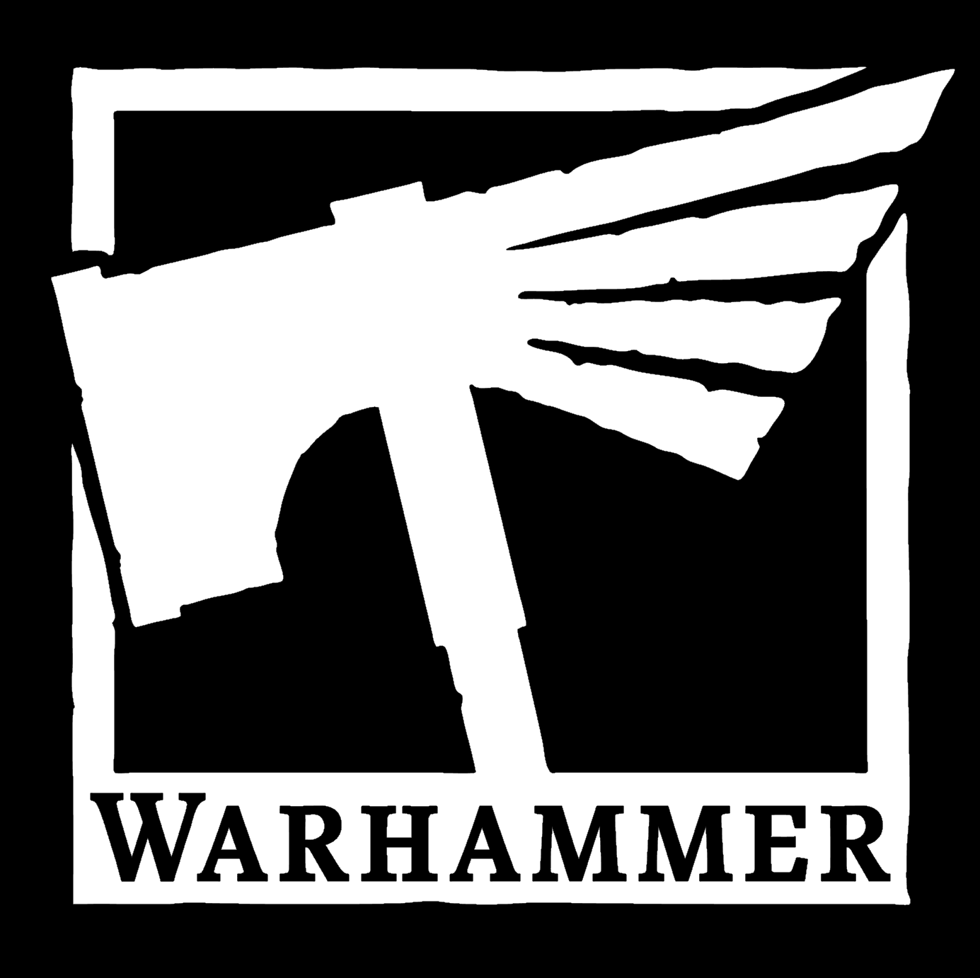
2020 – Today
![]()
The logo from 2019 is something completely different. The square white frame placed on a black background has a hammer image inside and a wordmark on its bottom bar. The wordmark in all capitals has its “W” enlarged and is executed in a serif typeface, with straight simple lines.
The hammer emblem combines two most important symbols of the game — the hammer and the eagle and has the right side of the hammer stylized as if it was the eagle tail.
![]()
The monochrome palette and minimalist geometric lines of the new Warhammer logo make the brand look modern and powerful. It shows the professional approach and expertise of the developing company and looks good on any background.
Font and color
The stable and brutal uppercase lettering from the official logo of the Warhammer board game is set in an extra-bold sans-serif typeface with the capital characters horizontally cut in their top parts by a straight horizontal line. The closest fonts to the one, used in the Warhammer insignia, are, probably, Scene Black, or Embarcadero MVB Cond ExtraBold SC, with some modifications of the characters’ contours.
As for the color palette of the Warhammer visual identity, it is based on a fresh and cold combination of silver, and blue, with an addition of black and red. The ma in shades makes the badge look strict and strong, lacking any emotions, and representing the essence of the game, while red strokes add some passion and energy to the composition.


