

![]() Minecraft Logo PNG
Minecraft Logo PNG
Although the logo of the sandbox video game Minecraft has been modified several times, its core “building material” – cobblestone – has been used in each and every version.
Meaning and history
![]()
The visual identity of the famous video game has undergone three major redesigns since its trial unused version was created in 2009. The current logo of the brand is pretty simple in shapes and color palette, though still instantly recognizable among games from all over the globe.
What is Minecraft?
Minecraft is one of the most popular online sandbox games that was created in 2011. Minecraft allows players to create their worlds and scenarios. Minecraft can be played either alone or in groups, via a local network.
2009
![]()
The very first logo for Minecraft was created by Hayden Scott-Baron in 2009, but it has never been used by the brand. It was a bold sans-serif inscription with jumping letters, glued to each other. The massive bodies of the letters featured a bright blue and green pattern, where blue was a sky, and green — earth.
2009 – 2011
![]()
The first official logo for the video game was introduced in 2009, and featured a gray stylized logotype, with geometric contours of the letters, and the diagonal bars composed of pixel-squares. The gray color of the surface stood for the cobblestone, and the same pattern was used for the game itself. The logo stayed with the brand for two years.
2011 – 2015
![]()
The Minecraft logo was redesigned in 2011, with its letters being thickened and pattern — refined. The color palette of the emblem was still composed of gray and black, but gray on this version was solid and had some thin black cracks on it. The typeface of the wordmark was changed to a bolder and more square one, which gave a more confident and stable look to the whole image.
2013 – 2021
![]()
The logo of the video game was refined in 2012, by adding some gradient shades to its gray color palette. This made the surface of the bold sans-serif letters look sleeker, and evoke a sense of professionalism and expertise. The contours of the symbols were emboldened and cleaned and the face of the “A” became more visible.
Also, special logos have been introduced for the Bedrock Edition and Java Edition. They are basically the same, except for a couple of minor details.
2021 – now
![]()
The redesign of 2021 has played with the shades of the Minecraft logo, adding lighter hues to the bottom part of the cubic inscription, and more matte ones to the main surface. The contours and geometry of the badge remained the same, but with the new shades, it started looking more professional and modern.
Icon
There are two options for the Minecraft Icon used by the famous online gaming portal. The first one is a three-dimensional cube, executed in a green and brown color palette, with a pixel-checkered pattern. This texture and color scheme are instantly associated with Minecraft and do not need further introduction.
The second version of the icon is mainly used on iOS and is executed in the same brown and green color palette with the pixel pattern, but this time it is a flat square image with a gradient white and gray three-dimensional “Minecraft” wordmark in all capitals, placed in the middle line of the square.
Font
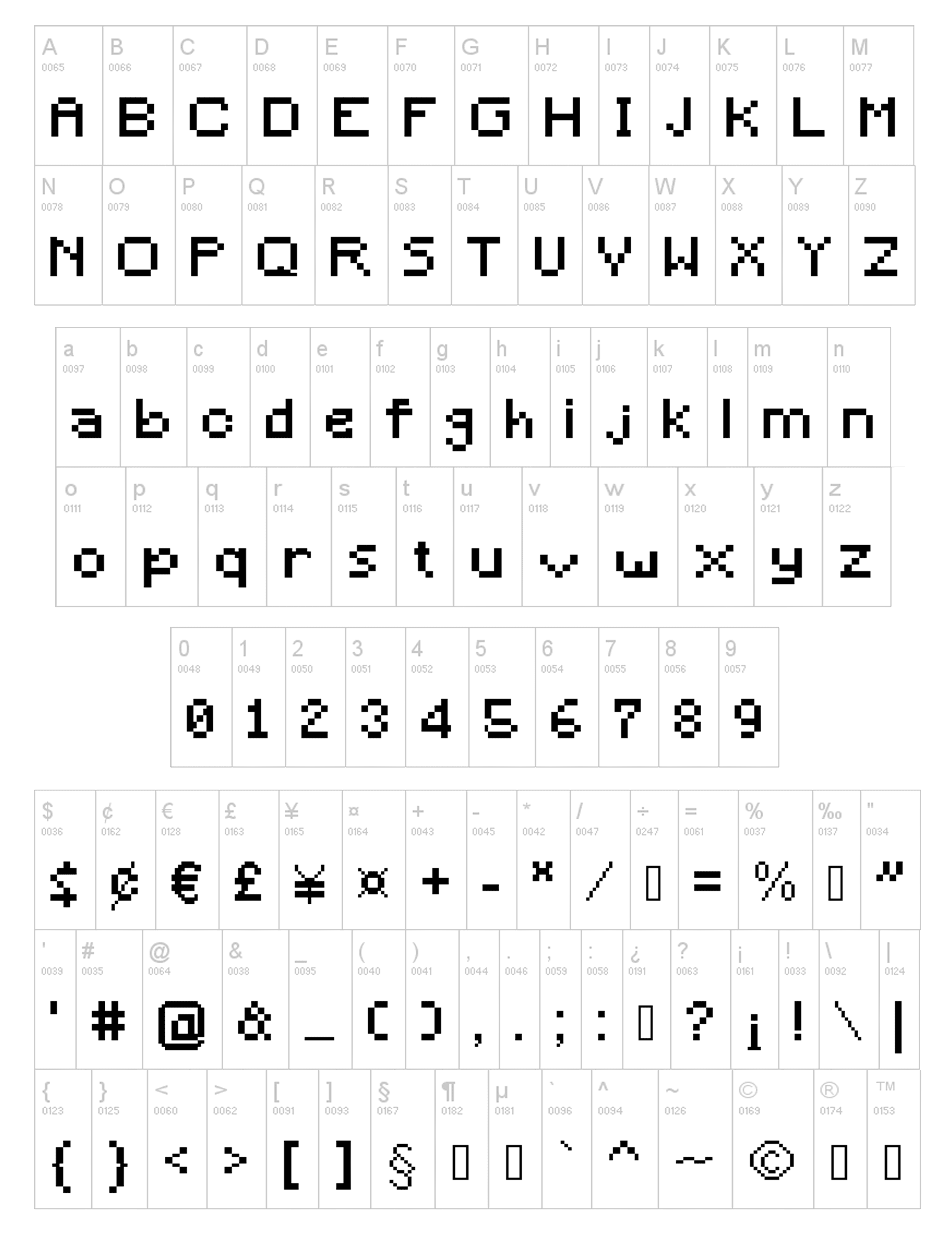
The wordmark has been created from scratch, so we can’t talk about a ready-made font, in this case. However, if you want, for instance, to make a wordmark in a typeface looking like the one on the Minecraft emblem, you may find it online. The type was inspired by the main wordmark and has a complete set of glyphs.
Colors
![]()
Various shades of grey in combination with black constitute the palette of the lettering, while the background is white.
What was the first logo of Minecraft?
The first logo of Minecraft, introduced in 2009, was a bright and vivid inscription in green and sky-blue, with massive stylized characters drawn with the top part arched, and with the bottom — cut straight. It was designed by Hayden Scott-Baron.
Why did Minecraft change its logo?
There were two major redesigns in the history of the Minecraft visual identity until the game finally came up with the perfect image, that brilliantly represents the essence of the world’s most popular sandbox game. The predecessor of the current image was introduced in 2011 and colored to the previous version, it was more stable, professional, and strong.


