![]() Xbox Logo PNG
Xbox Logo PNG
Xbox, a flagship video gaming brand owned by Microsoft, represents a significant player in the gaming industry. Microsoft, a global technology leader, ventured into the gaming market with Xbox, marking its inception into this dynamic field. Xbox has carved its niche by offering a series of video game consoles, each iteration more powerful than the last, such as the Xbox Series X, known for its powerful console capabilities and expansive library of Xbox Game Pass titles. This brand operates across the globe, leveraging Microsoft’s vast network to distribute its products and services. The company’s operations span various regions, ensuring availability and fulfillment center support to cater to the demands of fellow gamers worldwide. The Xbox ecosystem is designed to put control of your gaming experience in the users’ hands, from compatibility features that ensure older game versions can run on new consoles to Project xCloud, which hints at the future of gaming by allowing game streaming across devices.
Meaning and history
![]()
The Xbox brand was founded by Microsoft in the early 2000s, marking the company’s ambitious entry into the gaming console market. Since its inception, Xbox has been at the forefront of innovation in the gaming landscape, continually pushing the boundaries of what is possible in video gaming technology. One of the brand’s main achievements includes the development of a series of video game consoles that have set a new bar for gaming performance, including the Xbox Series X. Additionally, the introduction of services like Xbox Game Pass has revolutionized how gamers access and enjoy games, offering an expansive library of titles for a monthly subscription fee.
The evolution of the Xbox logo, from its inception to its current minimalist design, symbolizes the brand’s growth and the evolution of the gaming landscape. Xbox’s current position in the market is stronger than ever, thanks to its commitment to innovation, a deep understanding of gamers’ needs, and partnerships with some of the world’s greatest developers. The brand continues to expand its reach, exploring new territories with projects like Project xCloud, which promises to redefine the future of gaming by enhancing accessibility and convenience for gamers worldwide. The Xbox’s trajectory from a newcomer to a leader in the gaming industry underscores its significant contributions and lasting impact on the field.
What is Xbox?
It’s a leading video gaming brand owned by Microsoft, known for its series of video game consoles, the expansive library of Xbox Game Pass titles, and innovation projects like Project xCloud. Xbox aims to offer an immersive gaming experience, marked by its powerful consoles and a commitment to compatibility and a sense of community among gamers.
1999 — 2001
![]()
The original Xbox logo was used by the brand for only two years, during the development of the product. It was a custom geometric logotype in lime-green, executed in angular shapes and medium/weight lines. The lettering was slightly italicized, was airy, and pretty welcoming.
2001 — 2005
![]()
The redesign of 2001 introduced a new Xbox emblem, which was composed of a bold green wordmark placed on the left from the three-dimensional “X” sight, which looked like it was cut out of the white background. The gradient green and white color palette looked creative, playful, and dynamic.
2005 — 2010
![]()
The logo was changed in 2005, rewriting the inscription in a cleaner and simpler sans-serif typeface, and placing the light green “X” on a gray metallic sphere, located on the left from the logotype. The unique detail in the nameplate was an elongated tail of the “B”, which was diagonally cut.
2010 — 2013
![]()
The color palette of the Xbox visual identity was elevated in 2010. The green of the lettering became a bit darker and more intense, while the gray of the sphere, on the contrary, — lighter. The renewed color palette stood for the success and movement of the brand, as well as their ability and willingness to provide their users with better technologies and games.
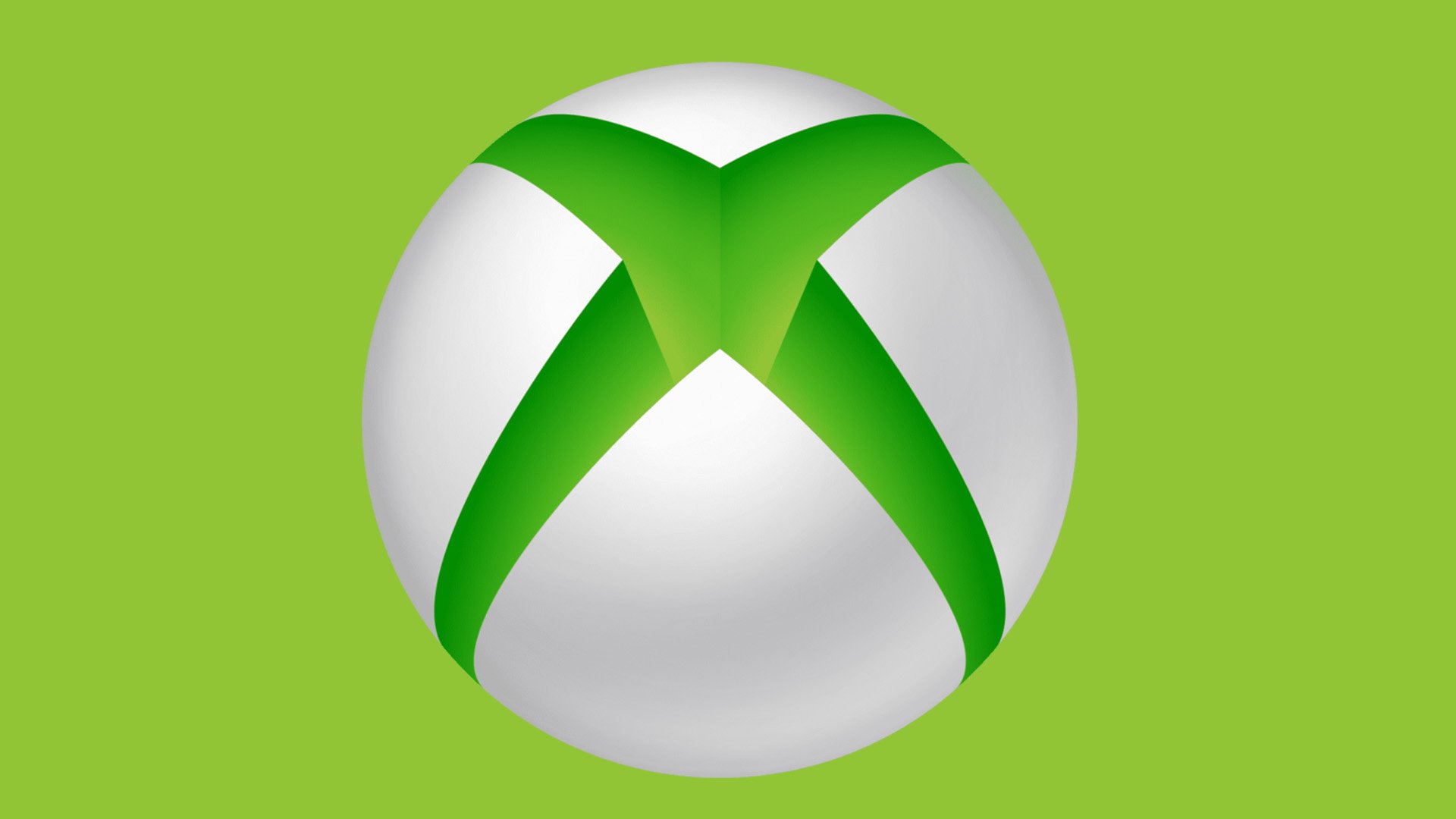
2012 — Today
![]()
The three-dimensional emblem was replaced by its flat version in 2012. The new logo features the same elements as the previous version, but now they all are executed in forest green, with white accents and background. This version of the logo is still used by the brand today.
2013 — 2019
![]()
In 2013 another version of the Xbox visual identity was created. The composition remained the same, but the gray color was removed from the brand’s palette, being replaced by a gradient white for the sphere. As for the main color, green, it was slightly modernized and started looking brighter and more delightful.
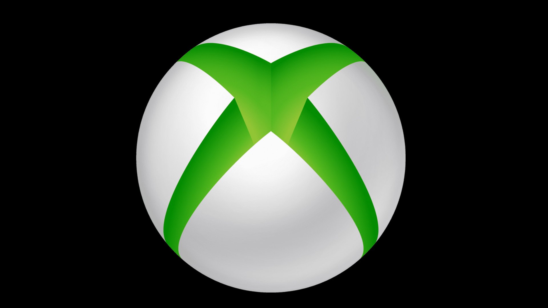
2019 — Today
![]()
The Xbox logo was refreshed in 2019. Two main changes were about the brand’s color palette and the disposition of the elements on the badge. The flat circle with the “X” is now placed above the “Xbox” logotype. The contours of the symbols were not changed, but due to the use of the new monochrome scheme, all elements started looking bolder and more powerful.
Alternative emblem
In 2012, an innovative emblem was introduced, marking a significant evolution in branding. This emblem was a departure from the traditional, embracing a minimalist and flat design aesthetic that was in harmony with the Metro design language requirements. The new emblem featured a striking dark shade of green on a white background, a bold choice that replaced the original palette of light green and grey. This color choice was not just aesthetic but also functional, designed to enhance visibility across various platforms, including Xbox Live on Windows Phone and Xbox Games on Windows 8. Despite the uniformity in design language, products like the Xbox 360 and Xbox One maintained distinct emblems, showcasing the brand’s versatility and its commitment to the development arm of design.
The emblem’s transition to a darker shade of green was a strategic move, designed to align with the visual identity of fast ship items and to accommodate the requirements of vector logos in digital and physical merchandise. This decision underscored the brand’s commitment to offering a seamless checkout experience, with the emblem becoming a symbol of trust and quality that customers associate with the seller of all merchandise.
Why is the symbol green?
The reason is pretty simple – it was the only color the co-author of the logo, Horace Luke, had at his disposal when he was asked to make the design. At least, that’s the version that the brand co-creator Seamus Blackley told during an interview.
According to Blackley, initially, Horace Luke had a set of markers, and there were a lot of colors. The markers looked so cool that Luke’s co-workers actually stole almost all of them, except for “the green nobody wanted.” At that moment, the group had a task to design a logo, and there wasn’t much time left before the meeting where they were to introduce it. So, the only choice was the neon green. “Can you imagine? – says Blackley – Now, the green is on buses in foreign countries.”
Font
The font used for the “Xbox” wordmark, X360, features sharp angles and elongated middle bars, embodying the brand’s forward-thinking and dynamic nature. This typographic choice complements the emblem’s design, reinforcing the brand’s identity across various touchpoints, from product-template lines to the checkout process on digital platforms. The font’s unique characteristics mirror the brand’s dedication to innovation, serving as a visual anchor for customers navigating the aspects of their purchase, from the computation results of their selections to the anticipation of the delivery date within days of receipt of delivery.
Colors
![]()
Throughout its history, the Xbox logo has predominantly featured shades of green, a color that has become emblematic of the brand’s identity. This consistency in color choice underscores the brand’s commitment to its roots while allowing for creative expressions in various iterations and product details. Besides the iconic green, the brand has also employed a black-and-white version of the logo for instances where the standard color scheme might not be applicable. This alternative version ensures that the brand’s identity remains flexible and adaptable across different media and shipping options, from the regular price listings on the exclusive Xbox gear shop to the estimates of time on multi-item orders, ensuring that the essence of the brand is at the fingertips of its devoted audience.