Quake Logo

Quake logoQuake Logo PNG

Quake is a first shooter game, which was first released in 1996 and by today has four sequels, which have versions for all the consoles and computer operating systems. Quake is considered to be one of the most popular shooting games ever.

Meaning and history

Quake is a legendary first-person shooter created by id Software, owned by Bethesda, and released in 1996. Even though the first version of the game was released back in the last century, Quake is still one of the most popular games in its segment, all thanks to its intense gameplay and fast-paced action.

Interestingly enough, the work on Quake started back in 1991, although id Software already had experience with the creation of the super-successful game DOOM. The main source of inspiration for the new project was the Dungeons & Dragons universe.

As a result, the game Quake appeared, which immediately after its release in 1996 produced among 3D shooters and originated the concept of cybersport. After all, in addition to a fascinating single-player campaign Quake was presented in multiplayer mode, which managed to attract the attention of an incredible number of players. So it was with the release of this game that the first large-scale championships were organized and a large enough community was formed.

Players enter the game as the Ranger, a lone protagonist making his way through ominous locations teeming with enemies. The campaign unfolds in multiple dimensions, in each of which the player’s main goal is to prevent the invasion of otherworldly forces. As you progress, the levels become more difficult, and skills and weapons are upgraded.

Quake is a game that from the first seconds envelops players in a chilling atmosphere, and its legendary soundtrack, composed by Trent Reznor, the permanent leader of Nine Inch Nails, only adds to the sense of country and tension.

1996

Quake logo

The Quake visual identity has become iconic and instantly recognizable all over the globe. Its elegant symbol looks evil and sinister, showing the game’s essence and nature.

The Quake logo is composed of a wordmark and an emblem, which takes the main part of the game’s visual identity.

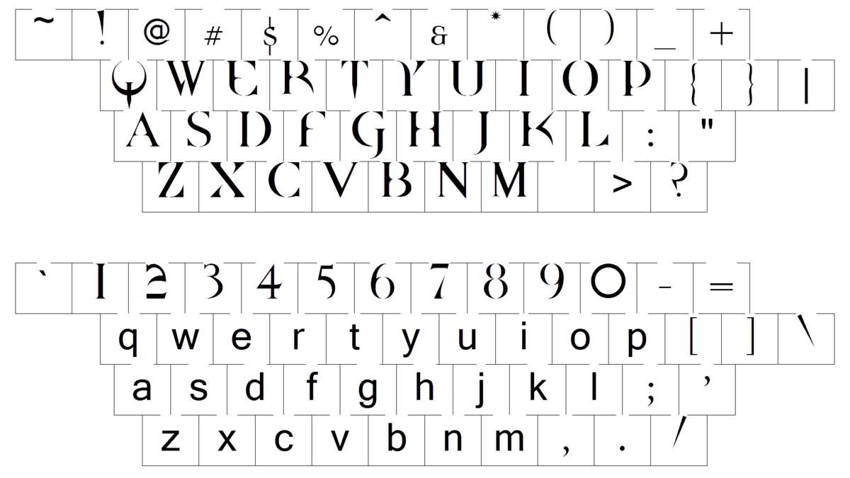
All capital letters of the Quake nameplate are executed in a sophisticated serif type-face, with thin lines, which are partially erased. The font named Quake was designed by Dead Pete, a game’s fan. The first letter of the wordmark is replaced by the famous Quake emblem.

The Quake emblem is a stylized interpretation of the letter “Q”, which is composed of a horseshoe-shaped figure with its ends pointing up and a vertically located nail, crossing its bottom part and pointing down.

In different sequels the vertical line is replaced by two or three of them, forming Roman numerals, showing the II or III parts of the popular game.

The Quake symbol resembles of the staff of the Satan, a historical symbol, signifying torture and the hellfire.

Font

Quake Font

The primary version of the Quake logo doesn’t contain any lettering, just the sharp and sleek symbol. However, for some of the occasions, the franchise has a different logo concept — with the emblem replacing the letter “Q” in a stylized wordmark, executed in a sharp designer typeface, which has somewhat in common with such commercial fonts as Haggard Small Caps or squadron Light, but, of course, with significant modifications of the characters’ contours.

As for the color palette of the Quake visual identity, it is mainly plain black on white, but other versions can be seen in silverish shades, which look cold and dangerous.

Join the Newsletter to get our latest content by email.

    Menu