Apex Legends, which has been often mentioned among the world’s most popular hero battle royale games, was created by the US video game development studio Respawn Entertainment and published by Electronic Arts. The design team was led by Jason McCord. The battle royale has two gameplay modes and supports cross-platform play.
Meaning and history
There are at least two possible versions of when the work on the game started. Mackey McCandlish, design director at Respawn Entertainment, claimed the development process had begun earlier than 2016. By 2018, the company’s team already had collaborated on the project.
Yet, Drew McCoy, who is executive producer, explained it all in a different way. He insisted that it was only in the spring of 2017 that development had started.
What both of them agreed about was that the team collaborating on the project included around 115 developers, which made it the company’s most labor-intensive project.
Another thing that is well-known is that until the game was launched, the public was unaware of what the new product would be. It was assumed that the studio was developing the third release in the Titanfall series.
What is Apex Legends
One of the most successful products of the Respawn Entertainment studio, Apex Legends is a free-to-play battle royale video game. What makes it similar to Titanfall, another project of the same studio, is that they are both set in the same science fiction universe.
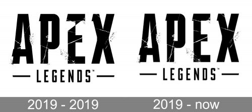
2019 – 2019
To see how this version is different from the more popular following Apex Legends logo, you’ll have to pay particular attention to the parts that are “damaged” or “worn out.” In this respect, the letter “E” in the old logo is particularly different as there is a comparatively large patch of white on its top. The top of the “P,” conversely, isn’t as “worn” as in the following logo.
Generally, though, the structure of the logo is the same, as are the typeface and the overall style.
2019 – present
The Apex Legends logo is dominated by the word “Apex” set in large capital letters. The glyphs are formed by lines of equal thickness, which makes them look stable and perfectly legible.
The type can’t be described either as a serif one or a sans serif one – it is rather a combination of both. The majority of the points where serifs are typically positioned don’t have any serifs. And yet, on each glyph, there is a serif-like element. Take, for instance, the left-hand side of the bar on the “A” or the left-hand top angles of the “P,” “E,” and “X.” This adds a unique touch to the type that is otherwise totally generic.
The word “Legends” below is set in lighter and smaller letters. While they also belong to a typeface of the same style, it doesn’t have the unique sharp elements on the letters. Instead, the ends of the glyphs are rounded. This seems like a wise approach as tiny details wouldn’t be seen in smaller sizes anyway.From each side of the lettering “Legends,” there is a short horizontal bar. It adds a touch of motion to the rather static design. Also, it balances the lengths of the two lines of the logo: due to the bars, both the lines have equal lengths.

Additionally, there is an icon featuring a shape that can be described as an open triangle with two fangs on the ends. The icon can be interpreted as a stylized “A.”
Colors and font
The default color scheme is black-and-white. The color of the wordmark depends on the background – the light background requires a black wordmark, while the dark background requires a white wordmark.
The type used in the Apex Legends logo is either a custom one or a customized one. Anyway, if you’re looking for a similar product, you may try the Agency FB Bold Compressed font, where the letters have similar proportions and are also formed by lines of equal thickness.


