![]() Super Smash Bros Logo PNG
Super Smash Bros Logo PNG
Super Smash Bros. is the name of a Nintendo video games series, which was first released in 1999. The main feature of the series is that it includes characters from all the most popular Nintendo games, such as Sonic, Mario, Kirby, and others. The game is available for all types of Nintendo consoles.
Meaning and history
![]()
The visual identity of the fighter video-game was changed with the release of each new version, though its graphical part, an icon, remained unchanged since 1999. During the first years, it was used separately, but starting in 2001 became an inevitable part of each Super Smash Bros logo.
1999 – 2001
![]()
The logo for the very first version of the Super Smash Bros game featured a bright yellow and black badge with red accents. It was an enlarged “Smash” inscription in all capitals, placed on a black background with triangular edges. The “Super” and “Bros.” Parts were set in the sides from the main wordmark, written in a narrow sans-serif typeface with clean and neat contours. The lettering used yellow color as the main and was outlined in black. As for the central part, it was also drawn in yellow but had a black shadow and a thick red outline.
![]()
2001 – 2008
![]()
The redesign of 2001 brought a new concept to the Super Smash Bros. visual identity. Now it featured a two-level inscription with all letters capitalized, and the first “S” in “Super” and “Smash” along with the past in “Bros” — enlarged. The wordmark was colored in gradient red and black and had a distinct white outline and black shadow. The “O” was replaced by the brand’s symbol, a solid circle with a stylized white cross on it.
2008 – 2014
![]()
In 2008 the logo, created in 2001, was modernized. The contours of the letters were refined and cleaned, making the lines thinner and more elegant, and the color palette was refreshed. Now all the white elements were replaced with light silver, and the gradient shades were added, which made the right part of the badge a bit lighter than the left one.
2014 – 2018
![]()
The redesign of 2008 made the Super Smash Bros visual identity brighter and bolder. The logotype changes its color palette and now the letter was colored in white, blue, and light orange, while their thick outline was black, and the additional graphics, placed under and on the right from the nameplate featured blue and red shades. The main graphical part of this logo version was flame and ice.
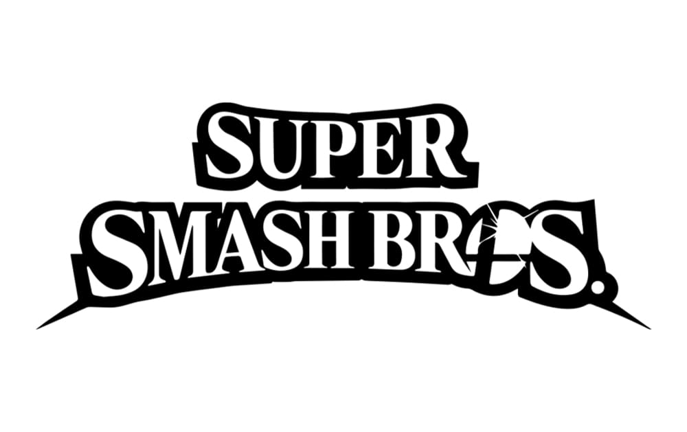
2018 – Today
![]()
In 2018 the logo was simplified. Keeping the contours of the letters and a slightly arched line of the bottom wordmark, the whole nameplate was set in flat monochrome, which looks modern and progressive. The game’s icon is now visible as never before, and all the lines and accents of the new insignia evoke a sense of professionalism and expertise.
Symbol
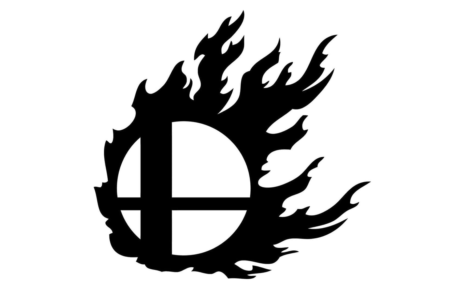
The Super Smash Bros symbol was introduced in 1999 and hasn’t changed at all by today. It is a solid black circle with a stylized white cross on it. The cross has its vertical bar thickened and moved to the left, while the horizontal line is thinner and placed slightly down.
On some of the official logo versions, the icon is drawn in red and silver with the colors reversed, black cross on white, though the composition never changes.
Font and color
The modern and stylish Super Smash Bros logotype in all capitals is executed in bold and elegant serif typefaces which looks very similar to such fonts as Kristopher Regular, Backlash Regular, and 5th Avenue Regular, but with some of the lines modified. The most special thing about the inscription is its slightly arched borders, which make the side letters a bit bigger than the ones in the middle.
The current Super Smash Bros logo is executed in a monochrome palette, having its official version drawn in black, but switched to white when placed on the cover of the game. It is a perfect choice for the game full of bright graphics, which allows the logo not to get lost and to always stand out.