Magic: The Gathering is a collectible and digital collectible card game developed by Richard Garfield. It was the first trading card game, which now boasts over 20 million players (as of late 2020). The game is also known under the names of Magic or MTG.
Meaning and history
Magic: The Gathering is the first of its kind and the world’s most popular collectible card game. It was created in 1993 by Richard Garfield, who also designed such gaming masterpieces as Lord of Tokyo, RoboRully, Netrunner, Rabbit Kingdom, and many others.
This magnificent card strategy game with timeless mechanics, which has long been a classic, was released in 1993 by Wizards of the Coast. The game immediately received the highest ratings and best reviews.From 1993-2015, the game was a nominee of the Årets Spill, Diana Jones, and winner of the Origins Awards, Mensa Select, Fairplay, and Deutscher Spiele Preis.
Four sets of around 700 new cardsare released each year, this is why it is never getting boring. The popularity of Magic is growing every day, and the number of players has already exceeded 20 million.
What is Magic: The Gathering?
Magic: The Gathering is the best-known and most popular collectible card game in the world, which was designed by Richard Garfield in 1993. Like all collectible games, it is of competitive interest on the one hand, and collectible interest on the other.
1993 – 2017
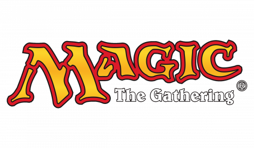
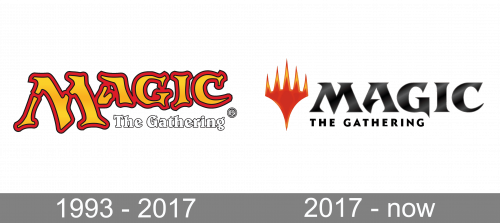
The project had a general release on August 5, 1993. Magic originated as a card game with an eclectic style inspired by traditional fantasy. The original Magic: The Gathering logo, which had been drawn by hand, emphasized this.
The wordmark was dominated by the large “M.” All the glyphs looked as if they had been drawn on an uneven surface and had been damaged by the time. This is how the writing in an ancient manuscript could have looked.
Despite the “ancient” effect, though, the glyphs had beautiful blue shades and trim in orange and black. The lettering “The Gathering” below was given in a simpler style featuring smaller white letters.
1999
The letters on the updated Magic logo looked not as rough as on the previous version, although they had preserved the slightly uneven borders and the gradient effect, which was less pronounced now. The blue was replaced by orange with red and black trim.
The modification was supposed to reflect the game’s growing popularity.
2015
The “ancient” filling of the lettering was replaced by a modern digital gradient. The company described the new color and pattern as “mystic orange.” The shape of the letters has remained unchanged, though.
2017 – Today
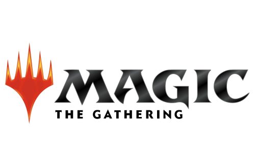
On April 21, 2018, the first printed product with the new logo (Dominaria Prerelease) was released. However, the emblem was presented online several months earlier.
The new logo featured the so-called Planeswalker symbol, which, according to a blog post on the official website, was “promoted to a command position in our identity system.” The symbol looked like a trident, except that it had five sharp ends.
The blogpost also promised that the symbol, which would be typically colored orange, would get the status of an icon “that signifies an official Magic branded product.” The orange was not solid but rather looked like the fire, with its darker spots and lighter yellowy highlights.
Next to the symbol, there was the word “Magic” in a beautiful custom type inspired by the shape of the Planeswalker symbol. The glyphs combined smooth arches and curves with sharp angles to create a dynamic and unique combination. The style of the letters was somewhat similar to the previous Magic: The Gathering logo, yet it was now more streamlined. The “ancient” effect of its predecessor was replaced by a modern tech touch.
The letters were either filled with a silver gradient (if placed over the black background) or black with a grayish gradient (if placed over the white background).
Font and Color
The custom sharp and aggressive uppercase lettering from the primary badge of Magic: The Gathering is set in a designer serif typeface with extra-bold bars decorated by pointed triangular serifs on their ends, which makes the silver characters look like sharp sword blades. The closest fonts to the one, used in this insignia, are, probably, Brotherland Regular, or Birthy Regular, but with major modifications of the contours.
As for the color palette of the Magic: The Gathering visual identity, it is based on a very dramatic combination of cold silver and hot red-to-orange gradients of the elements, and a plain black background, which adds a sense of danger and mystery.


