

![]() Windows Logo PNG
Windows Logo PNG
At the heart of the digital age, Windows stands as a pivotal operating system, orchestrating the seamless operation of millions of computers worldwide. This software behemoth, birthed by the visionary minds of Bill Gates and Paul Allen, has transformed from a mere graphical interface to an essential tool enveloping a broad spectrum of functionalities. Central to its design is the idea of a window—a beautiful metaphor for digital interaction, allowing users to navigate through a digital landscape as if gazing through windows into different virtual environments. The operation of Windows, marked by its user-friendly interface and robust capabilities, has become a cornerstone in the realm of computing, influencing the way individuals and businesses engage with technology.
Meaning and history
![]()
Founded by Bill Gates and Paul Allen in 1975, Microsoft embarked on a journey that would revolutionize the technology industry. Initially focusing on software development, the introduction of the first version of Windows in 1985 marked a pivotal moment in the company’s history. This graphical operating interface was designed to run atop MS-DOS, offering users a more intuitive way of interacting with their computers through the use of windows, icons, and menus.
Throughout the years, Windows evolved through various versions, each introducing significant advancements in technology and user experience. The release of Windows 95, for instance, brought forth the Start menu, taskbar, and the concept of plug-and-play hardware. As the internet era dawned, Windows adapted, integrating Internet Explorer as a key component of the operating system. Successive versions, including Windows XP and Windows 7, solidified Microsoft’s position in the market, showcasing innovations such as the Windows Server for enterprise environments, the introduction of Aero Glass for enhanced aesthetics, and improvements in security and stability.
Today, Microsoft stands as a behemoth in the tech industry, not just for its operating systems but for a diverse portfolio that includes the Xbox gaming console, LinkedIn, and cloud computing services through Azure. The company’s current position reflects its ability to innovate and adapt, maintaining relevance in an ever-evolving digital landscape. The Windows operating system, now complemented by Windows Server, Windows Essentials, and various other products, continues to be a cornerstone of Microsoft’s offerings, used by billions around the globe.
What is Windows?
Windows is the name of a computer operating system, which was developed by Microsoft and introduced in 1985. The system is available in more than 100 languages and is used by millions of people worldwide, being the world’s most popular operating system for personal computers.
1985 – 2001
![]()
The very first logo was developed in 1985 with the debut version of the program. It was a sky-blue and black image, composed of an emblem and a wordmark on its right. The emblem featured a stylized image of the window, formed by four squares of various sizes with white lines, separating them from each other. The “Microsoft Windows” wordmark in black was executed in a thin elegant serif typeface, representing professionalism and authority.
1990 – 2001
![]()
The logo was redesigned with the launch of Windows 3.0. It was a monochrome composition with a very realistic window picture and a wordmark placed under it. The emblem was executed in gradient shades, creating a mysterious feeling.
1992 – 2001
![]()
The “Flag” logo era for Windows began in 1992 and lasted until the 2010s. The first colorful badge was designed in 1992 and boasted a waving flag shape falling into pixels in its left part. The right part of the emblem featured four colorful squares — red, green, blue, and yellow in a thick black outline. The wordmark was still placed in the bottom part of the logo.
1993 – 2001
![]()
In 1993 the wordmark under the iconic flag was changed to Microsoft WindowsNT. It was executed in the same color palette, style and size as the previous version, so the “NT” lettering was the only change.
1994 – 2001
![]()
All of the elements of the logo were redrawn in 1994. The flag was enlarged, so was the “Windows” part of the lettering, which was now placed under the emblem, written in narrowed and elongated letters. As for the “Microsoft” part of the logotype, it was set vertically in the left from the “Windows”, also in black serif typeface.
Windows 95 logo ( 1995 – 2001 )
![]()
In 1995 the flag was placed diagonally on the left of the nameplate, which was now enlarged. The “Microsoft” part was executed in thin delicate lines and placed above the bold sans-serif “Windows” inscription, which was now the main part of the logo.
Windows NT logo ( 1996 – 2004 )
![]()
For the NT version the logo was changed again in 1996. The only change here was the replacement of the thin “95” digit with the extra-bold “NT” letters, set in the same stable and strong sans-serif typeface, as the “Windows” part of the inscriptions.
When did Windows change its logo?
Windows first altered its logo in 1990, introducing the logo – 1990-1992, marking the beginning of a new era in the company’s design journey. This period was characterized by a shift towards more modern and recognizable symbols, emphasizing trademark rights and setting a precedent for future updates, including significant changes like the Windows logo – 2012-2021, showcasing the evolution of the brand’s identity in response to technological advancements and market demands.
Windows 98 logo ( 1998 – 2006)
![]()
With the release of Windows 98 in 1998 the logo of Windows was refined. It was actually the same emblem, as the one, used by the software during the previous period, but with the bold and heavy “NT” replaced by the “98” executed in thinner lines. All other elements of the composition remained untouched.
Windows 2000 logo ( 2000 – 2010 )
![]()
The logo, created for Windows in 2000, was probably the most colorful among all the versions of the software’s emblems. It was still the bold black inscription, but now it was placed under geometric and multicolor graphics, formed by numerous square frames in orange, yellow and different shades of blue. Inside the bigger square, there was an iconic Windows flag set on a white background.
Windows ME logo ( 2000 – 2006 )
![]()
In 2000 two versions of the program were introduced — Windows 2000 and Windows ME, they both had their emblems redesigned. The signature flag was placed in a square frame, and in the 2000 version, the frame was blue with red, accompanied by yellow, red, and blue squares, while the ME edition featured green as the main color.
Windows XP logo ( 2001 – 2014 )
![]()
The visual identity was redesigned again in 2001. The black frame was removed from the flag, so now the emblem was only composed of four waving squares, which changed their colors to lighter ones. As for the wordmark, it was also refined and now featured a thinner and more elegant sans-serif typeface.
Windows Vista logo ( 2006 – 2017 )
![]()
In 2006, with the release of Windows Vista, the emblem got flatter and more modern design. It was still executed in gradient colors, but the texture of the squares was in 2D. The word “Microsoft” is removed from the logo, which makes it look more minimalist and professional.
Windows 7 logo ( 2009 – 2020 )
![]()
With the launch of Windows 7 in 2009, the logo was slightly changed again — the emblem is now enlarged and the colors of the squares are more intense.
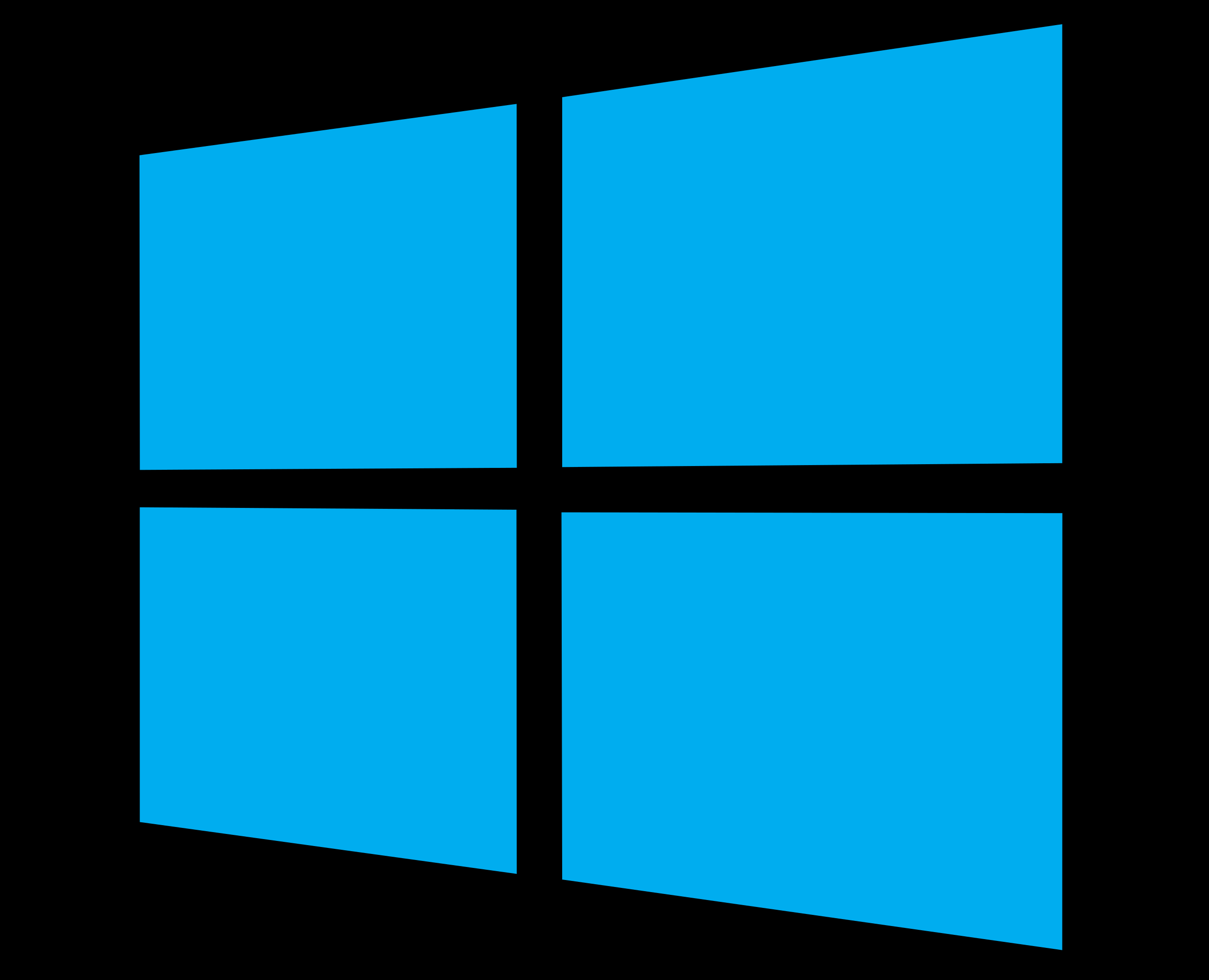
Windows 8 logo ( 2012 – 2016 )
![]()
The new era of the visual identity design starts for Windows in 2012. Now the company uses only blue color for its logo. The wave shape is gone, the emblem is strict and geometric. It is still composed of four squares, but now the window symbol is placed in half-turn.
2013 – Today
![]()
The emblem, created for Windows 8.1 is flat and modest, enough professionally executed, and evokes a sense of confidence and modernity. It is a solid square, composed of four smaller blue ones, separated with thin white lines. The emblem, placed in ¾ is set on the left from a neat sans-serif logotype in the title case.
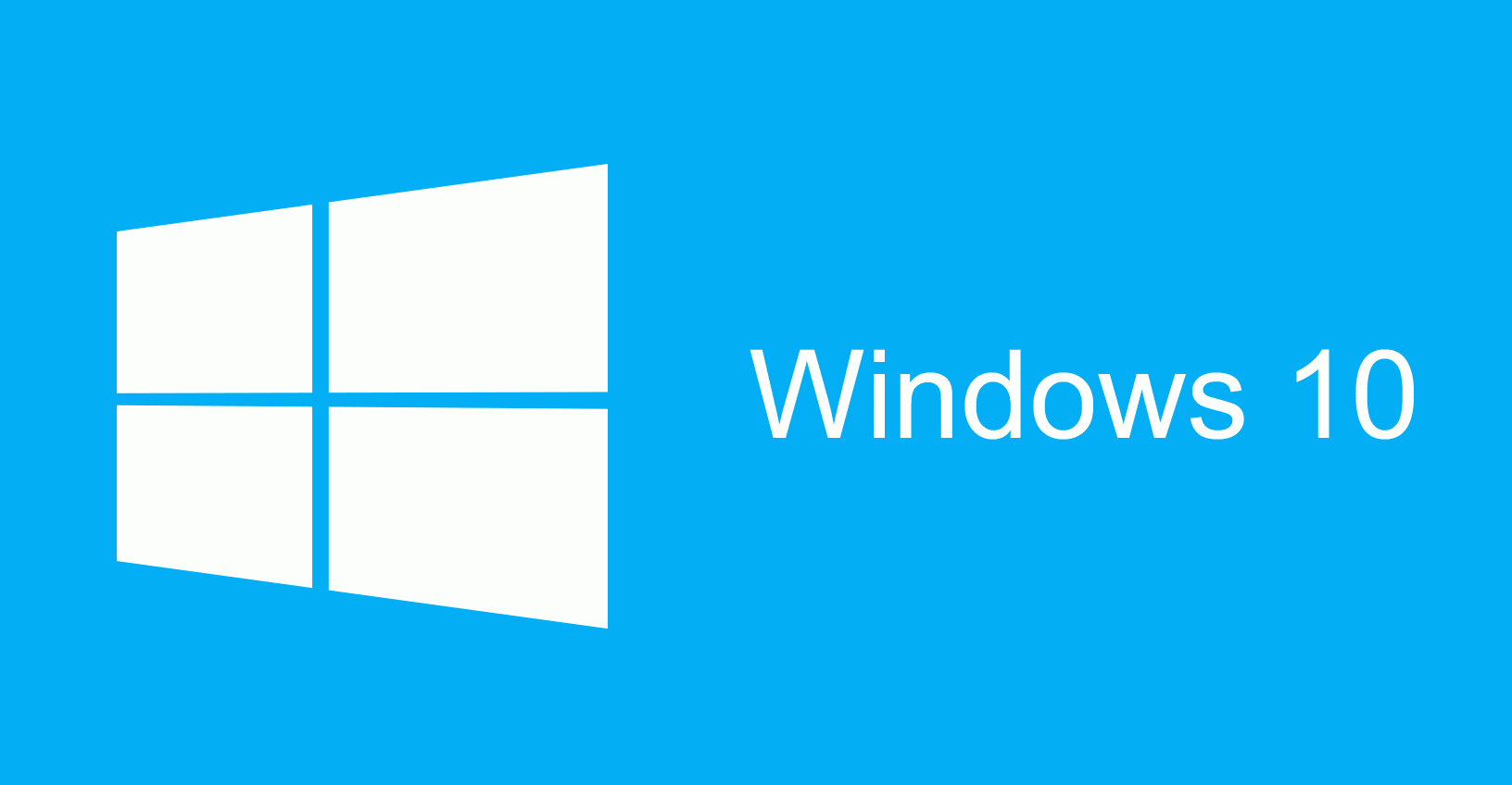
Windows 10 logo ( 2015 – Today )
![]()
In 2015 the sky-blue of the logo is replaced by a calmer and darker tone, which looks more professional and evokes a sense of reliability and protection. The wordmark was also refined and became thinner and cleaner.
Windows 10x logo ( 2020 – Today )
![]()
The latest version of the logo was created for Windows 10X in 2020. The wordmark still uses the shade of blue from the previous version, but the emblem is now drawn in gradient tones, looking brighter and fresher.
The simple yet strong inscription is written in a traditional sans-serif typeface, which is Myriad Pro. It balanced the bold and bright emblem, adding a sense of expertise and security.
2021 – now
![]()
For Windows 11, released in 2021, the company has simplified its logo, placing the emblem straight and flat, and using one shade of blue for all the elements of the badge. Now the four equal blue square form a large one, with thin white lines of a negative space, and are followed by a title case inscription in a bold sans-serif font, with the “11” in the same style.
Symbol
It was only in 2001 that the logo saw a more impactful update, which was connected with the release of XP. The black outline was gone, the overall look of the logotype became clearer. Also, certain graphic tools were applied, due to which the logo acquired a 3D look.
Getting ready for the release of the Vista operating system, the designers updated the emblem once again. The “flag” was placed inside a circle shape with dark blue filler. Also, one more new visual tool was applied to the symbol, adding dimension. The shade of blue was slightly modified.
The release of Windows 7 coincided with the introduction of an updated symbol. This time, the circle shape was removed leaving a logotype cleaner and fresher. Actually, it looked exactly as the 2001 version, except for a couple of graphic effects and a subtle shift in colors.
The 2012 emblem
Probably the most noticeable change to the Windows logo in this century coincided with the release of the Windows 8 operating system. The four-color emblem was replaced by a simple light blue one created by Wolff Olins. The aim was to make the icon closer to the new Metro design language. One of the distinctive features of this design language was that it focused on one color.
The new color scheme was not the only change. The 2012 logo featured a realistic window design instead of the usual emblem resembling a flag.
What was the original Microsoft logo?
The original Microsoft logo featured the “Blibbet”, a playful and iconic symbol that represented the company’s early commitment to innovation in software development. Over time, as Microsoft expanded its portfolio to include products like Windows and Skype, the need for a more unified and professional image led to the adoption of new branding elements, such as the Windows wordmarks and various product logos, reflecting the company’s growth and evolution in the tech industry.
Windows 10 logo
![]()
In comparison with the previous version, the Windows 10 logo features a darker shade of blue. Also, letters are somewhat thinner. The beta version of the operating system was released in 2014, while the final version appeared at the market in 2015.
Font
![]()
Starting with Windows 8, the wordmarks used by the company were based on the Segoe font, overseen by type designer Simon Daniels, marking a notable transition in Microsoft’s design philosophy. The type has been slightly modified from its original state, incorporating elements that reflect Microsoft’s evolving brand identity. This redesign of the logo integrates a brief history of Microsoft’s typographical choices, which range from the use of font awesome to modular windows logo templates, showcasing the company’s commitment to flexibility and innovation in its visual presentation. Additionally, the inclusion of SVG code development reflects the technical precision behind the creation of Microsoft’s wordmarks, ensuring they are scalable to both large and small sizes without losing clarity.
Color
![]()
The current version of the Windows logo sports only one color, dark blue, a choice that adheres to the aesthetic principles of the New Metro design language. This singular focus on a dark-blue hue represents a departure from the multi-colored approach seen in predecessors like the windows logo – 2012 flags and the original windows logo, which featured squares of different sizes and a more vibrant color palette. The transition to a monochromatic scheme underscores Microsoft’s desire for a sleek, modern look that aligns with contemporary design trends while maintaining a connection to the company’s heritage. The use of dark-grey in auxiliary elements, such as the windows RT logo and the azure logo, complements the primary color, creating a cohesive visual identity across Microsoft’s product line.
The evolution of the Windows logo from its original multi-colored iterations, including the windows logo – 1992 and windows logo – 2002, to the streamlined, dark-blue version reflects broader changes in the tech industry’s design preferences, influenced by the minimalist aesthetics of companies like Google and Apple. This shift towards simplicity can also be seen in the adoption of thick borders and a uniform color scheme, which facilitate greater legibility and recognition across various digital platforms, from browsers to wallpaper options.
Incorporating these elements into the narrative not only enriches the description but also provides a comprehensive overview of the factors that have shaped the Windows logo’s evolution, offering readers an own perspective on the significance of design in building and maintaining a brand’s visual identity.
What does the Windows logo key look like?
The Windows logo key, especially during the key logo – 2012-2021 period, showcased a simplified yet recognizable emblem of the Windows operating system. This design, characterized by its blue-purple hue and thick border, was a key element of keyboards and software interfaces, providing users with quick access to the Start menu and other essential features, symbolizing Windows’ commitment to efficiency and user-friendly design.


