The baseball club was established around 1976. It got its name after the so-called “Nashville sound,” a type of country music that was born in the area in the middle of the 20th century.
Meaning and history
Nashville Sounds, a Minor League Baseball club from Tennessee, was established in 1978 and has never changed its meaningful for the region name. However, the club’s stability in its identity was not transmitted to its affiliates: throughout their quite a long history the Sounds have had ten Major League Baseball partnerships.
Nashville Sounds started their long way in baseball by playing in the Southern League as the Double-A affiliate Cincinnati Reds, but it only lasted for one season. Already in 1980, the Sounds were invited by the New York Yankees, and this partnership lasted until 1984.
After that, there were several more short affiliations with such clubs as the Detroit Tigers, Cincinnati Reds again, Chicago White Sox, and Pittsburgh Pirates. For the longest, Nashville Sounds played under the wing of Milwaukee Brewers (2005 — 2014), changing them to Oakland Athletics and Texas Rangers, but coming back in 2021.
As for the professional achievements in the League, Nashville Sounds have won many titles: three League ones, two Conference, and eleven (!) Division titles, writing a history of a strong, experienced, and confident player, and a dangerous competitor.
1985
The logo, designed for the Nashville Sounds baseball club in 1985, featured a bright red-and-blue image of a baseball player, aiming to hit the ball with a large red guitar. It was drawn on a plain white background without any framing or additional lettering. This version of the logo only stayed active for one season.
1986 – 1992
The redesign of 1986 has kept the main image untouched, but placed it inside a frame, stylized as a baseball. Drawn in thin blue lines, the baseball shade was accompanied by thick tick-like blue stitches, which also played the role of arrowheads, pointing at the center of the composition, where the baseball played with a guitar was drawn.
1993 – 1997
Another redesign was held by the Nashville Sounds Club in 1993, and this time it was more significant. The concept of the centerpiece remained untouched, but it was redrawn in a more professional caricaturish style, with enlarged feet of the player. The contours of the baseball frame were also cleaned up and refined, and now the emblem was placed under a bold cursive wordmark, written in solid red characters with a thick blue shadow.
1998 – 2004
A completely new concept of the Nashville Sounds visual identity was introduced in 1998. A stylish and pretty minimalistic badge was executed in a classy black, red, and white color palette, and looked super progressive and strong. It was a solid roundel with a contoured musical note drawn in the center. The top left angle of the note had a white image of a baseball. The name of the team was written in narrowed white capitals on the sides of the note.
2005 – 2014
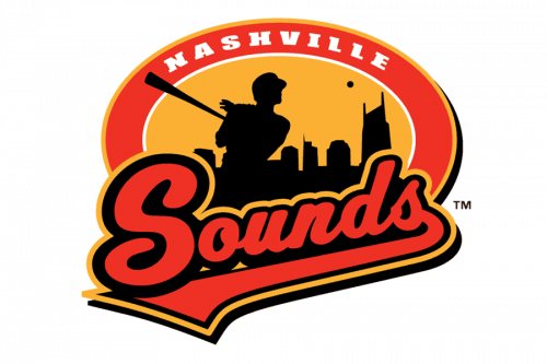 The 1998 Nashville Sounds logo shows a player who has just hit a baseball. There’s actually only the black outline of the player, while behind his back the Nashville skyline, also in black, can be seen. Placed over the orange background, it has a slightly romantic sunset feel. The logo has an oval shape, with the word “Sounds” in red positioned on the forefront.
2015 – 2018
 In 2015, a logo with a large red “N” over a grey shield was introduced. Interestingly enough, while the Nashville Sounds logo doesn’t copy any element from the emblem of the parent team, the “N” is somewhat reminiscent in style of the “A” from the Oakland Athletics logo.
2019 – Today
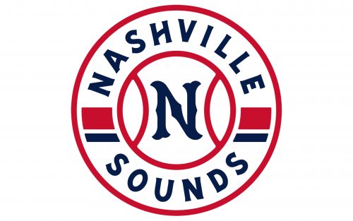
The Nashville Sounds visual identity created in 2019 boasts a bright and fresh circular badge in white, blue, and Ted color palette, which is the most patriotic one. The main color of the emblem is white, and the circle featured a central part, stylized as a baseball with a red outline, where the custom blue letter “N” is placed, and the “Nashville Sounds” lettering in the uppercase century placed around the perimeter. The inscription is separated by thick red and blue lines, which add recognizability and memorability to the logo.
Colors
Unlike many other affiliate teams, the Nashville Sounds created an absolutely independent palette (red, black, and platinum silver). Not a single color has been borrowed from the logo of their parent team.
What is Nashville Sounds?
Nashville Sounds are the name of the baseball club from Tennessee State, which was established in 1978. Today the club competes in the Minor League Baseball and is managed by Rick Sweet.


