The Super Bowl is the name in American soccer of the final game for the United States National Football League (NFL) championship. The game and its accompanying celebration over the years, Super Bowl Sunday, has already become a national holiday in the United States, given that the first game was played in the late 1960s.
Meaning and history
Every year in early February, the Super Bowl, the final game of the National Football League, takes place in the United States. From a purely sporting event, the Super Bowl has long ago turned into a super show.
The first Super Bowl game was played in 1967. Since 1967, when the National Football League and the American Football League began the process of merging, the Super Bowl has grown in popularity until it became a national phenomenon. Now the final game of the season, which determines the NFL champion, is a national holiday in the United States.
When are Super Bowl logos made?
Super Bowl logos are typically crafted months in advance, incorporating elements that reflect the spirit and culture of the host city. For example, the Super Bowl LIX logo, inspired by the vibrant atmosphere of New Orleans, cleverly integrated motifs reminiscent of the city’s rich Mardi Gras tradition and iconic wrought-iron balconies. The selection process often involves local artists, such as Tahj Williams, known as the queen of her black masking Indian tribe, highlighting the unique beading tradition of Louisiana. This collaboration underscores the Super Bowl’s commitment to celebrating local heritage and diversity in its branding.
Super Bowl is one of the most significant events in America, as around 70% of all homes in the U.S. that have a TV, turn on the game that night. Some watch the game, some watch the most expensive commercials, and some watch the top pop artists perform. On average, 100 million television viewers watch the Super Bowl each year. On American television, the final game of the NFL season is the most-watched game every year.
The TV broadcast of the game is so popular that the match itself has been moved to the evening over the years so that halftime falls on Sunday prime time. Various major brands produce separate commercials, especially for this broadcast. And during halftime, the stadium turns into a concert venue. The Super Bowl halftime show lasts 20 to 30 minutes and includes a 12- to 14-minute performance by an artist. The first person to take the performance in such a half-time show to a whole new level was Michael Jackson in 1993.
Since then, performing at the Super Bowl has become an important line on every major pop artist’s resume. In the 21st century, Aerosmith, N’Sync, U2, Janet Jackson, Justin Timberlake, Paul McCartney, The Rolling Stones, Madonna, The Black Eyed Peas, Bruno Mars, Katy Perry, and many others have performed on the biggest stage in the world.
The main trophy of the Super Bowl is the Vince Lombardi Trophy, named in honor of legendary coach Vince Lombardi. Every year the jewelry house Tiffany&Co makes the main trophy cup from 3 kg of silver.
What is Super Bowl?
The Super Bowl is the final game of the season of the National Football League, the premier championship in American football. The two strongest teams determine the champion in one game. The first Super Bowl was held in 1967, and the first winner of the title was the Green Bay Packers.
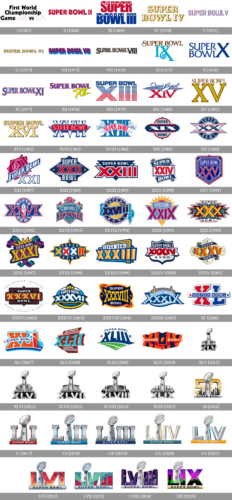
In terms of visual identity, for each new Super Bowl, a new logo was created, but all of them are bright and bold, reflecting the level and significance of the event. However, the history of Super Bowl logos can be split into periods. Thus, after the 50th anniversary of the event, the badges are being designed in one style, with just slight refinements.
Super Bowl I (1967)
The very first Super Bowl logo was completely different from all the following badges, executed in bright shades and using massive geometric elements. The original logo was based on the three-leveled lettering in bold black sans-serif characters, with the “AFL” and “NFL” abbreviations enlarged and written in outlined font, with the contours of AFL in red, and the NFL ones — in blue.
Super Bowl II (1968)
The event was renamed Super Bowl by the second season, and the new logo featured a modernized wordmark. It was a bold red uppercase inscription in a geometric sans-serif typeface, which each character outlined in blue. The intense and stable lettering was written against a plain white background with no graphical additions.
Super Bowl III (1969)
For the third Super Bowl, the logo was redesigned in a more powerful and confident style: the new composition featured two-leveled lettering in red and blue, with both lines set in one bold sans-serif typeface, and each of the characters was decorated by small white five-pointed stars. Some of the letters had two stars placed on their top parts, and some as just one.
Super Bowl IV (1970)
The Super Bowl IV logo was drawn in a completely different style — a more traditional and elegant one. It was a two-leveled inscription a bold serif typeface, with the letters featuring white bodies and pretty thick golden shadows. The color palette and the font of the lettering made the badge look very sophisticated and accented to the significance of the event.
Super Bowl V (1971)
The red and blue color palette came back by the fifth Super Bowl. It was a modern uppercase lettering set in one line, with the outlined characters executed in a futuristic geometric sans-serif typeface with rounded and slightly narrowed shapes and straight cuts of the bars. The logo looked very modern and progressive for its times, resembling a neon banner.
Super Bowl VI (1972)
The logo of Super Bowl VI was again executed in a gold color palette, but with more intense shades, than in the fourth badge. The one-line lettering was written in a super fancy wishbone serif font with slightly extended uppercase characters set in gradient gold. Despite the chic color palette; the font of the wordmark made it look very American and patriotic.
Super Bowl VII (1973)
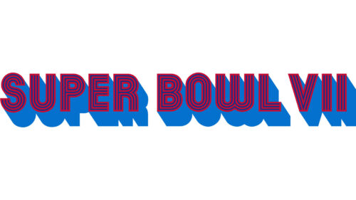
For the seventh Super Bowl event the designer decided to use the same style of the typeface, as they had on the Super Bowl V badge but made it more intense and bold. The solid dark-red characters featured a wide blue shadow, which created a sense of motion and created a very bright and strong image.
Super Bowl VIII (1974)
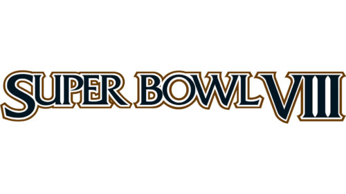
The logo, created for Super Bowl VIII looked more like a title of a popular nowadays series. It was set in a fancy golf and black color palette and used a very sophisticated serif typeface for its characters. The “S” and the “VIII” were enlarged, creating a frame for the rest of the inscription, which was all set in uppercase. The contours of the “framing” characters were also bolder and had more visible black bodies.
Super Bowl IX (1975)
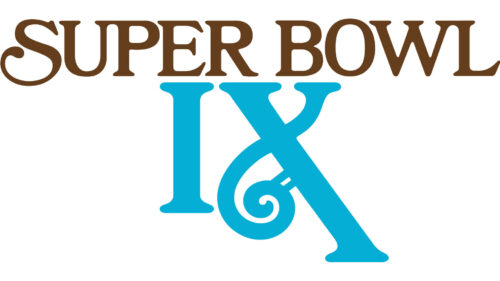
The redesigned logo of Super Bowl IX was executed in a brown and turquoise color palette, and set in two levels, with the elegant “Super Bowl” in chocolate brown placed above the enlarged “IX” in bright turquoise. The “S” and the “X” in “IX” had their lines elongated and curved, which created a sense of playfulness and looked very fancy.
Super Bowl X (1976)
For the tenth anniversary of the event, the logo was redrawn in intense blue, with the “Super Bowl” party split into two levels, and the enlarged “X” placed on the right of it. All characters of the wordmark were set in one shade and used a very sophisticated typeface with sharp elements on the ends of some bars.
Super Bowl XI (1977)
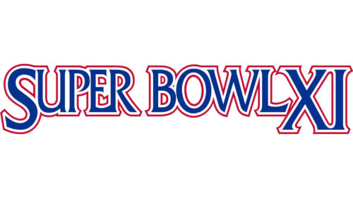
The logo of the Super Bowl XI looked pretty much the same as the one, designed for the Super Bowl VIII, but with a new color palette and slightly enlarged characters. The serif uppercase lettering was now set in blue, and each character was outlined in red. The “S” and the “XI” were larger and a bit bolder than the other letters of the logotype.
Super Bowl XII (1978)
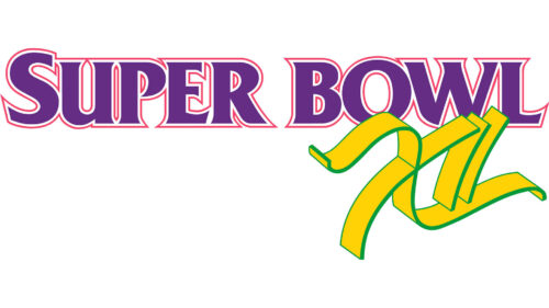
For the twelfth Super Bowl, a new color palette was adopted, and stylistically the badge was now more complicated. It was a purple uppercase lettering in an elegant serif font with sharp serifs and each letter was outlined in a lighter shade of purple, set above an enlarged acid-yellow “XII” with lime-green lines on it. The numeric part of the logo was hand-drawn, with elongated wavy lines of the characters.
Super Bowl XIII (1979)
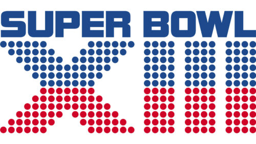
A traditional for the event blue and red color palette came back to the logo of Super Bowl XIII. As for the style, it was something new, with massive geometric elements and concrete stability of the wordmark and the graphical part. The composition featured a solid blue uppercase “Super Bowl” lettering in an extended geometric sans-serif typeface, placed above the massive “XIII”, where each element was formed by numerous solid dots — the blue ones in the upper halves, and the red ones — in the bottom ones.
When was the Super Bowl logo released?
The unveiling of the Super Bowl logo usually occurs in January, the year before the big game. This strategic timing allows for an extended period of anticipation and marketing leading up to the event. For instance, the logo for Super Bowl LIX, held in the Caesars Superdome, home of Super Bowl LIX in New Orleans, was revealed last month, capturing the essence of the Big Easy with nods to its famous Mardi Gras celebrations and architectural beauty, setting the stage for next year’s showdown.
Super Bowl XIV (1980)
The redesign of the Super Bowl logo by the 14th season has adopted a more elegant yet still modern and confident style and kept the iconic blue and red color palette. The “Super Bowl” lettering was now set in a handwritten script font, in blue, with a double-underlined separating it from the enlarged red “XIV” set in an extended serif typeface.
Super Bowl XV (1981)
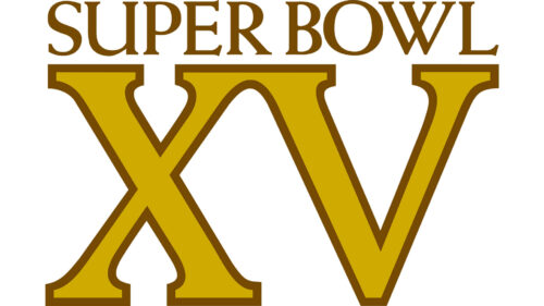
The Super Bowl XV badge was set in a gold and brown color palette, and an elegant serif typeface. The upper part of the logo featured a medium-weight uppercase “Super Bowl” wordmark in brown, while the bottom part comprised an enlarged “XV” with the characters set in gold and outlined in brown. The logo was well-balanced and looked quite traditional.
Super Bowl XVI (1982)
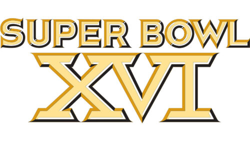
The logo of the Super Bowl XVI was set in a vivid and delightful light-yellow shade, with some blue and dark-yellow lines in the outline of the characters. The composition remained the same — an uppercase “Super Bowl” lettering above the enlarged “XVI”, but the execution was new. The typeface turned bolder and sharper, with the whole mood of the badge representing confidence and strength.
Super Bowl XVII (1983)
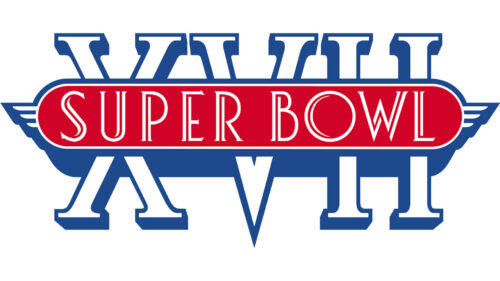
For the 17th Super Bowl event a logo was completely redrawn, with the blue, red, and white color palette brought back. It was an Art-Deco style logo; with the enlarged contoured “XVII” in elegant shapes, overlapped by a solid red banner where the narrowed “Super Bowl” inscription was written in a modern font with fancy contours of the characters.
Super Bowl XVIII (1984)
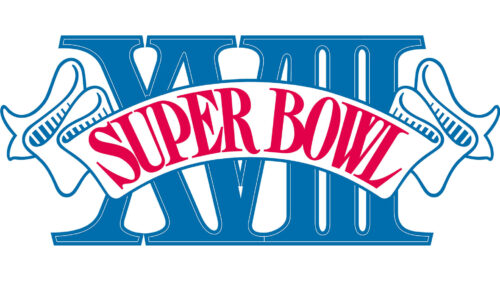
The logo of Super Bowl XVIII used lighter shades of blue and red for its composition, which made the badge look friendlier and more vibrant. The logo was based on a massive serif “XVIII” in medium blue, overlapped by a white arched ribbon in a thin blue outline. The ribbon had wavy ends and featured a bold red “Super Bowl” lettering in a narrowed serif font written on it.
Super Bowl XIX (1985)
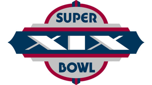
A very brutal and bold logo was created for Super Bowl XIX. It was a badge, that differed a lot from all the previous versions. The logo featured a rounded light-gray medallion with the “Super Bowl” inscription written on its top and bottom parts in solid blue characters set in a modern sans-serif font. The two parts of the wordmark were separated by a wide geometric banner, overlapping the roundel in the center. The banner was composed of three layers — the upper one in blue, with the white massive “XIX” written on it, the second layer in red, and the third — in gray.
Super Bowl XX (1986)
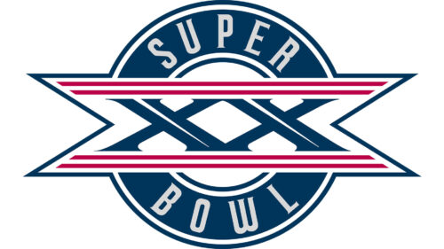
For the twentieth Super Bowl, the logo was also set in the patriotic blue, white, and red palette, but the composition differed from other versions. It was a white circular badge with an extra-wide blue frame and narrowed uppercase lettering written around its perimeter in thin white lines. The roundel was overlapped by a horizontally-oriented banner with triangular cut-outs on the sides. The sharpness of the angles in the banner was supported by the lines of the “XX”; wringer in bold blue bars on a white background, and enclosed between the four horizontal lines in red.
Super Bowl XXI (1987)
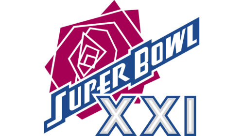
An abstract geometric red rose in a dark and soft shade was added to the logo of the Super Bowl XXI. Drawn with straight contours and white outlines, the flower was set on the background and overlapped by white lettering on a solid blue banner, with the “XXI” set in a stable sans-serif, with white bodies and blue outlines of the characters.
Super Bowl XXII (1988)
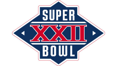
The Super Bowl XXII logo was brutal and edgy, with geometric elements and intense colors. It was a solid blue rhombus in a double white and red outline, with the enlarged red “XXII” in a stable serif font set in the center; and the white “Super Bowl” lettering placed on Ive and beyond the red part. The white inscription was also set over a blue background, creating an additional square figure on the rhombus.
Super Bowl XXIII (1989)
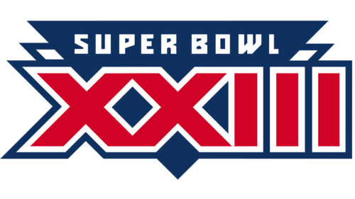
The style and the color palette were kept during the redesign of the logo for the 23rd Super Bowl, but the composition was changed. Now it was a geometric badge formed by two overlapping triangles pointing down. The bottom layer was set in white and outlined in blue, while the top one was solid blue. This solid blue element featured a bold white lettering written along its upper border, and a massive red “XXIII” with a double white and red outline.
Super Bowl XXIV (1990)
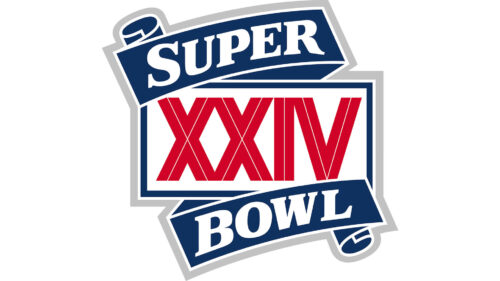
The new logo looked quite modest and simple, compared to several previous versions. Even though the color palette was still the same — red, blue, and white. The main element of the Super Bowl XXIV badge was a white rectangle in a blue outline, with the red “XXIV” set on it in a narrowed geometric sans-serif font. The banner was decorated by two solid blue ribbons with the white “Super Bowl” lettering set in them in a bold serif typeface.
Super Bowl XXV (1991)
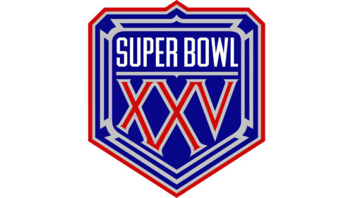
A geometric crest became the base of the Super Bowl XXV logo. Set in blue, the sharp shield with the triangular bottom was outlined in red and decorated by light-silver lines all over its body. The white uppercase lettering in a slightly narrowed modern sans-serif font was placed in the top part of the crest, while the stylized red “XXV” with gray outlines took the largest part of the logo.
Super Bowl XXVI (1992)
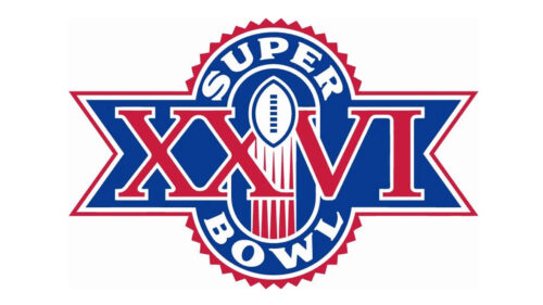
The Super Bowl XXVI logo had an interesting shape with a vertically-oriented oval overlapped by a wide ribbon with triangular cut-outs on the sides. The banner was colored solid blue and outlined in red and white. The central part of the logo depicted a vertically flying white ball in a blue outline, which was leaving white and red traces. The lettering was arched above and beyond the image, set in white capitals of a bold and extended serif font. As for the “XXVI”, it was written in massive red serif capitals in the horizontal part of the logo.
Super Bowl XXVII (1993)
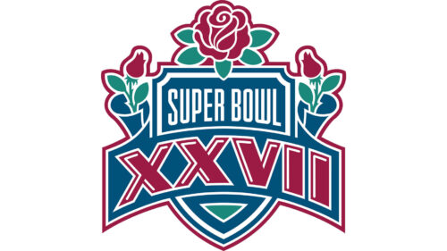
The red rose decor was brought back to the Super Bowl XXVII badge, but modified and extended. The large flower was set on top of the blue triangular crest, accompanied by two smaller closed roses on the sides. The white “Super Bowl” inscription was set in the narrowed sans-serif font above the massively enlarged ribbon with a bold red “XXVII” written on it. The badge was decorated by small green elements — on the leaves of the flowers and small triangles on the crest — which added more vibrancy to the composition.
Super Bowl XXVIII (1994)
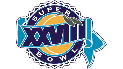
For the 28th Super Bowl the logo, which opened a whole era of colorful designs, was created. A rounded medallion with an orange fruit in the center had a wide blue outline with white lettering along its perimeter, and a smooth light-blue ribbon crossing it. The dark-blue “XXVIII” was written along the ribbon and decorated by two small green leaves of the fruit. It was a very delightful eye-catching logo, which looked completely different from all the previous versions.
What does the Super Bowl logo mean?
Each Super Bowl logo is imbued with symbolism that honors the host city’s culture, landmarks, and history. Taking the Super Bowl LIX logo as an example, the design pays homage to New Orleans’ French Quarter with elements like bead motifs and references to the local beading tradition, serving as a nod to the city’s vibrant Mardi Gras festivities. The logo acts as a visual celebration of the host city, blending sports with local culture and traditions, and for some, it even sparks discussions around themes like the “Super Bowl logo conspiracy theory,” though often these theories are dismissed as mere fascination rather than fact.
Super Bowl XXIX (1995)
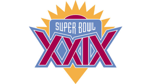
The next Super Howl logo was even brighter. It was composed of a solid yellow triangle, pointing down and decorated with a geometric sun on top. The crest was overlapped by a light-blue banner with the white “Super Bowl” written in small capitals in its top part, and a massive geometric “XXIX” set in an intense crimson shade, and balanced by a small element in the yellow sun above the blue part.
Super Bowl XXX (1996)
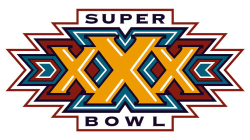
For the thirtieth Super Bowl event the logo gained deeper shades, more volume, and sharper lines. It was a geometric banner with sharp triangular Enders and a massive intense yellow “XXX” in the center. The middle “X” was larger than the two on the sides. Each of the “X”s was placed on a separate element — burgundy ones for the smaller characters, and a light blue for the largest. The “Super Bowl” inscription was placed above and beyond the colorful composition, written in wide sans-serif characters against a plain white background.
Super Bowl XXXI (1997)
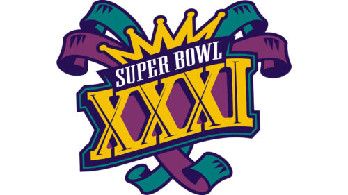
The Super Bowl XXXI logo looked pretty much like a harlequin hat, set in a bright green and purple color palette with yellow elements. The logo featured several ribbons with curved ends, a yellow drown on top, and a voluminous yellow “XXXI” in gradients, accompanied by a delicate white “Super Bowl” inscription in small capitals of a modern sans-serif typeface.
Super Bowl XXXII (1998)
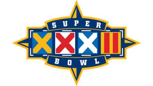
If the previous logo reminded me circus, the one, designed for Super Bowl XXXII resembled a slot machine. Each of the elements in “XXXII” was drawn in a bold rounded sans-serif font and placed in a separate square. The squares were colored blue, white, and yellow, while the characters — in yellow, red, and white. This composition was placed on a sharp four-pointed star in blue and yellow and accompanied by two arched blue ribbons with the white “Super Bowl” lettering set over them.
Super Bowl XXXIII (1999)
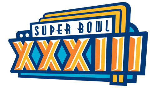
The logo of the Super Bowl XXXIII was bright and voluminous. The enlarged “XXXIII” was set in yellow and orange, with each character outlined in dark blue. The element was placed on a light blue banner in the same dark outline, and accompanied by a white badge with the blue “Super Bowl” lettering in a fancy Art-Deco sans-serif typeface. The top part of the logo was decorated with yellow stripes, finishing along the right edge of the banner.
Super Bowl XXXIV (2000)
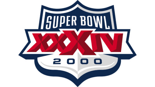
For Super Bowl XXXIV the logo was executed in a blue, white, and red color palette and used classic shapes but with modern features. It was an elegant distinctive crest with a banner, comprising the red “XXXIV”, overlapping it. The top part of the light-gray and white crest was decorated by a blue segment with the white “Super Bowl” lettering on it.
Super Bowl XXXV (2001)
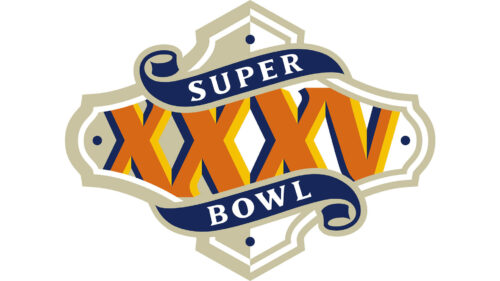
The Super Bowl XXXV logo featured a completely new event color palette. It looked tender and friendly, despite the massive shapes of the “XXXV” characters. The main part of the wordmark was set in solid orange with a blue outline, placed on a light-peach background in a fancy frame, and decorated by two elegant ribbons in blue, with the white serif inscription on them.
Super Bowl XXXVI (2002)
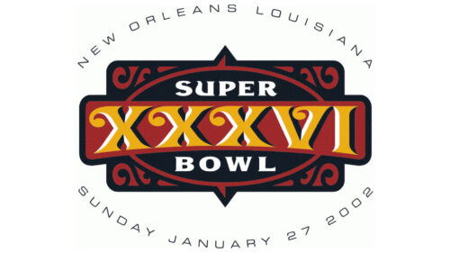
The patriotic style and color palette were adopted by the designers for the Super Bowl XXXVI logo. The white “XXXVI” with blue shadow was placed over a striped red and white banner, which repeated the contours of the USA. As for the “Super Bowl” wordmark, it was written in bold white capitals on a blue narrow rectangular badge, attached to the top part of the logo. The whole composition was inclined to the left, which made it look voluminous and vivid.
Super Bowl XXXVII (2003)
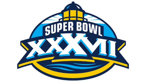
The shape of the Super Bowl XXXVII was changed to a horizontally-oriented oval, and the color palette — to blue, white, and yellow. The white and sky-blue “XXXVIi” was set on a dark-blue ribbon with yellow edges, placed across the oval medallion, with a yellow lighthouse drawn above the bold white “Super Bowl” inscription in a dark-blue outline. The additional lettering was set in dark blue and written around the graphical badge, in small capitals.
Super Bowl XXXVIII (2004)
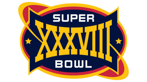
The space theme was used in the design of the Super Bowl XXXVIII badge. The composition was built around a solid dark-blue medallion in a shape of a horizontally-oriented oval, resembling a football. The badge was crossed by an orbit, with the whole element outlined in orange and yellow. The central part of the logo was taken by an enlarged yellow “XXXVIII” in a bold geometric serif font, while the white “Super Bowl” was written in small capitals of a modern serif, and placed on the top and bottom parts of the blue badge.
Super Bowl XXXIX (2005)
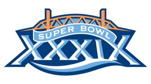
The Super Bowl XXXIX logo was executed in a tender and elegant color palette, with sophisticated contours of the elements. It was a distinctive sky-blue “XXXIX” inscription with small white strokes adding volume, and a dark blue outline, which merged into a background of the graphical part of the logo, where a yellow and blue bridge was depicted. As for the “Super Bowl” lettering, it was written in white capitals of a modern font over a wavy sky-blue ribbon, placed between the bridge and the “XXXIX”.
Super Bowl XL (2006)
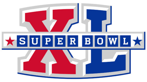
The fortieth Super Bowl took place in Detroit and had a very masculine and confident badge. It was voluminous but quite a minimalistic composition with the red and blue “XL” set on the background, overlapped by a gradient silver rectangular banner with the white “Super Bowl” lettering on it. Each of the letters in the I script was placed on a solid blue square. The silver bar was decorated by two five-pointed stars — a red one on the left part, and a blue one on the right.
Super Bowl XLI (2007)
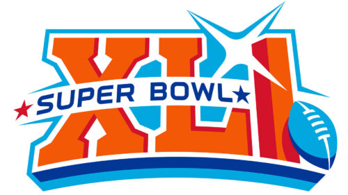
The style of the Super Bowl XLI was pretty much the same as in the previous badge, but the color palette was changed to a more delightful one. Now the “XLI” part was drawn in orange with red edges, and underlined by an arched element in light and dark blue lines. A bright blue football was placed in the bottom right corner of the composition, and the blue “Super Bowl” inscription was written on a white arched ribbon, overlapping the “XLI” on the right. The red and blue stars were decorating the white ribbon. Another decorative element in this logo was a white geometric sparkle in a light-blue outline, placed between the orange “L” and “I”.
Super Bowl XLII (2008)
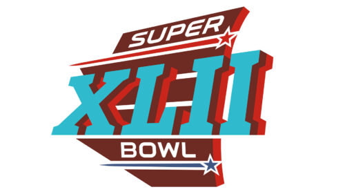
The logo of Super Bowl XLII was set in an interesting brown and light-blue color palette with some burgundy elements. It was a voluminous blue “XLII”, set in a geometric serif font with red edges, a brown background with white horizontal lines, the white “Super Bowl” inscription in extended capitals of a modern sans-serif font; and two stars with thick long tails: red one above the “XLII”, and the blue one — under it.
Super Bowl XLIII (2009)
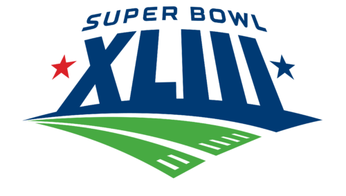
A very modern and minimalistic version of the logo was created for the 43rd Super Bowl event. It was composed of a massive “XLIII” inscription in solid blue, executed in a modern sans-serif typeface, accompanied by an arched “Super Bowl” wordmark in blue capitals, and decorated by two five-pointed stars in the sides — a red one on the left, and a blue one on the right. The composition was underlined by three wide distinctive strokes — a blue one on top, and two green ones under it.
Super Bowl XLIV (2010)
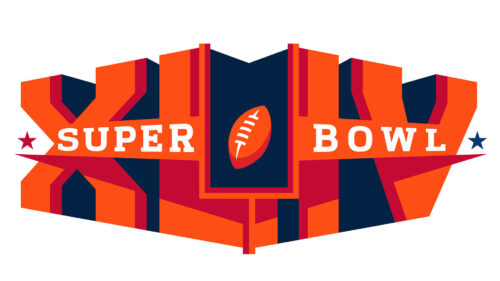
A very intense and stable logo was designed for Super Bowl XLIV. The massive three-dimensional “XLIV” characters featured bright orange facades and solid blue edges. The central part of the composition was rectangularly cut out, and a small orange football was placed in this improvised gate. The white uppercase “Super Bowl” inscription was written across a thin banner, overlapping the composition in its central point, with red and blue five-pointed stars set in the sides from the lettering.
Super Bowl XLV (2011)
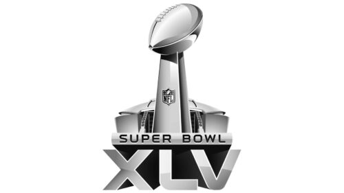
The new era of the Super Bowl visual identity started with the badge, designed for the 45th event. All the bright colors here gone and now the three-dimensional composition was executed in gradient silver with black additions. The voluminous “XLV” became a basement to the new composition. It was set in 3D characters of a geometric sans-serif typeface, accompanied by a narrow banner with the black “Super Bowl” lettering engraved on it, and decorated by a large silver trophy on top. The background of the trophy featured an image of the stadium in, which the event was taking place.
Super Bowl XLVI (2012)
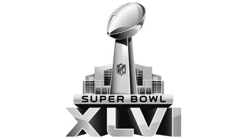
The composition of the Super Bowl XLVI logo was exactly the same, as the previous one, but with the “XLV” replaced by the “XLVI”, more gloss was added to the silver surfaces of the elements, and the shadows on the characters’ edges getting darker and gaining more black gradients. And, of course, the shape and contours of the stadium were changed to a new one.
When does the Super Bowl logo come out?
Super Bowl logos are typically revealed to the public in January, giving fans a glimpse into the theme and aesthetic of the next year’s event. This early release is part of the NFL’s strategy to build excitement and momentum as it leads up to the big game. For example, the anticipation for the game in New Orleans was heightened with the release of a logo that captures the city’s festive spirit and artistic heritage, including references to its famous Mardi Gras celebrations, a testament to the thoughtful design process that goes into each Super Bowl logo.
Super Bowl XLVII (2013)
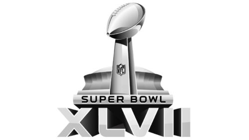
The Super Bowl XLVII event used the same style for its logo as the two previous ones. Apart from the rewritten number at the bottom of the badge, not many changes have been made to the banner. The negative space between the characters became even darker, which added distinction to the contours of “XLVII” and depth and volume to the whole composition. And again; the new stadium was added to the badge.
Super Bowl XLVIII (2014)
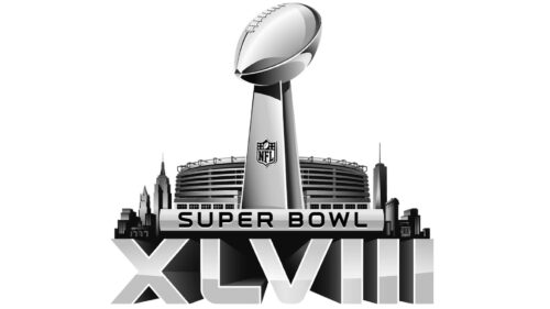
The “XLVIII” inscription gained more light gradient shade to its surface, which made the whole emblem looks even more voluminous and glossy. The new stadium structure was added to the top part of the badge. As for all other elements, they remained absolutely the same as in several previous versions.
Super Bowl XLIX (2015)
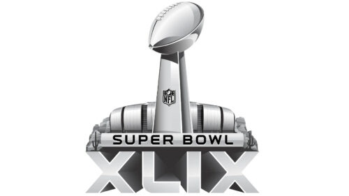
The silver shades got lighter in the badge of Super Bowl XLIX. Since the bottom part of the logo now comprised fewer characters, the whole badge looked more compact and minimalistic, and this mood was supported by the super smooth and laconic contours of the new stadium, set behind the trophy.
Super Bowl 50 (2016)
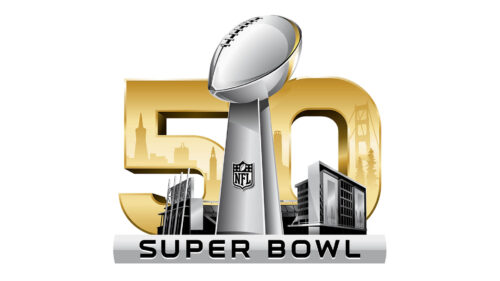
The Super Bowl’s 50th anniversary took place in San Francisco Bay Area in 2016. Hence, the stadium on the logo was replaced by the silver figure of Levi’s Stadium in Santa Clara, California. The building was placed on a black ground with a golden three-dimensional “50”, which glossy surface reflected the landscape of the city. The enlarged trophy in silver metallic was placed in the center of the composition, while the silver banner with the black “Super Bowl” engraved on it in a modern sans-serif typeface, was placed under the graphical part.
Super Bowl LI (2017)
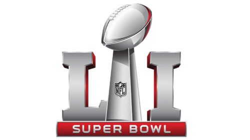
The new generation of the Super Bowl visual identity was introduced with the badge for the 51st event. It was a three-dimensional silver composition with the desirable trophy as the central element. The trophy became a separation line between the “L” and the “I”, which featured almost the same size and were set in silver too, but with red edges, supported by the red narrow banner with the “Super Bowl” lettering on it.
Super Bowl LII (2018)
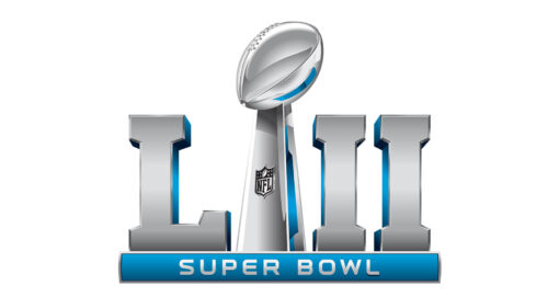
For the Super Bowl LII, the additional color was switched from red to blue, and the right part of the trophy now comprised two “I”s. The trophy itself was also slightly refined, with more glossy gradients added to the football part on top of it. The badge started looking more elegant and vivid.
Super Bowl LIII (2019)
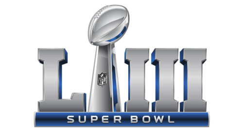
The logo, designed for Super Bowl LIII was executed in a silver and dark blue color palette, with the composition and style remaining absolutely the same, but the trophy placed now between the “L” and the three “I”s on the right. With a darker shade of blue, the logo started looking brighter.
Super Bowl LIV (2020)
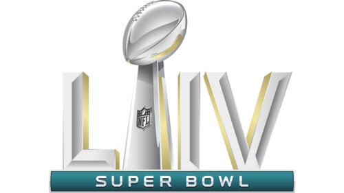
The logo of the Super Bowl LIV was more colorful and voluminous. The banner under the main part became green, while the accents on the trophy and the “LIV” turned yellow. The typeface of the main characters was switched from a massive serif to an elegant sans-serif, with the facets of the elements getting straight ribs.
How are the Super Bowl logo colors decided?
The colors of the Super Bowl logo are carefully chosen to reflect both the NFL’s branding and the unique characteristics of the host city. In recent years, designers like Kevin Zuppe have taken creative liberties to incorporate colors that resonate with the local culture and landscape. For Super Bowl LIX in New Orleans, hues reminiscent of Mardi Gras, such as vibrant purples, greens, and golds, were blended with traditional NFL colors to create a visually stunning logo. This thoughtful integration of local culture into the logo’s color palette not only celebrates the host city but also enhances the overall Super Bowl experience for fans.
Super Bowl LV (2021)
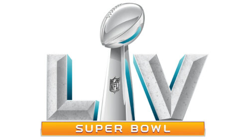
The Super Bowl LV logo featured bolder and more stable characters on the sides of the trophy, which kept its shape and size. The banner with the uppercase “Super Bowl” lettering turned yellow, with the characters gaining gloss and shadows. As for the accents on the main elements of the badge, they became light blue.
Super Bowl LVI (2022)
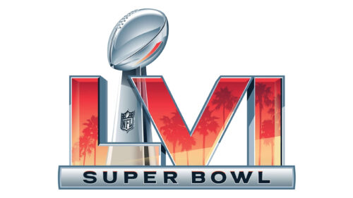
For the 56th Super Bowl, the logo was significantly changed. The “LVI” characters were now placed ahead of the silver trophy, and turned from silver to transparent icy, with a pattern of a red and yellow flame. As for the banner at the bottom, it was a three-dimensional silver plate with a “Super Bowl” wordmark engraved on it in black capital letters of a modern sans-serif typeface.
Super Bowl LVII (2023)
The color palette of the Super Bowl LVII logo was composed of turquoise shades, red, and fuchsia, making up a very stylish and vibrant image. As for the composition in general, it remained the same as in the previous version, but the bottom part of the logo was slightly modified. The engraved “Super Bowl” wordmark gained some turquoise gradients, which added depth to the whole badge.
Super Bowl LVIII (2024)
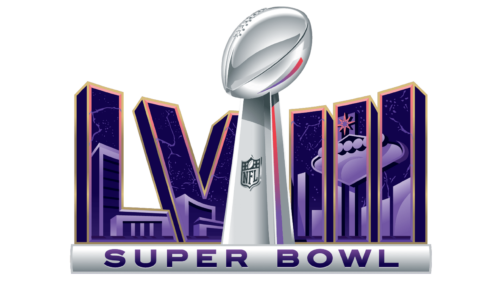
The trophy moved to the front part and got centered in the Super Bowl LVIII logo. The “LVIII” is now placed forming an angle at the back part, which creates an interesting geometric volume. As for the color palette of the logo, the surface of the characters uses purple-to-pink gradients, while the frames and the trophy are still set in glossy silver.
Super Bowl LIX (2025)
The logo for Super Bowl LVIII features a prominent and glossy silver trophy that is centralized and brought to the foreground, symbolizing the significance of the achievement it represents. Behind the trophy, the Roman numerals “LVIII” are stylized and placed at an angle, creating a sense of depth and three-dimensional geometry. The characters are adorned with a gradient transitioning from purple to pink, giving the logo a vibrant and energetic look. This color scheme also adds a modern and playful touch to the overall design. The wordmark “SUPER BOWL” is presented in a bold, capitalized font, placed below the trophy, grounding the logo with a sense of stability. The color palette is a combination of the futuristic sheen of the silver elements and the lively hues of the gradients, encapsulating both the tradition of the event and a forward-looking dynamism.
Fonts and Colors
Throughout the years, the logos of the Super Bowl have been using different typefaces and color combinations. Some were used more frequently, others — less. For a significant period, the favorite color palette of the Super Bowl designers featured a mix of blue, red, and white, the most patriotic combo, which always looks strong and classy. The later versions of the Super Bowl badges started using more complicated color combinations, with gradients and depth.
Regarding the typefaces, in the Super Bowl visual identity history we have seen them all. But the latest eras have been based on modern sans-serifs with distinctive contours and stable shapes of the characters.


