Katy Perry is one of the most popular singers in the United States, who is widely known across the globe. She was born in 1984 and became her career in 2001. Since that time Katy Perry released six albums, and the first one was named “Katy Hudson”, after the singer’s real name.
Meaning and history
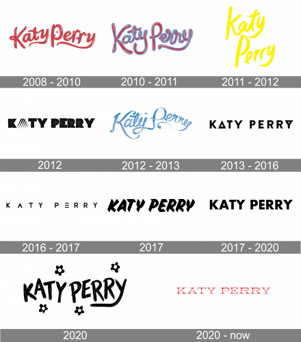
One of the pop-stars, with the most amount of logo redesigns, Katy Perry, has always had her special unique style, which was always reflected in all her emblems and logotypes.
2008 — 2010
The first official logo for Katy Perry was designed in 2008 and introduced in the cover of her “One of the Boys” album. It was a very girly fuchsia-pink script wordmark with elongated tails of letters “Y”, surrounded by small pink hearts and stars.
2010 — 2011
In 2010 the logo was redesigned to suit the new album of the singer, “Teenage Dream”. The young spirit was reflected in a renewed and modified inscription, executed in red with a thick blue outline. The rounded sans-serif typeface of the logotype made it candy-like and no additional elements were needed.
2011 — 2012
In 2011 Katy Perry releases her single “The One That Got Away” and for this occasion, the new logotype was designed. The color palette is switched to bright yellow on white, which looks fresh and crispy. As for the typeface, it looks more modern and stylish with simplified shortened lines and brush-style execution.
2012

The logo from 2012 was strong and geometric — the bold black inscription in a solid sans-serif typeface was accompanied by a pyramid-like striped figure, replacing the letter “A”. It was something new for the singer, and definitely showed another side of her “sweet and girly” image.
2012 — 2013
In 2012 Katy Perry comes back to ribbons and curves with her new logo. Now the cursive lettering is drawn in gradient blue, which gives a three-dimensional effect to the nameplate.
2013 — 2016
The tenderness is replaced by brutality in 2013. The black geometry comes back but in a new way — the modern sans-serif inscription in all capitals has a letter “A” and “Y” customized.
2016 — 2017
In 2016 the logotype is being refined — letter “A” now has its horizontal bar removed, and the letter “E” is written without its vertical bar. The wordmark is perfectly balanced and looks powerful.
2017
In 2017 Katy Perry releases another single, “Chained to the Rhythm”, and the logotype is being redrawn again. Now it is an extra bold handwritten typeface, which is slightly italicized, in order to give a sense of movements and energy. The color palette is still black and white.
2017 — 2019
The most minimalist and simple logo was used by the singer in 2017. A traditional sans-serif inscription in black is a perfect choice for any kind of placement, representing professionalism and stability.
2020
The redesign of 2019 brought a bit of every previous logo into a new visual identity. The monochrome brush-written wordmark is surrounded by small black-and-white flowers, which add a sense of tenderness and playfulness.
2020 — Today
The 2020 renovating of the logo depicts the red inscription with the thin serif letters. They have a curious feature: the large and sharp serifs at the end of each letter make something similar to pikes, so the whole inscription looks elegant and serious at the same time.


