

![]() Houston Oilers Logo PNG
Houston Oilers Logo PNG
Houston Oilers is the first name of the professional football club from the American National Football League, which was established in 1960, and today is known under the name Tennessee Titans. The club moved to Tennessee from Texas in 1996.
Meaning and history
![]()
Houston Oilers were formed in Texas in 1960 and stayed in Houston for three decades. At the beginning of its history, the club won two championships in the American Football League and became a member of the NFL at the end of the 1960s. Throughout the years the Oilers won six division championships and appeared in the playoffs 15 times, which is quite impressive.
However, in 1996 the club moved to Tennessee, changing its name first to Tennessee Oilers, and then to Tennessee Titans. Today the club performs in the National Football League as a member of the AFC South Division.
What is Houston Oilers?
Houston Oilers is the former name of a professional football club from the United States, Tennessee Titans. The club was established in 1960 in Texas, and moved to Tennessee in 1996, switching its name to Tennessee Oilers, and becoming Titans in 1999.
In terms of visual identity, Houston Oilers were never afraid of experiments. Under their first name, the professional football club has changed its emblem four times, with the last badge moving with the Oilers to Tennessee, and staying active for another season.
1960 – 1961
![]()
The very first logo was created for the club in 1960 and stayed with the Oilers for just one season. It was based on an image of the oil production landscape and a man in a blue and yellow uniform, with a rugby ball in his band and a cowboy hat on his head. Apart from the hat, the man was also bearing a pair of yellow cowboy boots.
1961 – 1968
![]()
The redesign of 1961 has played with the colors and contours of the previous badge, changing yellow to gray, and refining the lines of the background, making the oil production sites more confident and readable. As for the main hero of the logo, he changed his cowboy hat to an oil man’s helmet.
1968 – 1972
![]()
The redesign of the late 1960s has brought a completely different concept to the Houston Oilers’ visual identity. It was a white rugby helmet in a thick black outline with a black image of an oil Derrick drawn in it in thick clean lines. This was a very progressive and laconic badge, which stayed with the club for three more seasons.
1972 – 1980
![]()
In 1972 the Houston Oilers badge got some colors in it. The contours of the helmet were now set in intense blue, and the oil rig got its lines scarlet-red, with a double white and blue outline, which balanced the whole look, making it confident and professional.
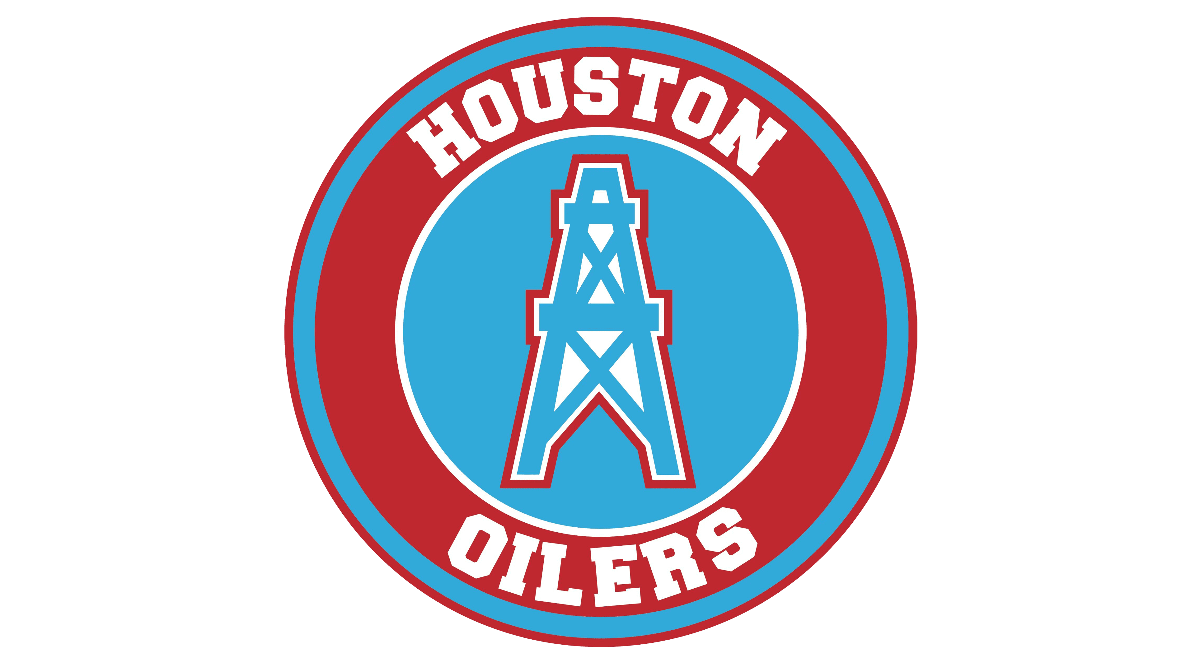
1980 – 1996
![]()
The last badge for the Houston Oilers was created in 1980 and stayed with the club till the end. The helmet was gone, and only the Derrick remained. It kept its original contours but changed the colors. The rig was now drawn in sky-blue, over a white background with a double white and red outline.
Font and color
The bright and stable logo of the Houston oilers football club has no lettering on it, just the oil rig in a bright color palette, which elevated its simple straight lines to a modern composition. The palette of the logo consists of blue, red, and white, the three main colors of the American flag, but their lighter shades. The blue on the Oilers badge is called Columbia blue, while red is used in its scarlet shade, and white simply stays white.


