

![]() AFL Logo PNG
AFL Logo PNG
The AFL includes 18 teams from five Australia’s states. The design of each AFL team logo is unique as each team has its own distinctive features.
Meaning and history
![]()
The Australian Football League, the highest-level competition in the sport of Australian rules football, has a sporty and at the same time a patriotic logo. It has gone through two modifications that touched the overall shape but left the color scheme unchanged.
1972 — 1975
![]()
The very first badge for the Australian Football League was created in 1972 and staunch with the organization for a bit less than three years. It was a very simple traditional medallion in a shape of a horizontally stretched oval with a medium-thick black outline and a monogram with three black letters overlapping each other, placed in the center of the badge. All letters were executed in a sharp and strong serif font and featured the same size and boldness.
1976 — 1989
![]()
The redesign of 1976 introduced a modern and stylish version of the badge, though still in a simple and minimalist execution. This time it was a solid navy crest with a rounded bottom and straight top line, a white rugby ball placed vertically and a massive Sans-serif capital “V”, looking more like a chevron, set under the image of the ball, also in white.
1990 — 1999
![]()
The Australian Football League logo history began in 1990 when the Victorian Football League was renamed as the Australian Football League. The change of the name caused by the competition spreading to other states led to rebranding.
The first AFL football logo was adopted in 1990. It preserved the shield shape and some elements of the old Victorian Football League logo which had been in use for 13 years. The shape of the shield was slightly altered, though. The letter “V” was gone, of course. Instead of it the letter “A” appeared.
This is what exactly the 1990 emblem looked like ‒ a shield in blue (brighter than in the previous logo) with the image of a white football of an oval shape (the Sherrin football) and a stylized letter “A” in red and white in the top right corner.
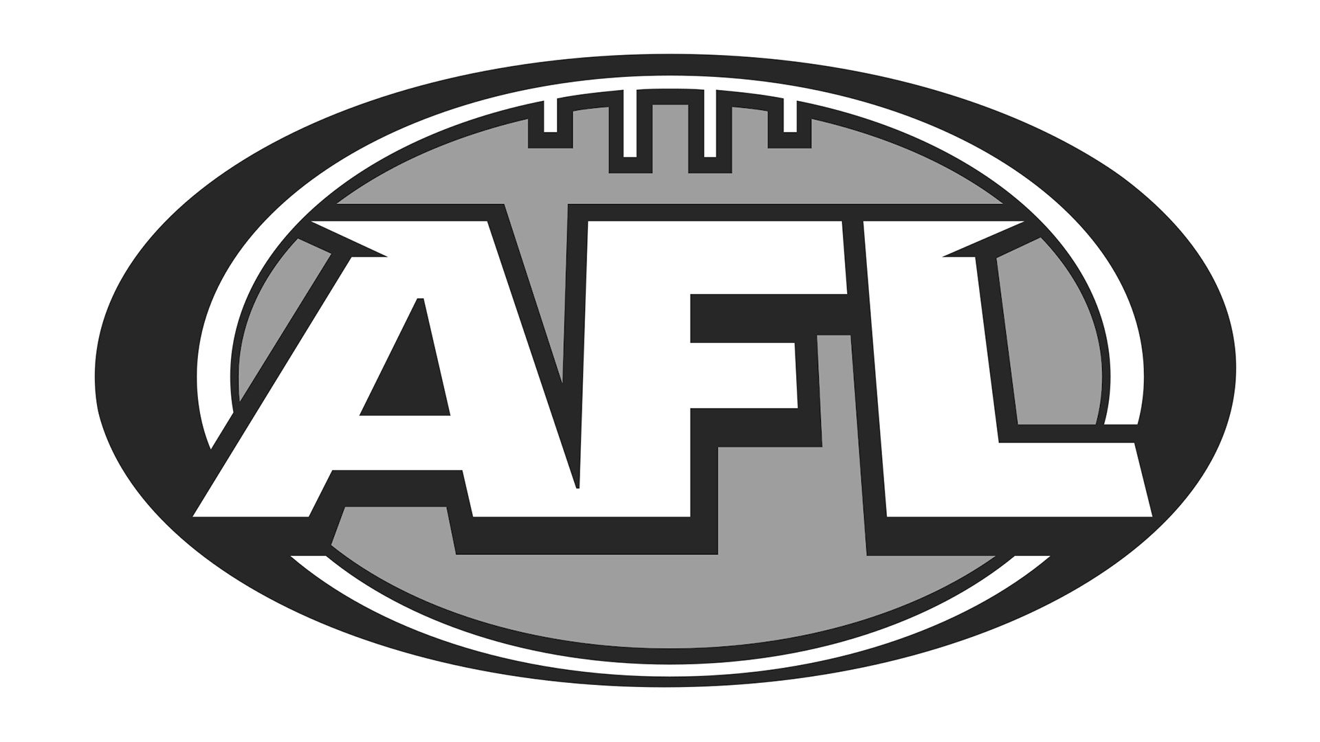
2000 — Today
![]()
In 1999 the AFL redesigned its insignia to give it a more contemporary feel. The new design displays the abbreviation “AFL” against the background of a red oval outlined in white and blue. The letters are in white with a blue outline, the effect being a 3-D format. The top-left end of the letter “A” and the top-right end of the letter “L” have stylized elements that look like small wings which most probably symbolize speed.
The oval shape of the symbol refers to both the playing field and a football. The four vertical lines in white color with a blue outline positioned above the abbreviation represent goal posts.
Font
There is every chance that the typeface for the letters A, F and L was custom made.
Color
![]()
The color palette of the logo is represented by the following colors ‒ USAFA Blue (#00529B), Alizarin Crimson (#E21E31) and White (#FFFFFF).


