Established in 1902, Indianapolis Indians is one of the oldest professional teams in Minor League Baseball. In fact, it is the e second-oldest, after the Rochester Red Wings, which was founded in 1899. A very experienced club, the Indians, have won 14 League titles and 7 class titles; changed more than ten MLB affiliates, and became one of the most popular names of the Minor League. Today the Indians play as the Triple-A affiliates of Pittsburg Pirates, and this collaboration started in 2005.
Meaning and history
Throughout its long and intense history, the Indianapolis Indians baseball club has never changed its name, and only redesigned its logo four times, which is almost nothing, compared to other teams, which only manage to find the perfect identity from the tenth or eleventh attempt. This stability touches not only the visual marketing side of the club’s approach but also their professionalism on the field: the Indians are considered to be one of the strongest representatives of the International League, which the team joined back in 1988.
Before becoming members of the IL, Indianapolis Indians used to play in the American Association and Pacific Coast League, where they also gained significant popularity and success. The first League title the Indians won during their first season in baseball, was in 1902, and that win set in motion a string of team accomplishments that to date has consisted of seven Class Titles, 14 League titles, and 13 Division titles. And we are pretty sure, there is still a lot of space to grow.
In terms of visual identity, Indianapolis Indians stick to their name and use a beautiful yet pretty laconic image made of the traditional Native American ornament, which creates the main accent in the logo and fully represents the spirit of the club.
What are Indianapolis Indians?
Indianapolis Indians is the name of a baseball club from Indians State. The club was established at the beginning of the 20th century, and today competes in the Minor League Baseball and is managed by Brian Esposito.
1969 — 1984
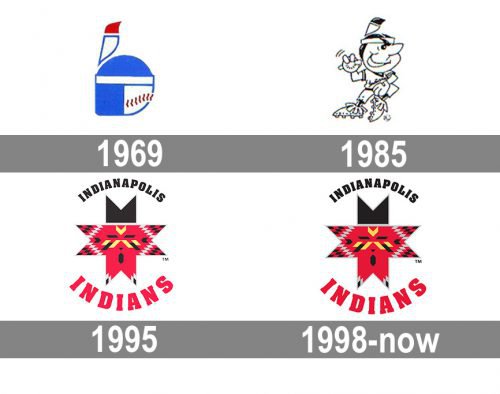
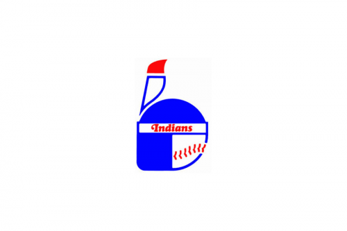 Throughout most of its history, the Indianapolis Indians logo has been focusing on the “Indian” theme, in one form or another. For instance, the 1969 emblem featured a side view of the head of an Indian wearing an ethnic headdress. The palette consisted of blue, red, and white.
1985 — 1994
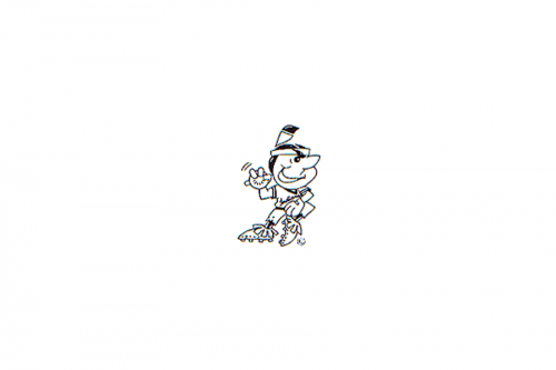 The logo introduced in 1985 sported a cartoonish Indian in black and white. The character was going to throw a baseball.
1995 — 1997
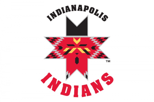 Eventually, in 1995, the team unveiled a fundamentally new emblem featuring a Navaho quilt pattern. While the pattern forms a Native American’s face, it looks far better than the stereotypical images of the past.
1998 — Today
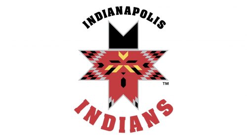
The logo for Indianapolis Indians, created for the club in 1998, has been used for more than a decade. It is actually a refined and softened interpretation of the previous red and black badge of the baseball team. The contours were cleaned and strengthened, white the color palette of the cross was a bit muted, making the whole image look more stylish and unique. As for the lettering, it is still placed around the graphical symbol, using the same black and Ted colors, but the letters got smaller and more balanced, evoking a sense of professionalism and confidence in one of the oldest baseball clubs of the Minor League Baseball.
Colors
The Indianapolis Indians logo comprises the following colors: red, black, silver, yellow, and white. The palette looks bright and eye-catching helping to create the “Native American” feel.


