The Rochester Red Wings trace their roots to at least 1899. The team currently has the status of the top minor league affiliate of the Major League Baseball club Minnesota Twins.
Meaning and history
While old emblems of the Minor League Baseball team Rochester Red Wings featured some abstract red wings, in recent logos, the wings, have been just part of the team’s bird mascot.
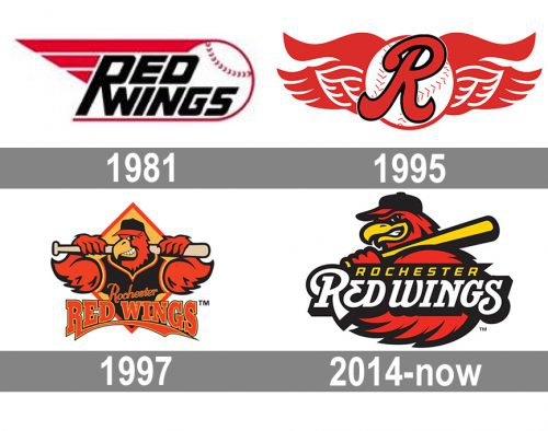
1981 — 1994
 The Rochester Red Wings logo introduced in 1981 featured a flying baseball with the team’s name on the forefront.
1995 — 1996
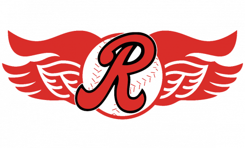 In the following version, which was adopted in 1995, the ball seemed to be static, but it had a pair of red wings, one from each side. The name of the team was replaced by a script “R” in red.
1997 — 2013
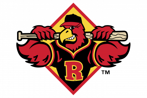 Only two years later, the team unveiled an entirely new brand identity. It featured a red bird, who actually was team mascot called Spikes.
2014 — Today
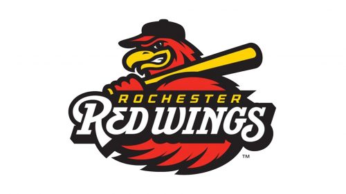 While the current logo also sports Spikes, the team mascot now has a different mood – he is glaring with a ferocious look. The same attitude is preserved on the cap insignia and alternative emblems.
Colors
The color scheme is a balanced combination of black, red, white, and gold. Red seems to take a bit more space than any of the other colors, and yet, it’s not really dominating the design.


