

![]() Pacific Coast League Logo PNG
Pacific Coast League Logo PNG
The Pacific Coast League (PCL) stands as a notable Minor League Baseball league, under the ownership of Minor League Baseball itself. This league serves as a Triple-A affiliate to Major League Baseball, showcasing a high level of play just below the major leagues. Operating chiefly in the Western, Midwestern, and Southern United States, it has teams spread across these regions, providing a platform for up-and-coming baseball talents to hone their skills and strive for a spot in the Major Leagues.
Meaning and history
Founded in 1903 by six baseball enthusiasts, the Pacific Coast League was established as a minor league baseball organization. Over its extensive history, the PCL has been recognized for its significant contributions to the development of baseball in the United States. It has nurtured countless players who went on to achieve fame in the Major Leagues. Notably, during the mid-20th century, the league was considered almost equal to the major leagues due to its high level of play and financial success. Today, the Pacific Coast League holds a pivotal position in Minor League Baseball, continuing to serve as a critical developmental ground for future Major League stars, while maintaining its unique identity and rich history within the sport.
What is Pacific Coast League?
The Pacific Coast League is a key player in baseball’s developmental landscape. As a Triple-A affiliate of Major League Baseball, it functions as a vital stepping stone for players aspiring to reach the majors, offering a competitive environment that bridges the gap between minor and major league play.
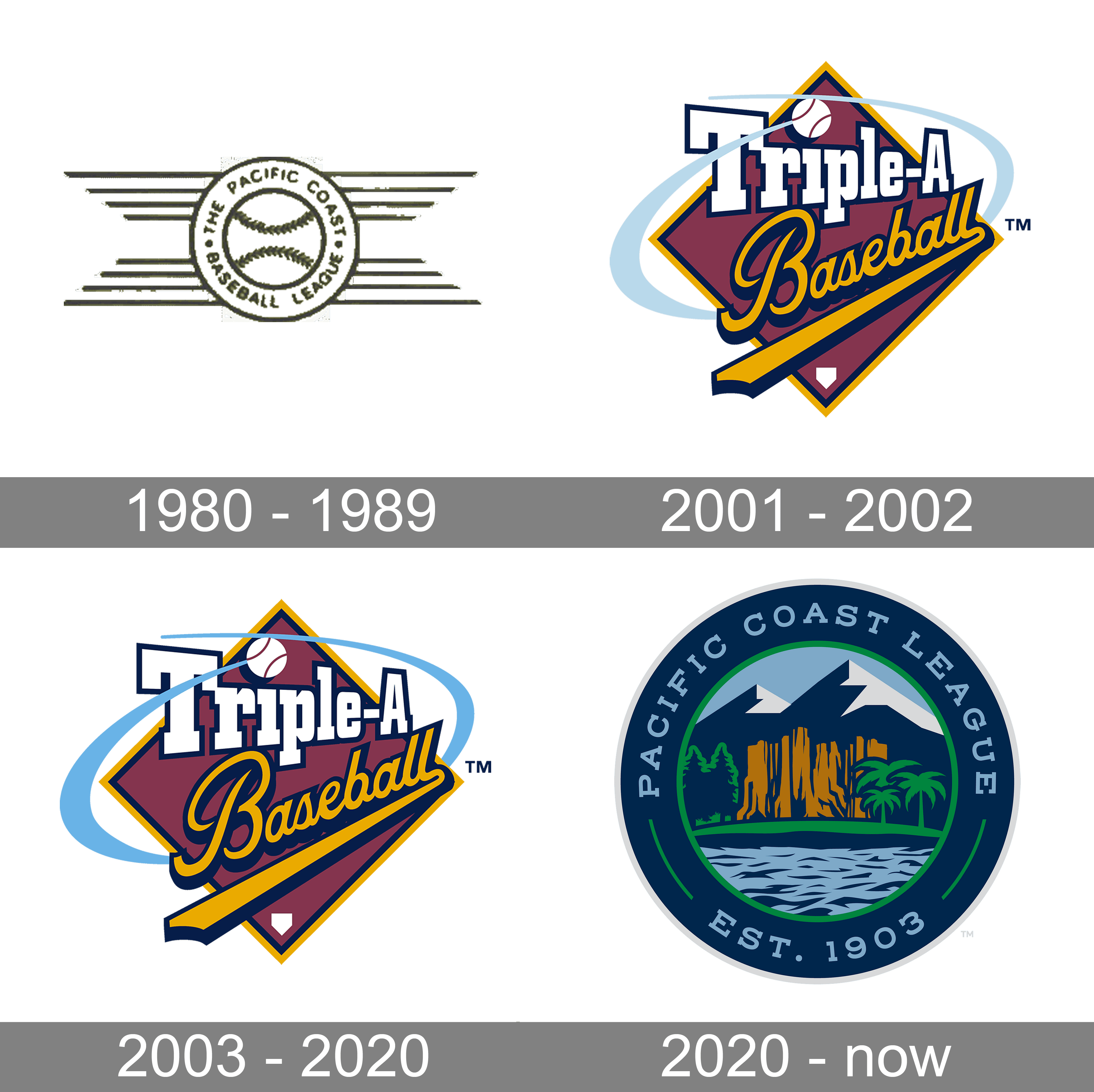
1980 – 1989
![]()
The original logo was a black-and-white drawing of a baseball with a round frame around it. Furthermore, several lines of various lengths stretched from it to both sides. The frame held the league’s name: ‘The Pacific Coast Baseball League’.
2001 – 2003
![]()
The centerpiece of the Pacific Coast League logo is the lettering “Triple A” in white and “Baseball” in yellow. The first part of the text is given in bold block letters, while “Baseball” features a curvy and soft script.
The lettering is placed over a dark red square “standing” on its angle. There’s also a baseball “orbiting” around the emblem. You can even see a light blue trace behind it.
This version was adopted in 2001. Earlier, the League used a black-and-white logo featuring a baseball with eight horizontal streaks on either side. The baseball was encircled by the name of the organization.
2003 – 2020
![]()
The Pacific Coast League (PCL) logo introduced in 2003 reflects a fusion of natural beauty and athletic tradition, encapsulating the league’s regional identity. The central element of the logo is a circular emblem bordered in navy blue, within which the text “Pacific Coast League” is prominently displayed at the top, while “Est. 1903” anchors the bottom, paying homage to the league’s long history. The inner circle features a picturesque landscape, with towering mountain peaks in the background and a serene lake in the foreground. Lush greenery and palm trees flank both sides, symbolizing the diverse geography of the Pacific Coast. The central focus of the landscape is a rocky cliff, rendered in earthy tones, which adds a sense of grandeur and natural majesty. This scenic depiction is both tranquil and inspiring, capturing the essence of the region. The use of vibrant yet harmonious colors enhances the visual appeal, making this logo a striking representation of the PCL. It successfully merges the beauty of the Pacific landscape with the league’s storied past, creating a powerful and memorable image.
2020 – Today
![]()
The modern Pacific Coast League (PCL) logo is a sophisticated and visually appealing design that encapsulates the league’s regional heritage and longstanding tradition. The logo is circular, framed by a dark navy blue border that prominently features the text “Pacific Coast League” at the top and “Est. 1903” at the bottom, both in a clean, white, sans-serif font that underscores the league’s establishment and enduring legacy.
Within the inner circle lies a beautifully rendered landscape scene, symbolizing the diverse and picturesque geography of the Pacific Coast. Dominating the background are majestic mountain peaks, depicted in shades of blue and white, representing the towering ranges found along the coastline. In the middle ground, a rugged, orange-hued rocky cliff adds a sense of grandeur and permanence, reminiscent of iconic natural landmarks. Flanking the cliff are lush green trees and distinctive palm trees, illustrating the varied flora of the region.
The foreground of the logo features a serene body of water, its blue tones adding depth and tranquility to the composition. This element not only enhances the aesthetic appeal but also signifies the coastal aspects of the league’s geographic influence. The use of vibrant yet harmonious colors creates a visually striking image that is both modern and timeless.
Overall, this logo is a masterful blend of natural beauty and historical significance, effectively representing the Pacific Coast League’s identity. Its detailed and evocative imagery celebrates the league’s connection to its regional roots while maintaining a fresh and contemporary design ethos.


