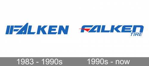
The original Falken logo featured the word “Falken” with a distinctive “F.” Instead of a single vertical bar, the character had three vertical bars.
Meaning and history
Falken was created in 1983 by the Japanese company Ohtsu Tire and Rubber. It owes its Western name to the desire of the founders to enter the international market, which the brand managed to do very quickly. Already in 1985 Falke entered the North American market.
In 2003 Ohtsu Tire and Rubber were taken over by another Japanese tire manufacturer, Sumitomo Rubber Industries (SRI), which now owns all rights to the Falken trademark. Together with the Dunlop Tires brand, also owned by SRI, Falken is part of the Falken Tire Corporation group, headquartered in Fontana, California.
Today Falken is one of the most reliable and trustworthy tire brands in the world, which is proved by the fact that such famous car brands as Suzuki, Subaru, and Daihatsu choose Falken products as the original equipment for their vehicles. Also one of the reasons forthe popularity of Falken tires is participation and numerous victories in various racing competitions, the most famous of which isthe Le Mans races.
What is Falken?
Falken is the name of a tire manufacturing company from Japan, which was established by Ohtsu Tire and Rubber in 1983. In 2003 the brand was acquired by another reputable Asian manufacturer, Sumimoto, which gave Falken the second breath and has turned it into one of the market leaders in tire production.
1983 – 1990s
When the first Falken tire was introduced in 1983, a blue symbol appeared above the wordmark. The symbol represented stylized tire tracks.
1990s – Today
The current logo was adopted not later than in 1999 – the car on which Team Falken competed in the ADAC 24h Rennen Nürburgring (1999) already showcased this logo.
At first glance, you could notice it was pretty similar to its predecessor in terms of the overall style. It looked dynamic and featured a distinctive “F.” The shape of the “A” looked very much the same on both the logos. The palette did not change much, too.
And yet, if you took a closer look and compared the two versions side by side, you could notice the logo had been in fact redrawn from scratch. The “F” grew lighter, its middle bar was replaced by a red flag.
The top end of the “A” was cut. As a result, the height of the letter became the same as that of all the other letters in the wordmark. Due to this, the current logo looks somewhat smoother and more dynamic.
The updated logo has quite a few other details making it more dynamic in comparison with its predecessor. We can mention, for instance, that the ends of many characters have been rounded and look like the streamlined shape of a car.
In addition to the primary version where the letters are blue, you can often see the variation featuring white letters. Typically, the distinctive red “flag” on the “F” has been preserved no matter what the color of the letters was.
Colors
Since at least 1983, the Falken logo has been dominated by blue, red, and white. There has been some playing around with the shades, though.
Font and Color
The dynamic and strong uppercase lettering from the primary badge of Falken is executed in a progressive heavy sans-serif typeface. The closest fonts to the one, used in this insignia, are, probably, Ethnocentric Bold Italic or Venus Rising Heavy Italic, but with significant modifications of the characters’ contours.
As for the color palette of the Falken visual identity, it is based on a classic combination of blue and red on a plain white background, where blue boasts a smooth and calm medium-light shade, which evokes a sense of safety and reliability. The color scheme of this logo represents a professional and confident brand, which values quality and expertise.


