The earliest Panasonic logo, which was introduced in 1955, featured a mountain-like triangular shape in the middle of the wordmark. Since then, the emblem has undergone a couple changes.
Meaning and history
One of the most famous and reliable electronics manufacturers, Panasonic, appeared on the international market in the 1950s, and since that time the company redesigned its logo just twice, which says a lot about its stability, confidence, and values of heritage and roots.
What is Panasonic?
Panasonic is a Japanese consumer electronics brand, which was established in 1918 as Matsushita Electric Manufacturing Works, and got its current name in 2008. The company is known all over the globe as a manufacturer of television sets, audio systems, and many more.
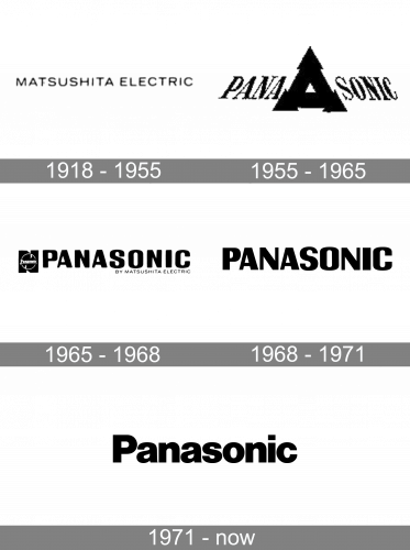
1918 – 1955

The original logo was just a wordmark of the company’s contemporary name. It said ‘Matsushita Electric’ in thin, capital letters.
1955 – 1965
The very first Panasonic logo was introduced in 1955 and featured a monochrome badge with a logotype, which was split into two parts by a strong geometric symbol. Both parts of the inscription were inclined to the center, creating a sense of growth and moving up. The emblem on this logo featured a bold black triangle with a small white one in the middle and arrow-like elements on each of its angles. It was a representation of progress, diversity, and confidence in the company, which looked truly strong and remarkable. The whole badge had a thin strict black outline, repeating its contour.
1965 – 1968
The redesign of 1966 brought a new look to the Panasonic visual identity. Now the logotype in all capitals was executed in a smooth bold sans-serif typeface with soft rounded angles and clean contours. On the left from the wordmark a monochrome emblem was placed — a thin white circle on a black background, resembling the letter “N”, with a white “Panasonic” inscription in the middle. Another change was about a tagline, “By Matsushita Electric”, which was written in a lightweight sans-serif under the right part of the logo, also in black.
1968 – 1971
The redesign of 1968 has simplified Panasonic’s visual identity to a heavy black lettering in the uppercase of a modern sans-serif typeface. The font of the inscription looked pretty close to the previous version of the badge, but with cleaner lines, more distinctive contours, and sharper angles. This version of the logo stayed in use by the company for just three years, with the black leaving the concept in 1971.
1971 – Today
In 1971 the logo we all can see today was introduced. A simple bold wordmark in blue or black was the only element of the new brand’s visual identity. No framing, no graphics, minimalism, and professionalism. The Panasonic logotype is written in a title-case and executed in a traditional font with thick lines, which is very similar to the Sequel Sans Black display.
Font
The type used in the wordmark is Helvetica Black, a classic sans-serif font. The lack of offbeat features may be interpreted as the brand’s desire to emphasize that its products are classic and reliable, providing smooth operation. We can mention, however, the “Wonders” advertising campaign of 2014 featuring a more extravagant type.
Color
The current version of Panasonic logo is based on the combination of two colors: dark blue and white (for the background). The shade of blue used communicates the ideas of bright future and consistency. Alternatively, a black-and-white version may be used, as well as a combination of a brighter shade of blue with red (National Panasonic advertising campaign).


