

![]() Mobil Logo PNG
Mobil Logo PNG
The US oil leader Mobil has been one company with Exxon since 1999. It has had several emblems throughout its long history.
Meaning and history
![]()
Mobil is a brand with a very intense and rich history, which dates back to 1892 when the Standard Oil Company of New York was established. Then, in the 1930s the Mobiloil and Mobilgas brands appeared, and, finally, in 1955, Mobil became an official name, recognized and respected worldwide.
What is Mobil?
Mobil was the name of a huge corporation in the oil segment, which was established in the United States in 1911. The company was one of the market leaders for decades, and in 1999 it merged with another large oil brand, Exxon, forming Exxon Mobil. Today the company is based in Texas and operates all over the globe, providing countries and corporations with oil and gas.
1892 — 1904
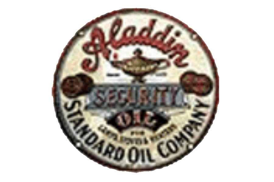
The very first logo, created for Standard Oil Company of New York, was introduced in 1892 and can be called the first Mobil emblem. It was a circular badge with lettering around its perimeter and a “Security Oil” banner in the middle. The color palette featured such shades as yellow, red, black, and gray.
1904 — 1908
The emblem, the company used at the beginning of the 20th century was more modern and classy, featuring a circular badge in dark blue with a thin red outline, it what a switched stylized lettering placed around a shield-like cream badge in the center of the circle. The wordmark in red capitals of a strong geometric sans-serif was set in three levels inside the shield.
1904 — 1932

The first iconic gargoyle appeared on the Mobil visual identity in 1904. It was a red creature in a black outline, facing right. A representation of strength and courage, the symbol became recognizable very fast, as had no analogies on the market.
1911 — 1931
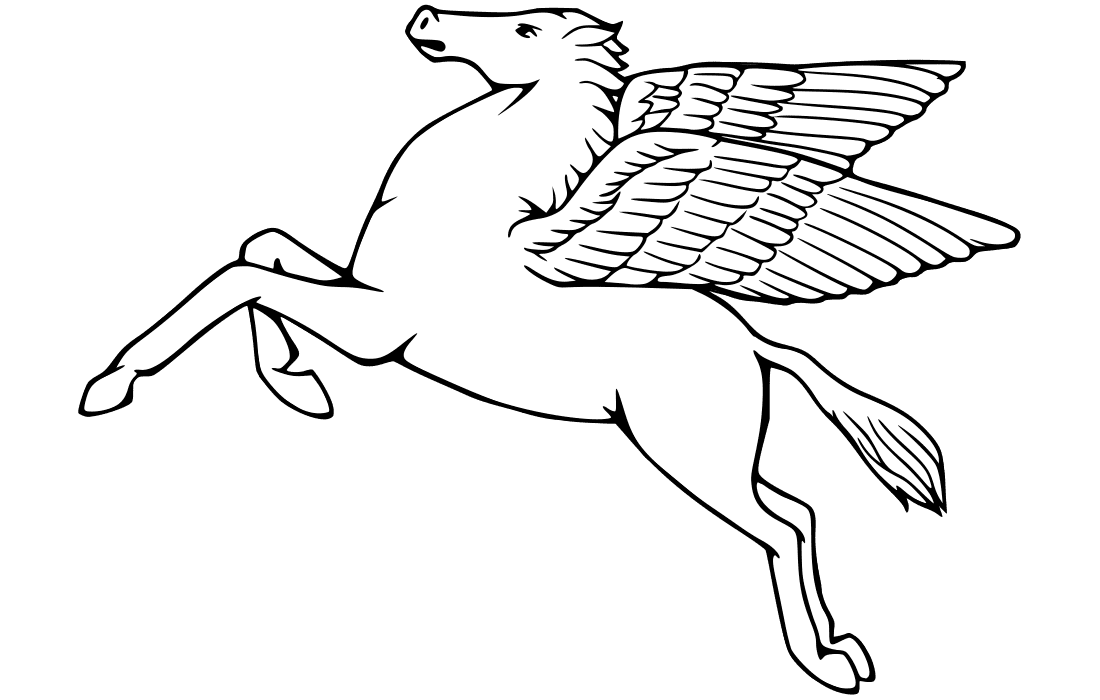
Another iconic symbol, a Pegasus, became a part of the company’s visual identity in 1911, to balance the strong and dangerous look of the gargoyle, Pegasus was drawn in white and had a thin black outline, which made the image graceful and light.
1931 — 1932
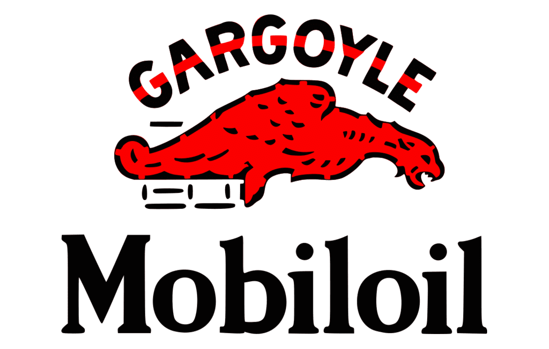
The first logo for Mobiloil was composed of a red gargoyle placed above the black serif lettering in a title case. The “Gargoyle” inscription was arched above the image, executed in all capitals of a custom sans-serif font.
1932 — 1959
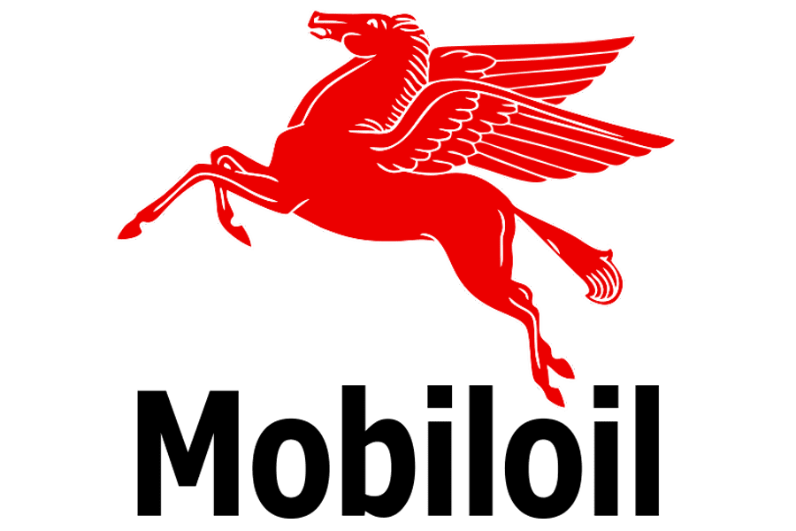
In 1932 the red Pegasus replaces the gargoyle, and the lettering of the wordmark was rewritten in a narrowed and neat sans-serif typeface, in black title case. It was a modern and clean logo, which brilliantly reflected the character of the brand and its values.
1932 — 1939

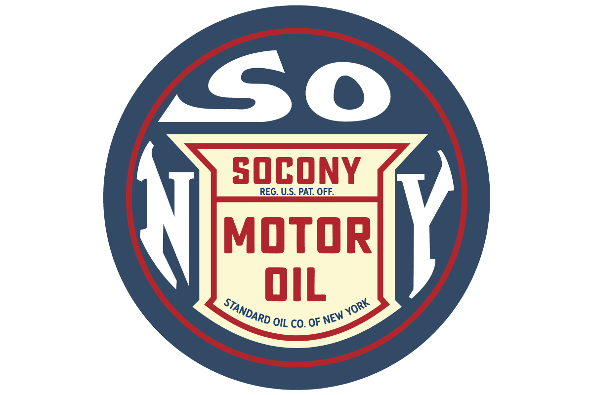
For Mobilgas the company used the same logo, but with a dark blue wordmark and a fancy shield-like frame in the same color, there was also a delicate red tagline “Socony – Vacuum”, but it only stayed with the brand for seven years and then got removed.
1939 — 1955
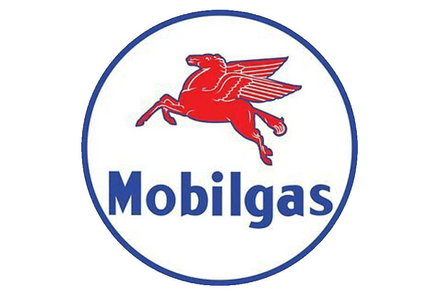
After the redesign of 1939, the Pegasus gained a blue outline and the frame was changed to a circular one. The blue shade of the frame and the lettering was changed to a calmer one, which evokes a sense of stability, trustworthiness, and professionalism.
1955 — 1966
![]()
The first logo for Mobil was introduced in 1955 and kept the color palette and the iconic symbol. It was a bold blue wordmark in a title case executed in a condensed sans-serif typeface and placed above the delicate red Pegasus silhouette. The framing of the logo was composed of two parts — the rectangular blue one on top, and a bold triangular in red, on the bottom. Though the logo stayed with the brand for less than a decade, it is still very recognizable across the globe.
1964 — Today
![]()
In 1964 the Mobil logo was redesigned by a famous Chermayeff & Geismar design bureaus, and for a modern laconic look, the logo we all can see today is composed of a bold logotype in sans-serif, with all the lettering in calm blue, and the “O” in red. The red Pegasus sometimes appears neat in the logotype, but the official version of the logo featured only the wordmark, which looks simple yet powerful and exquisite.
Font

One of the most characteristic features of the wordmark is its minimalistic sans-serif font. The first letter of the company’s name is capitalized.
Color
![]()
The characteristic red-and-blue color scheme of the Mobil logo has stayed basically the same since 1932, except for slight alterations of the shades of these colors.


