Pirelli is an Italian brand of tire manufacturing company, which is considered to be one of the most renowned in the world. The company was founded in 1872 and today it operates in more than 160 countries across the globe.
Meaning and history
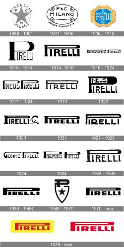
The Pirelli logo is iconic. As everything, designed in Italy, it is a work of great taste and style. The brand’s visual identity had undergone dozens of modifications but the legendary logo base was created in 1945 and was only slightly redesigned during the last 70 years.
All the previous Pirelli logo were reflecting the trends of its times, celebrating them in the changing typeface and spacing.
The elongated “P” is a striking element of the Pirelli logo, which represents the elasticity of the rubber, the famous tires made of.
It is modern, stylish and powerful. One of the greatest logos in history with a rich visual heritage.
What is Pirelli?
Pirelli is the name of the iconic brand, which by today has become synonymous with Italian style and quality. The brand is specialized in the production of car tires, though is also widely known for its advertising campaigns and the famous Pirelli calendar, where all top models are willing to appear.
1888 – 1901
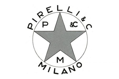
The first Pirelli logo was designed in 1888 and was composed of a circle with a black star inside and the wordmark around its perimeter. The wordmark was “Pirelli & C Milano”, and letters “P”, “C” and “M” were placed inside the circle.
With its fine lines and naive design the first Pirelli logo has nothing in common with the confident mark me all know today.
1901 – 1906
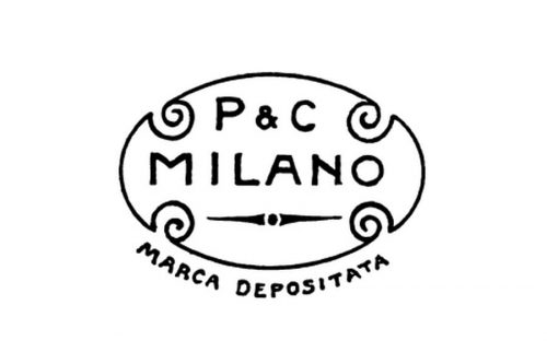
In 1901 the logo became more elegant, the wordmark is now placed in a medallion frame with vignettes, and the tagline “Marca Depositata” is added beyond the frame.
1906 – 1910
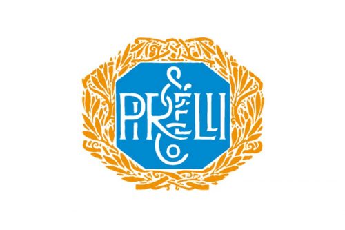
The most colorful Pirelli logo was designed. It features a bright blue octagon in a golden laurel framing with white elegant lettering Pirelli&C inside. The letters are beautifully intertwined.
1910 – 1914
The first Pirelli logotype with elongated “P” was created. The typeface is still far from the iconic logo.
1914 – 1916
In 1914 the lettering becomes bolder and more confident, the logo looks stronger and smart balanced than the previous version. The brand is one step closer to the perfect identity.
1916 – 1924
There were a few changes to the Pirelli typeface Durocher this period of time, the word “Pneumatici” was added and then removed. The elongated “P” didn’t change much, all the modification were mainly held with other letters.
1917 – 1924
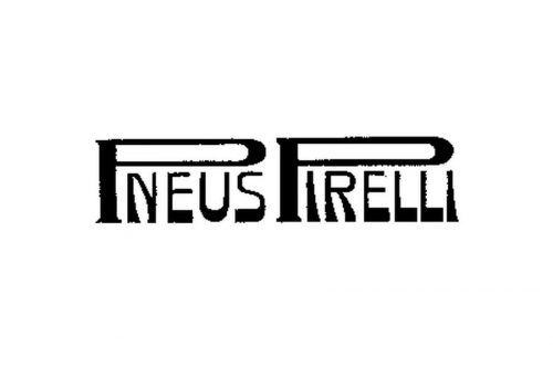
The Pirelli logo, created in 1917 and used by the Italian brand for seven years, was composed of a “Pneus Pirelli” inscription in black, placed on a white background. The lettering in the uppercase was executed in a handwritten serif typeface and the two letters “P” was enlarged and had their upper parts stretched horizontally, covering all other letters of the logotype.
1919
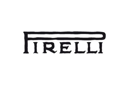
Another version of the iconic logo was introduced in 1919. This time it was just the “Pirelli” lettering executed in the same serif typeface and with the same style of the first “P”. Though in the new version the letters of the nameplate were placed with a bit more space between each other, and this made the whole logo look more stable and solid.
1920
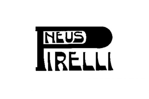
In 1920 Pirelli created two more insignias. The first one was the iconic “Pirelli” lettering with emboldened lines of all letters, especially the first “P”. Inside the signifier there was “Neus” lettering written in the same style and size of the letters as the main inscription. This logo didn’t stay for long.
1920
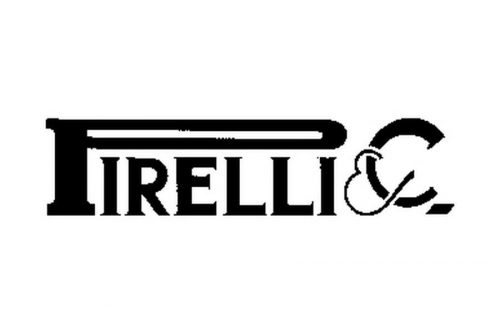
Another logo designed in 1920 featured a refined geometric “Pirelli” logotype with a thin yet still elongated upper part of the letter “P”. The serifs on this version became more square and massive. The inscription was followed by an elegant and smooth ampersand and the letter “C”.
1921
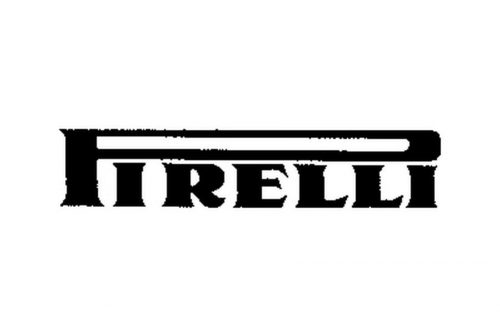
Next year, in 1921, two more Pirelli logos saw the light. The first one was executed in an extra bold serif typeface with playful sharp serifs, which were oriented slightly diagonally and looked elegant and fine, balancing the thickness of the main letter lines. The upper part of the letter “P” used a bit thinner lines for its execution, in order not to overload the image.
1921 – 1923
Another version of the Pirelli visual identity stayed with the brand for three years. It was a handwritten sans-serif inscription, which looked simple and minimalist, though much more modern than all the previous classy and traditional serif versions of the logotype. This logo looked pretty much like the ones, which the company started using in the 1930s.
1924

1924 was a very productive year for the company, and this is when three more emblems were created. The first one consisted of two words “Gomme Pirelli”, executed in the iconic company’s style — with the first letters enlarged and stretched. Though the “G” was not easy to draw in the “P”-way, it had just one horizontal line extended and “roofing” the “Gomme” part of the logo.
1924
The second logo from 1924 featured the “Pneumatici Pirelli” nameplate, with both “P” in the same style. The uppercase inscription was executed in a bold and modern sans-serif typeface, while the first “P”s were written in a very traditional and sophisticated serif.
1924 – 1930
And the third emblem created in 1924, which stayed with Pirelli for six years, boasted a single “Pirelli” logotype. The lettering combined two typefaces again — the bold and confident sans-serif for the “irelli” and modern serif for the “P”.
1930 – 1946
In the 1930s the font becomes bolder and thicker, it looks like a complete picture now, though the lines and balancing is not perfect yet, it is almost close to the ideal.
1946 – 1970
Finally, in 1946, the basement for today’s logo was born. The lettering and it’s spacing is perfectly balanced, the typeface is clean and confident. In the same year the brand creates a shield-like emblem, which consists of a geometrical framing, letter “P” on it and a star.
The 1970s
The Pirelli logo was slightly redefined, letter “R” became more powerful and wide, which made the logo look completed now.
1997 – Today
The first red and yellow logo appeared in 1997, the typeface looks even stronger in red execution. It is a real icon of the visual identity styling and design.
1974 – Today
Today the Pirelli logo is instantly recognizable worldwide, it is a mark of a great quality and design, the legend and a masterpiece of visual identity and creativity.


