Havells is the name of an Indian company, which specialized in the reduction and distribution of electrical equipment. The company was established by Qimat Raí Gupta in 1958 and today operates all over the globe, having a good reputation for the quality of its products and services and a wide portfolio.
Meaning and history
Havells is the brand, which is extremely popular in India, its motherland. The company was established at the end of 1950 and started an incredibly fast development, which by today turned it into a real giant with over 20 representative offices and more than 6 thousand employees in almost 50 countries across the globe.
Havells manufactures electric appliances and lighting products and owns several brands, such as Lloyd, Standard Electric, Crabtree, and a few others.
What is Havells?
Havells is the name of an electric equipment manufacturer from India, which was established in 1958 by Qimat Rai Gupta. Today it is one of the largest appliance manufacturers, which has stores in more than 50 countries across the globe and owns several small labels in the electric equipment and lighting segments
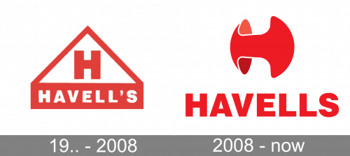
19.. – 2008
The original Havells logo was set in a bright red and white color palette, which has been kept free from the redesign of 2008. The initial badge featured a pentagonal crest, with an enlarged upper triangular part in a thick red outline, accompanied by a solid red horizontally stretched narrow rectangle, where the bold white lettering in the uppercase of a traditional sans-serif typeface was written. The badge looked pretty simple yet edgy and powerful.
2008 – Today
A large Indian company with its representative offices all over the globe has its visual identity simple yet bright and recognizable so that today it is synonymous with higher quality electrical equipment and is trusted by millions of people worldwide. The logo was created with the idea “the less the better” in mind, and it turned really good.
The Havells logo is composed of a bold and neat sans-serif logotype in the uppercase, which is executed in one of the most famous fonts, such as Helvetica or Swiss 721 Std Black. The solid and clean wordmark is set under the Havells emblem.
The emblem of the Indian company boasts a stylized letter “H”, which is drawn in smooth arched lines and turned in ¾. The three-dimensional letter resembles a thick voluminous pill, which was cut out from the top and bottom parts, making up the corporate “H”. The letter on the emblem has a delicate white outline and soft pink color is used for the internal elements, to show the volume and motion.
The red and white color palette of the Havells visual identity stands for energy and power, but along with these strong feelings, it evokes a sense of caress and attention, which the company tends to give to their customers with their products. The delicate white accents in the emblem symbolize loyalty, transparency, and trustworthiness.
Font and Color
The clean and stable geometric sans-serif lettering from the primary Havells badge is set in the uppercase of a modern and distinctive font, which looks very confident and balanced the smooth three-dimensional emblem of the brand. The closest fonts to the one, used in this insignia, are, probably, Swiss 721 Std Black, or Newhouse DT Black.
As for the color palette of the aha Ella visual identity, here the company chooses a traditional way: the primary version is set in red and placed on a white background, while the second option of the logo is executed in black and white. Both combinations evoke a sense of professionalism, stability, and power in the Indian company.


