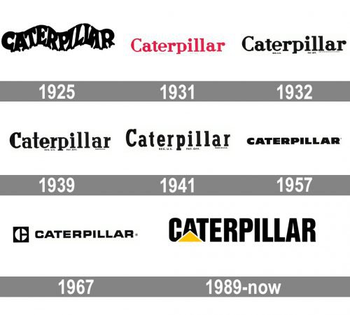
Although the CAT logo has always been nothing more than the company name, in fact it has undergone dramatic changes throughout its more than 90-year history. The logo has been redesigned eight times.
Meaning and history
Caterpillar, also known as CAT, is one of the world’s leading manufacturers of specialized equipment for mining, construction, transportation, and other industries. A wide range of other products is also produced under the Cat® brand. The corporation includes more than 480 units located in 50 different countries on all continents except Antarctica. The company’s headquarters are located in the United States.
The history of the company dates back to the beginning of the 1880s. The Caterpillar predecessor was the Stockton Wheel Company, founded by the Holt brothers back in 1883 in California. The company specialized in the production of agricultural machinery. In 1904, the company developed and released for sale its first profitable crawler tractor. It was offered under the name Caterpillar.
What is Cat?
CAT is the name of a brand, owned by Caterpillar corporation. It was established in the United States in 1925, and by today has grown into one of the American Fortune 100 companies, engaged in the production of construction machinery and engines. The company operates all over the globe.
1925 – 1931
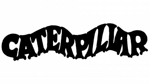
The original Caterpillar logo, which appeared in 1925, sported a unique wavy typeface, which presumably symbolized either a crawling caterpillar or a patch of land before the Caterpillar machinery was used on it.
1931 – 1932

In the 1931 logo the “wavy” effect was gone. Like the first logo, the wordmark was red on the white background, yet the very shape of the letters was absolutely different. The serif typeface looked rounded. The next year, the color scheme was replaced by the black-and-white one, while the font itself stayed the same.
1932 – 1939
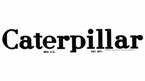
The wordmark was now red on the white background. It made the Cat logo more eye-catching but reduced the variety of backgrounds where it could be used without changing the main color.
1939 – 1941

The 1939 update included minor changes to the shape of the letters, while the overall design stayed almost the same. Two year later, the company experimented with the font once again, this time making the space between the letters wider.
1941 – 1957

Many of the square serifs disappeared. The proportions of the glyphs were altered: the characters grew narrower. And yet, the overall width of the logo didn’t change, which resulted in a more transparent design.
1957 – 1967
At last, in 1957 designers decided to opt for a bold sans serif uppercase typeface that somehow conveyed the idea of reliability and solidity. The font was slightly updated in 1967, while a new company emblem (so-called Block C) was placed to the left of the wordmark.
1967 – 1989
The type grew lighter. Also, the basic shape was now closer to the square. It echoed the emblem that appeared to the left of the wordmark. The square emblem featured a stylized white “C” over the black background.
1989 – Today
The current symbol, which was adopted in 1989, features the name of the company with a yellow triangle buttressing the “A”. In addition to the logo with the full name of the company, there is also a shorter CAT logo. Itsuggests that consumers already know that “CAT” stands for “Caterpillar”.
Font
The typeface used in the Caterpillar logo belongs to the Helvetica font family. Itis either Helvetica Inserat Roman created by Max Miedinger or Helvetica Compressed designed by Eduard Hoffmann and Max Miedinger.
Color
The iconic combination of black and yellow has been the distinctive feature of the CAT logo since 1989. The earliest logotypes were red, while from 1932 to 1988 the company stuck to the black-and-white color palette.
What does the Caterpillar logo mean?
The stable and bright logo of Caterpillar represents the confidence and strength of the company, shown in the bold uppercase “CAT” lettering in a modern sans-serif font, and a bright yellow triangle, which symbolized growth and progress. The badge is pretty simple in its composition, yet looks very intense and energetic.
What kind of triangle is in the CAT logo?
The isosceles triangle on the Caterpillar logo is set in a solid yellow color, pointing up, with its base stable and horizontally stretched. The yellow color of the CAT triangle stands for development, innovations, and growth, while the shape and orientation of the triangle mean confidence and professionalism.
Are CAT and Caterpillar the same company?
CAT is a stick symbol and the Major brand of Caterpillar Inc, an international corporation, established in the USA in 1925, and growing into the world’s largest player in construction machinery equipment manufacturing.
What does CAT stand for Caterpillar?
CAT is how the whole world knows the Caterpillar Corporation. It is a major brand of the company, responsible for the production of construction machinery and equipment, along with engines and other spare parts.


