Colgate is the brand of dental care products, created in 1806 in the United States and owned by Colgate-Palmolive Group. Mouthwash products under this label are one of the most popular across the globe, with the brand’s presence in almost every country in the world.
Meaning and history
The visual identity of the world’s most famous toothpaste has always been constant in its color palette. Once created at the end of the 19th century, the white and red composition was only changed in terms of style and typeface, but never — in colors.
What is Colgate?
Colgate is the name of toothpaste and oral care brand, which was established in the United States in 1873, and today is a part of a Colgate-Palmolive company. The brand produces toothpastes, mouthwashes, brushes, and accessories, which can be found in pharmacies and supermarkets all over the globe.
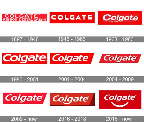
Though the company was established at the beginning of the century, its first toothpaste was introduced only in the 1870s, and it didn’t have any logo, but the simple lettering. The first real design was created in 1897 and since that time it was redesigned eight times, keeping the original structure and color scheme.
1897 — 1946
The very first logo for the toothpaste was created in 1897 and featured sleek white lettering on a red background. The nameplate was set in two levels — “Colgate’s” was placed on top and enlarged, while the name of the product, “Ribbon Dental Cream” was written in smaller letters under the brand’s name.
The nameplate was written in a custom sans-serif typeface with rounded shapes and slightly curved lines. It was modern and slightly playful, making the product stand on the shelf.
The red and white color palette of the logo was symbolizing power, confidence, and passion. The red background made the white color look even brighter and fresher, evoking a sense of cleanliness and shining.
1946 — 1963
The first logo stayed with the brand for more than 40 years and was only redesigned in the middle of the 1940s. The typeface of the nameplate was changed to a sharper and more modern one, and the name of the product was now “Dental Cream with Gardol”. All the inscription was executed in capitals letters, except for “with”, which was in the lowercase and a smaller size in comparison to other words.
The “Colgate” lettering was pretty good balanced and the straight distinct angles of its letters were evoking a sense of protection and confidence. The logo stayed with the brand for another decade.
1963 — 1980
The redesign of 1963 brought a new style to the Colgate logo. Now the name of the brand was written in the title case and executed in a custom sans-serif typeface with smooth elegant lines. There was a geometric blue element added to the product’s packaging — on its right side, featuring “With MFP” lettering in white.
The new logo looked modest yet contemporary and instantly recognizable. It was actually a prototype for the logo we all know today.
1980 — 2001
The redesign of 1980 only slightly changed the typeface. Now it was a sleek italicized sans-serif, the one in the same style as the previous inscription, but more professional and elegant.
The custom typeface was probably based on Magistral Bold Italic, but with the more rounded letter “C” and pointed peaks of “G” and “A”.
It was a well-balanced and professionally executed logotype, which has been in use by the company for more than twenty years.
2001 — 2004
In 2001 the logotype was redrawn again. The typeface became more sophisticated and gained smoother lines with slightly visible curves. Now the custom font of the nameplate was resembling Sanstone Heavy Italic, but with some lines shortened.
The color palette and style of the logo remained the same, and even the change in the typeface was not very obvious, so nothing made the customers get used to a new visual identity, it was a very organic process.
2004 — 2009
In 2004 the company decided to add some volume and dynamics to its logotype, so the white inscription gained a burgundy shadow, which made the letters look brighter and more solid and confident. As for the typeface, it was slightly refined again, keeping the signature style of the brand.
2009 — Today
In 2009 the lines of the inscription were softened, and the edges now gained sharp peaks, while the letterforms started looking sleeker and fancier.
There were two variant of the logo — a flat one and the one with the shadow, which are both still in use today, along with the version, designed in 2018z
2016 — 2018
It was only for one year, from 2016 to 2018, when Colgate decided they need something new and changed their inscription with the new idea in mind. The tail of the letter “G” was elongated and curved, forming a smile-like line. Though the experiment failed, the company loved the idea and replicated it in the logo design of 2018.
2018 — Today
The current logo of the toothpaste is a combination of the versions from 2009 and 2017. The classic “Colgate” inscription is accompanied by a white smile, placed under it and disconnected from the nameplate. It looks fresh and friendly, representing the brand’s essence and purpose.
Colors
The Colgate logo is represented by two colors: red and white. Red reflects the brand’s dynamic and energetic pace and never-flagging vigor. White stands for sincerity and purity. This combination creates an optimistic and vivid mix, which is highly reflective of the brand’s success.
Font
The font used in the Colgate logo belongs to the FreeSet group developed by Manvel Shmavonyan and Tagir Safayev (1992).


