

![]() Michelin Logo PNG
Michelin Logo PNG
Although the Michelin logo has been heavily modifiedseveral times, it has preserved its visual identity due to the use of the company’s mascot, the so-called Bibendum.
Meaning and history
![]()
The iconic Michelin mascot, Bibendum, was introduced by the brand in the middle of the 1890s and has glued to the company, staying its unchangeable symbol throughout the years. There have been several redesigns of the Michelin logo during its history, but the Michelin Man has been an inevitable part of each of them.
The mascot was designed by a famous French artist, Marius Rossellini, also known as O’Galop, and its contours and shapes were slightly changed until the today-known Michelin Man was introduced in the logo of 1936.
1889 – 1925
![]()
In the initial years of Michelin existence, they were a rubber-processing business. Their emblem was basically a rectangular ticket with a lot of text and imagery on it. The latter bit included two palms on the sides of the figure. Meanwhile, the text included the big word ‘Michelin’ written in the middle in Gothic letters, the ‘manufacturer of rubber’ written in French, among a lot of other details.
1936 – 1968
![]()
The running Bibendum and a script wordmark were two parts of the logo, created for Michelin in 1936. The mascot was running with a tire, and the tail of the wordmark’s “N” represented a road. The logo was executed in monochrome and looked friendly and playful, brilliantly reflecting the purpose of the brand.
1968 – 1997
![]()
The redesign of 1968 changed the Michelin logotype to a modern and solid one, with its capital letters in an extra-bold sans-serif typeface, which was extended and shortened. The letters featured thick lines and traditional straight cuts of their ends, evoking a sense of stability and seriousness. As for the Bibendum, he showed up here and there, in different poses and surroundings, depending on the logo placement.
1997 – 2017
![]()
The blue, white, and yellow color palette was adopted by the company in 1997, placing the white logotype on a blue rectangular background, and underlined with a thin yellow line. The inscription featured an italicized bold sans-serif typeface and has a standing saluting Michelin Man on the left.
1997 – Today
![]()
In the same 1997, the company started using a simple yet very recognizable black logotype in all capitals as its official logo. This slanted sans-serif inscription with stable letters, clean contours, and sharp angles is still used by the iconic brand. The letters on the “Michelin” wordmark are slightly extended horizontally.
2017 – Today
![]()
The redesign of 2017 brought a new light and cool composition to the Michelin logo. The color palette and the typeface of the wordmark remained untouched, but now the mascot image is enlarged and the lettering is placed right under his smiling face, separated by a thick line, which is yellow for the brand’s products and blue on the corporate materials.
Symbol
In the course of time, Bibendum attained the status of the brand’s worldwide ambassador. Not only did he present the company’s new products, but he also advised and assisted motorists in every way possible.
![]()
Emblem
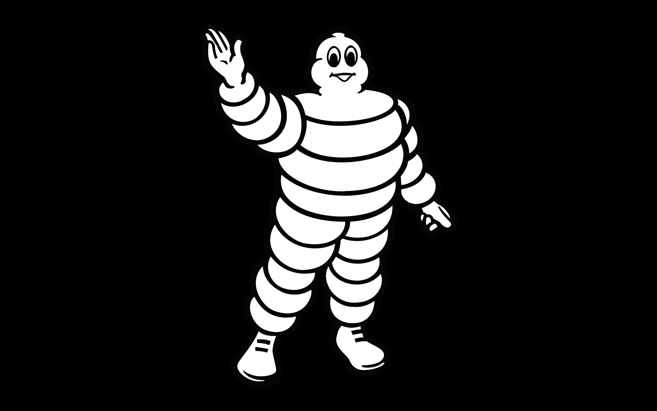
![]()
Every designer that worked on the new versions of the logo brought about his own interpretation of the mascot. In the current version of the Michelin logo Bibendum waves his hand as if to greet the motorists driving past the company’s offices.
Font
![]()
The current wordmark features a solid italic san serif typeface. All the letters are capitals.
Color
![]()
The Michelin Man is white with the black outline; the wordmark is dark blue, while the background is white.


