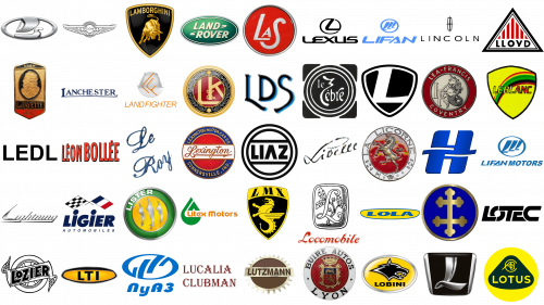
The world of car brands is surprisingly rich with names that start with ‘L’. That includes several big companies, such as Lexus, Lamborghini and Lotus (all sports car manufacturers, in fact). But here are also plenty of smaller manufacturers all over the planet.
What supercar start with L?
Ferrari’s LaFerrari supercar is amongst the world’s most famous supercars. It’s one of the company’s finest cars as of late. It was designed specifically for F1.
What expensive cars start with letter L?
Lexus LS is one of the most popular cars produced by Lexus. It’s an executive sedan, produced by them since the 80s. There have been 5 generations of these cars.
What car brands that start with L?
There’s a surprising number of car brand that start with ‘L’. In particular, there are many sports car manufacturers. That means Lamborghini, Lotus and Lexus (to an extent).
Lexus
Lexus is a subsidiary of Toyota that specializes in premium cars. It was founded in 1989 as a branch that would build luxury vehicles. That includes executive cars, expensive sports models and high-quality passenger cars of all sorts. Their emblem is a circular shape with a hollow space inside. The only other element is a combination of two lines, drawn at an angle from the frame’s right side. This image is supposed to look like a bit letter ‘L’.
Lamborghini
Automobili Lamborghini is likely the most famous car brand to start with an ‘L. Often called ‘Lambo’, these cars are primarily high-performance models from Italy. That includes sports cars, supercars and grand tourers. Their logo depicts a golden bull, placed into a shield-shaped badge of color black. The other golden elements include a frame around the shape, as well as the name along its top edge. The name uses tall sans-serif letters.
Land Rover
Land Rover is amongst the most famous British car brands. It belonged to various international manufacturers over the years, eventually being united with Jaguar. Most of their cars are various crossovers, SUVs and all-terrain vehicles. The logo is a green oval with a grey frame. The brand’s name was featured inside, using white sans-serif letters with some tilt. The two other elements were dash lines at the end of the text’s first line and the start of the second line.
Lotus
Lotus is a prominent manufacturer of high-performance cars from the United Kingdom. They originally specialized in small, brisk sports cars. Presently, they make the bigger models, such as Evija or Emira. Their logo is a bright yellow circle with a triangular, dark green shape inside. That’s where much of the imagery is, including the big word ‘Lotus’ in bold yellow and the emblem. That emblem is located right in the top of the central shape, and it basically features slim letters ‘C’, ‘A’, ‘B’ & ‘C’ one inside the other as homage to the original name.
LUCID MOTORS
Lucid Motors is an American producer of luxury vehicles. They aren’t the usual luxury cars – these are electric executive vehicles. The first of these were teased in 2007, and the final products were only shipped recently, which drew a lot of public attention. What they use both as a logo and for car decoration is just their name. In this design, ‘Lucid’ is written in fully capital letters in an abrupt, thin design. The letters are far apart from one another and also stretched sideways a lot.
Lincoln
Lincoln is an American carmaker, a subsidiary of Ford. Lincoln is famous for their premium vehicles, which includes a lot of executive cars. Historically, they were a big supplier of these cars, but nowadays they build a small number of luxury crossovers and executive sedans. Their badge is a sort of tall rectangle with curved sides. Inside of it, there is a cross that stretches to central points of all four lines. There’s also a wordmark, used alongside this emblem, which is just the words ‘The Lincoln Motor Company’ in bold black.
Lada
Lada is the most popular car brand to come from Russia. These cars have been produced by AvtoVAZ since the 70s. The models largely include small, affordable cars for an everyday laborer. Now, they’ve become bigger and more powerful, yet remaining cheap. Their emblem is an oval shape with a boat depicted inside. It’s wordplay – in Russia, this type of boat if called ‘Ladja’, which is where the brand’s name comes from. The name wordmark is also usually located nearby, written in typical sans-serif letters
La Buire
La Buire was a car manufacturer from France until 1930. They entered the production in 1899, and that initially included small carriage-like automobiles. They later moved on to the bigger passenger models. Their logo is a circle emblem with a red spot inside and a white frame around it. The former is where they put the crest of Lyon, the city where these cars were made. The latter held the company’s name (written as ‘BUIRE-AUTOS LYON’) along the edges.
La Fayette
La Fayette was an American brand of early automobiles, active in the 1910-20s. They primarily built 4-door sedan passenger cars. A LaFayette coupe was their most popular model. Their logo depicted the likeness of Marquis de La Fayette, a prominent historical figure in the American Revolution. It was placed half-face and designed as a bust. The image was then put in the center of a darker vertical oval.
La Salle
La Salle was a brand of luxury cars in the 1920-40s. It was a subsidiary of Cadillac, which was in turn a subsidiary of General Motors. The cars they made were primarily big executive and touring models. Their emblem was a red circle with a thin metallic frame around it. Inside the circle, there were three letters ‘L’, ‘A’ and ‘S’. They were written in white and in different sizes (the middle letter in particular was much smaller than the rest).
Lagonda
Lagonda is a brand of luxury cars, owned by Aston Martin. It was founded in 1906 and spent much of the 20th century as a low volume producer. The brand was only sporadically active since the 80s. Their logo is inspired by the logo of Aston Martin. It’s the same badge of metallic wings, except these are more elegant, round and joined in the bottom. The center is occupied by a black circle with a strip of the same color in front. That’s where the word ‘Lagonda’ is written in white.
Lammas-Graham
Lammas was a short-lived brand of motor cars, active in the 30s. They only built a handful of models, which were largely semi-premium models. In addition to that, there were some high-performance products. Their logo depicted two sharp, abrupt wings with a thick shield in the center. On the latter, the name ‘Lammas-Grahan’ was written in two lines of white text. Above the shield, there was also a knight’s helmet depicted in profile.
Lanchester
Lanchester was a British carmaker, founded in the end of the 19th century. They haven’t released a new car since 1954, although they also haven’t closed the business down yet. Their cars were largely normal passenger cars or luxury vehicles, some designed based on cars of other brands. Their logo is a wide pentagon shape colored in black. The name was written inside in elegant, silver letters. The same color was also used as a frame for the whole logo.
LandFighter
Land Fighter is a Dutch brand of all-terrain vehicles. These are largely quad bikes, but there are snow bikes and other models on sale, as well. The company doesn’t operate outside a small number of countries in Western Europe, hence their obscurity. Their logo depicts a sphere that looks like it’s made of glass. On it, there are two orange marks that resemble the letters ‘L’ and ‘F’. The former is rotated to imitate the top of the latter on this emblem.
Laurin and Klement
Laurin and Klement was one of the oldest Czech carmakers, founded in 1895. They are also a direct predecessor to Skoda. L&K proper built motorcycles, bicycles and automobiles of often luxury quality back in the day. Their logo depicted a burgundy circle, set inside a black frame that was then also outlined in gold. There were also golden elements all over the place, like the letters ‘L’ and ‘K’ inside the red circle, as well as the symbol ‘&’ behind them. The font was a linear sort of serif.
LDS
LDS is a series of racing cars, built in the 60s in South Africa. These were cars built using foreign engines (often Alfa Romeo). The chassis were original, but developed based off some British racing car models. The producer’s logo is the acronym ‘LDS’, written in dark blue letters. The font is a fluid style with small serifs. At the same time, the bottom lines of these characters are drooping down to create more room for the middle one.
Le Zebre
Le Zebre is a French car manufacturer, active until the 1930s. They primarily touring cars, including smaller models created in the 1910s. The production numbers weren’t too high, and the company went down soon. Their logo was a black circle with several alternating layers of black and white around it. The company’s name was also written in white inside that circle. The font was a sort of artistic handwriting (except for the article ‘le’).
Leader

Leader is another not very well-known brand of automobiles from our list. The company uses a sleek yet minimalistic badge with the heavy and smooth white letter “L” inscribed into a triangular crest, resembling the iconic logo of the luxury Lexus marque.
Lea-Francis
Lea-Francis was a British carmaker that stopped making new cars in the 90s. They originally just sold bicycles, but later switched to cars. In particular, they made a lot of high-performance vehicles in the 40s. They had a round emblem with a red frame that said the company’s name and their birthplace (‘Coventry’). Inside the frame, they’ve placed letter ‘L’ and ‘F’, as well as an image of hippocampus. These are basically mermaid horses.
LeBlanc
LeBlanc is a car manufacturer from Switzerland. They primarily build sports and racing cars based off models of other brands. Their flagman is Caroline – a closed racing vehicle fit for road driving. Their logo is a yellow shield with a black outline. Inside, they’ve drawn a rainbow that increases in size towards the right. In front of it, the company’s name is written in yellow and red letters.
Ledl
Ledl was an Austrian carmaker, active in the 70-80s. It primarily focused on building high-performance cars, including copies of vintage roadsters from Italian and German makers. The company was later revitalized, but as a tuning shop. Their classic logo depicts an orange rectangle with letters on it. These were black, big and bold. The font was a basic sans-serif font.
Leidart
Leidart was a British carmaker that existed in the 30s. They built a total of one high-performance model. This car used an early V8 engine and was in many things an ancient sports car. In addition, they made it roofless, which further increases the image of a typical sports car. This model was commonly called an ‘Anglo-American hybrid’ because it used an American engine with a British chassis. They didn’t have any truly accepted emblem.
Leon Bollee
Leon Bollee was a French engineer who primarily built cars in late 19th and early 20th centuries. These cars were early automobile models, such as steam cars and tricycles. The later models were larger touring vehicles. The company’s logo was just the words ‘Leon Bollee’, written in red letters. The second word was a bit larger than the other. The font was a sort of tall sans-serif.
LeRoy
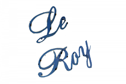
LeRoy was a Canadian car model, produced until 1904. It was mainly built using American parts (mainly of GM make), but there were also plenty of original solutions. The car was generally a basic automobile model, which means an open carriage-like design. The car didn’t have any emblems, besides the name wordmark. There were made in two lines using golden letters. The font was a cursive italic design.
Lexington
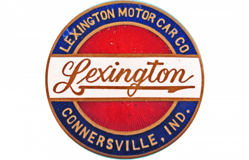
Lexington was an early American touring car model, built in 1910-20s. There were several variations, including several sports car versions. But the car was pretty much a basic design for the time, except with a stronger engine. The logo displayed a circle logo with a blue frame and a red core. Across the middle, they’ve also stretched a strip of white. Here, the company’s name was written in red, using cursive italic letters. The full name, as well as the location of the company, was written along the edges.
LIAZ
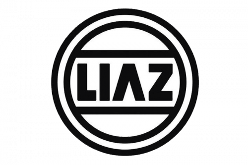
LIAZ was a Czech vehicle manufacturer, abolished in 2003. This company largely built buses and trucks of many varieties. A lot of them were Skoda models, built under license, but LIAZ also manufactured models of their own make. The company emblem is just the acronym ‘LIAZ’. It’s written fully in red and with slightly tilted letters. The font was a simplified sans-serif. Many bits in these letters were either diminished or cut away.
Libelle
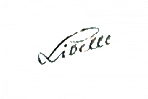
Libelle was a model of microcar, produced by Austrians in the 50s. The company used the same name, but it seems to be their most successful creation. But even then, not many of these were ever built. It was a three-wheel car with engine located in a special extension behind the car. As an emblem, they used just the vehicle’s name, written on the front. The font was a cursive italic design, and the word was as a rule written diagonally. The color of choice was black.
Libyan Rocket
Libyan Rocket was a Libyan project of a powerful sports car, reveled in 1999. Muammar Gaddafi himself took part in the development of this model, which is what the car’s most famous for. Besides that, it’s a massive sports car with a unique bloated shape. For a logo, these cars used the former Libyan national symbol. It depicted an eagle with folded wings and a shield on its chest. It was usually fully grey when used as the car badge.
Licorne
Licornehttps://1000logos.net/corre-la-licorne-logo/
was a series of French cars, produced until late 40s. These cars were primarily of high-performance variety. Some of them were powerful luxury vehicles. The logo had a circular shape. A red center was outlined by a white frame. The former held an image of a prancing unicorn (as per the name). The latter was where they wrote the manufacturer’s name as ‘La Licorne’.
Lida Buses Neman
Neman is a Belarusian vehicle manufacturer, established in the 80s. Their primary products are buses, vans and trucks. Many of these use the chassis of foreign brands, such as Iveco. The emblem is a big letter ‘H’. It has a soft, but also mechanical look, with several abrupt shapes and unnecessary extensions. Two wavy lines also cut into it to make It look like it’s being hugged. The word ‘Neman’ is also written below in white.
Lifan
Lifan is one of the smaller Chinese carmakers, founded in the 90s. Lifan builds affordable motorcycles and several models of compact cars. There are also plenty of crossovers, vans and other small vehicular products. Their logo depicts a silver oval with three ‘L’ letters inside. They are depicted with gradually smaller sizes and in unnatural, curved shapes. That’s because they are meant to resemble sails, as the company’s name translates to ‘power sail’.
Lifan Ethiopia
The history of Lifan Motors in Ethiopia is weird. The production of Lifan cars started in 2007, but not by the original manufacturer, these were basically copies. In 2011, the business received blessing of Lifan and was purchased by them. Nowadays, the Ethiopian branch produces plenty of compact sedans and some crossover. They use the same logo as the parent company. It depicts an oval with three Ls inside.
Lightning
Lightning is a British carmaker that was founded in 2007. Their flagman is Lightning GT, an electric sports car. It was finally released in 2020 after long development. Their logo is the company’s name, written in tilted cursive letters. These are connected together by a line in the bottom, and the design is generally curvy and smooth. The preferred color is either white or black.
Ligier
Ligier is a French vehicle manufacturer with a bizarre product line. The business was established in the 60s, and for two decades the company built racing cars that took part in F1. After that, they started focusing on extremely small vehicles. That includes a microcar model and a small electric bus. There have been several badge variations, but the logo depicts their name, written in big bold letters. Right above, there are two crossed flags. One is a checkered racing flag, and the other is the flag of France.
Lister
Lister is a car brand from Britain. It was originally founded in the 50s, when they first started making racing cars. They still make them, although the focus shifted from bullet cars to bigger F1 models. Their logo depicts a white circle with a layer of green surrounding it. There’s the company’s name written in white on top of this frame. The yellow core displays three silver saber swords.
Litex Motors
Litex Motors is an automobile manufacturer from Sofia, Bulgaria, established in 2008. This is the largest producer of low-cost compact vehicles in the country. It assembles cars of Chinese manufacturer Great Wall Motors at jointly developed facilities across Bulgaria. Litex Motors Logo depicts the name written in an orange futuristic typeface. Behind it we can see an emblem of a green triangular, separated from an also green letter ‘L’ by a white space and the name. Together, they’re supposed to form a drop.
Lloyd
Lloyd Engine Works was a car manufacturer, which operated between 1908 and 1963 and was located in Bremen, Germany. They specialized on making luxury cars and parts for them. One of their most popular car lines was Lloyd LP – a series of saloons produced in 50-60s. Lloyd long was their name in a black sans-serif typeface. It was placed inside a triangular with black frame and white inner part. In the inner part itself were stripped vertical red lines.
LMX Sirex
LMX Sirex was a sports car line created by an Italian car manufacturer Linea Moderna Executive and produced in 60-70s. This was one of the most popular sports cars of LMX. It was a 2-seat coupe powered by 2.3 L V6 engine. This car even had its own logotype – a black dragon, drawn next to the large red serif abbreviation ‘LMX’. Below it was an inscription ‘Automobile srl Milano’. The logo’s background was a yellow rectangle.
Lobini
Lobini was a Brazilian manufacturer of sports cars which existed between 1999 and 2006. Their single product was a vehicle called H1. It was a 2-seat sports car with Audi engine and saloon made of fiberglass and carbon steel. The company logo was a yellow oval with a silver-white frame. In the center of logo was a head of a wolf, colored black-and-white. Also, there was some highlighted areas on the logo.
Locomobile
Locomobile was a pioneering carmaker from America. It was founded in 1899 and was purchased in 1926. It was one of the earliest vehicle manufacturers in advent of automobile era. In different periods of their history, they made compact passenger cars based on steam and internal combustion engines. Their logotype depicted a hand-written letter ‘L’, placed in the center of a black-and-white rectangle. Behind the ‘L’ there was an image of a tree.
Lola
Lola Cars International was a large producer of vehicles located near London. The company designed and engineered racing cars. Their products were mostly bolides, sports cars and Formula 1 cars. Their logo was a yellow oval with the company blue sans-serif name inside it. Below it was the phrase ‘World Leader in automotive technology’. All this was on a blue background.
Lombard
Automobiles Lombard was a car manufacturer from France. It was active between 1927 and 1929. The company designed and produced racing vehicles as well as components for them. Their single car line was AL – a series of one-seat sports cars and prototypes of those. These cars were made with using of internal combustion engines and aerodynamic construction of body. The company didn’t have any logotype. Probably they used just their name to distinguish them apart of competitors.
London Motors
London Motors was a Canadian company, based in London, Ontario, existed in 1920s. It was a producer of touring cars, roadsters and sedans, as well as parts for them. Their most popular car was London Six – an impressive vehicle, designed with using of wooden disc wheels, pointed wind glass screen and 6 cylinder engine. The aluminium used in construction allowed the car to speed up to 85 mph at maximum. The London Motors Company didn’t have any logotype. Probably it didn’t need to, because they used just their name as a distinctive element.
Lorraine
Lorraine-Dietrich was a French company focused on aircraft engine and automobile designing and production. It existed between 1896 and 1935. In the list of the company’s products were racing cars and luxury cars with no roofs and glass screens. They were made with four-cylinder twin engines. The company didn’t have any special logotype, because the company always used just their name as a word mark. It had an elegant serif typeface.
Lotec
Lotec GmbH is a German producer of luxury cars, founded in 1962. Their products include sports cars and racing cars. One of their curious models was C1000 – a 2-seat sports vehicle equipped with 5.6L Mercedes-Benz V8 engine, flitted with two turbochargers with output of 1000 hp. The company logo depicts the name, written in a gray contoured typeface. A letter ‘T’ has a long vertical line, which also covers the letter ‘E’; ‘O’ character is drawn as two separated lines. All this is shown on a white background.
Lozier
Lozier was an American producer of automobiles, based in Detroit. The company made high performance luxury vehicles from 1900 to 1915. These were limousines, landaulettes, touring cars and roadsters. The cars Lozier made were available for a very specific audience due to its high prices even in terms of luxury cars. The company logo was their name, written in a bold black & white serif font. It was written on a wide line with wings on right and left sides. Behind it all was a huge car wheel.
LTI
The London Taxi Company (formerly – London Taxi International) was a British automotive company. LTI was launched in 1919 and ceased operations in 2012. It was focused of designing and production of taxi cars, hire cars and commercial vehicles. In the list of their taxis were coupe cars, touring cars, convertibles and estates. They made cars using vehicles components of other companies. The LTI didn’t have any logotype – they just used their name in advertisement blocks in journals and newspapers.
LuAZ
LuAZ is Lutsk Automobile Factory. It was established in Ukraine in 1955. In this factory, they make parts for different cars generally of Russian manufacturers, truck bodies. They also made vehicles for the Red and Ukrainian armies, such as LuAZ-967 – an off-road vehicle notable for its small size and good passability. The factory has its own logo. It’s an oval symbol composed of two separated parts. Below it, there is the name, written in a lowercase sans-serif typeface. The whole logo is drawn blue.
Lucalia Clubman
Lucalia Clubman is a sports car produced in Australia between 1970 and 1982. It was used only was racings. This is a front engine, rear-wheel drive roadster. All Lucalia car models are equipped with an inline four cylinder engine and drivetrain components from Japan. There are two model variation of Lucalia car. One of them is known as P4 and had a standard clubman form, while another one, P6, was wider and longer, but had generally the same components.
Lutzmann
Lutzmann is the first vehicle built by a German manufacturer Opel in the end of 19th century. It was a two-seat, no roof automobile with no glass screen. Its wheels were made of wood and steel, and the rear wheels were larger than the front ones. Lutzmann was equipped with so-called ‘Otto’ 1.5 liter engine having a 3.5 horse powers. It weighted 520 kg, had a length of 2,15 meters, heighted 1.35 meters and had a width of 1.44 m. Only 65 Lutzmann vehicles were assembled between 1899 and 1902.
Luxgen Motor Co. Ltd.
Luxgen is a Taiwanese manufacturer of automobile, founded in 2009. This is a brand of low cost passenger cars, most of which are crossovers and minivans. They build vehicles on basis of Chinese and Japanese car components and sell their products across the world. Luxgen logotype depicts a metal white & black icon with handwritten ‘L’ character on it (also metal-white). Below it is the name written in a sharp metal-white sans-serif typeface.
Conclusion
In this comprehensive exploration of car brands that start with “L,” we’ve journeyed through a captivating list of car brands that have not only shaped the automotive landscape but have also stood as testaments to innovation, luxury, and performance. Among these, Lancia, a marque synonymous with elegance and engineering prowess, showcases the depth of different manufacturers’ contributions to our global car brands. The story of Roland Lloyd, whose dedication mirrored that of icons like Porsche, highlights the spirit of automotive excellence. Meanwhile, the tale of Ferruccio Lamborghini, a founder who revolutionized the concept of high-performance sports cars, remains a pivotal chapter in the history of luxurious car brands.
From the historical lanes of England, where companies like Lister Motor Company signify the essence of British sports car manufacturer prowess, to the innovative grounds of Austria, the legacy of figures such as Ferdinand Porsche is engraved in the heart of automotive culture. The narrative extends to the elegance of LaSalle, the technical brilliance of Laurin & Klement, and the pioneering spirit of Daimler, illustrating a rich tapestry of automotive marvels across continents.
In the realm of electric and hybrid innovation, LEVC, backed by Tata Motors and intertwined with the legacy of Jaguar Cars, points towards a future where tradition and innovation converge. Leyland’s history, with its roots deeply embedded in England and extending its branches to Canada, reflects the global impact of these brands.
This article has not only provided a list but also woven a narrative that connects luxurious car brands, high-performance sports cars, and the visionaries like Ferdinand Porsche and Ferruccio Lamborghini, whose dreams and drives have propelled the automotive world to new heights. As we reflect on these stories, it’s clear that the “L” in our journey stands not just for the names of these distinguished manufacturers but for the legacy, luxury, and leap towards the future that they collectively represent.


